Designed & built for Zora
SUMMARY
Zora is a social discovery app for recommendations from people you trust. Born from a simple, repeating friction. Every trip, the same pattern of asking and being asked for recs, and then losing those recs in text threads, DMs, and screenshots. I founded, designed, and built Zora solo, using Claude Code to go from Figma to production without a dev team. Shipped live at go-zora.com.
↑ Live — interact with the real app
Role
Founder, Designer, Developer
Team
Just me (and Claude Code)
Timeline
2025 to 2026
Tools
Figma, Claude Code, Next.js, TypeScript, Tailwind, Supabase, Vercel
Skills Used
Product design, UX research, user testing, iterative design, front end development, AI native build workflows, product strategy, brand design, mobile first design
Founder, designer, builder
AI-native solo build
Vibe-coded to production
go-zora.com
Every trip, the same pattern. People asking me where to go, me asking them. The best recs lived briefly in text threads, then disappeared. Google reviews are noisy strangers. Instagram saves get lost. How do you make recommendations from people you trust as discoverable as recommendations from algorithms?
Act 01
The spark.
This started the way most real products start. A friction I kept running into.
Got any recs for Mexico City?
Send me that list you made!
Where should I eat in Tokyo?
Travel made the problem loud.
Real life · Personal
Everywhere I went, the same question. From me, to someone else, or from someone else to me. 'Where should I eat?' The best answers always came from people I actually trusted. And they always lived exactly where you'd expect. In a text thread, buried under three screenshots, or in a DM I forgot I sent. Meanwhile, the places with the loudest voice online were the ones ranked by an algorithm that didn't know me. I wanted something in between. A social platform where guides from people you trust could live, get shared, and be rated by the people who care.
Act 02
What Zora had to be.
Four things had to work together, or the product didn't earn its place on someone's home screen.
The product · Pillars
Four things, all non negotiable.
Create a guide in minutes.
If guide creation took longer than a text message, no one would do it. The whole product depended on people being willing to make one.
Share it like anything else social.
Built for sharing to individual friends, to groups, to stories. The guide had to move through the same channels friends already use.
Discover from your circle first.
Top rated is great, but the Explore feed leads with what your people actually saved. Because that's who you trust. Strangers second, algorithms never.
Rate and save as a trust signal.
Ratings turn a personal list into a trustworthy guide. Saves turn a trustworthy guide into a trip.
Act 03
The design.
Zora is Slavic for 'dawn' or 'sunrise,' symbolizing new beginnings and the start of new adventures. The logo is a sunrise. The brand is mobile first and warm, built around one clear shape: create, share, discover, rate.
Home feed · Discovery
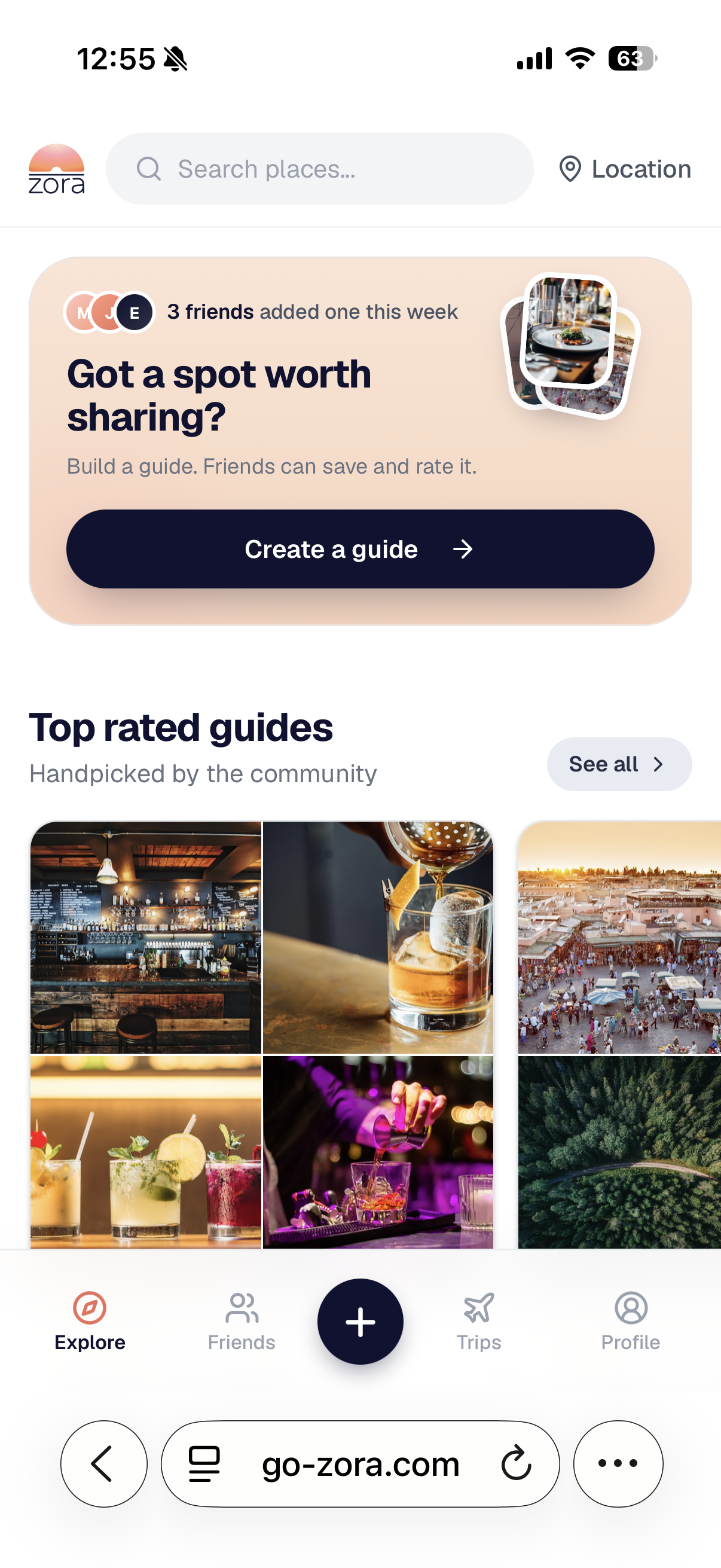
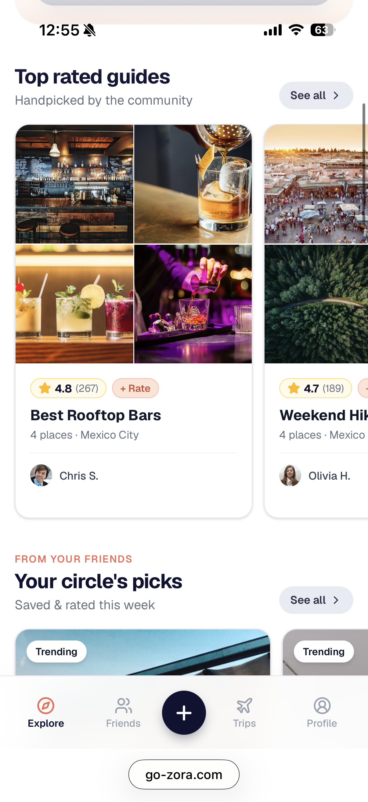
Explore starts where trust does.
The Explore tab leads with a prominent 'Create a guide' CTA, Top Rated Guides curated by the community, and Your circle's picks. Trust is the first thing the app shows you. Algorithm ranked content is further down, not at the top.
Trust signal · Trending this week
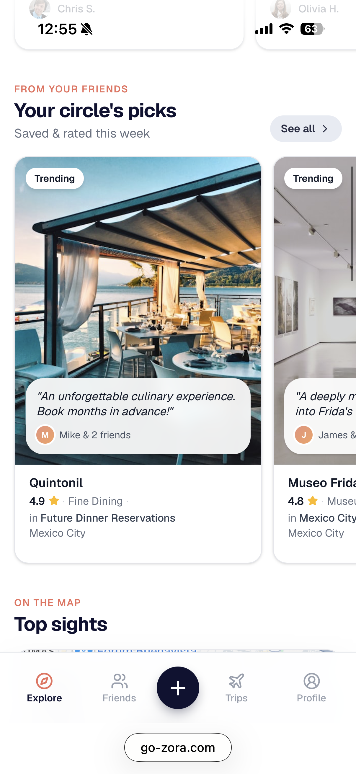
Your circle's picks.
The top of Explore shows places saved and rated by friends this week. Every card carries the social proof. Who saved it, the quote from their note, the rating. These are not reviews from strangers. These are recs from your people.
Spatial discovery · Top sights
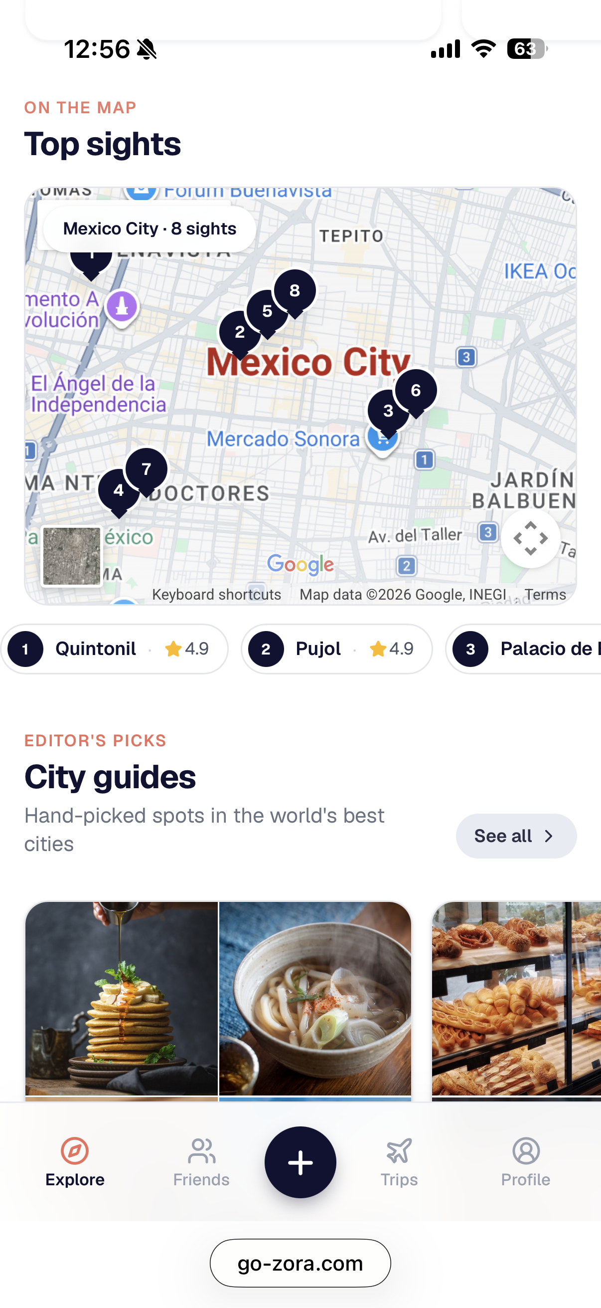
On the map.
The map shows the top sights in the city you're in or the one you're planning. Numbered pins connect to a horizontal scroll of cards below. Tap, explore, save. Built for travelers making decisions in motion.
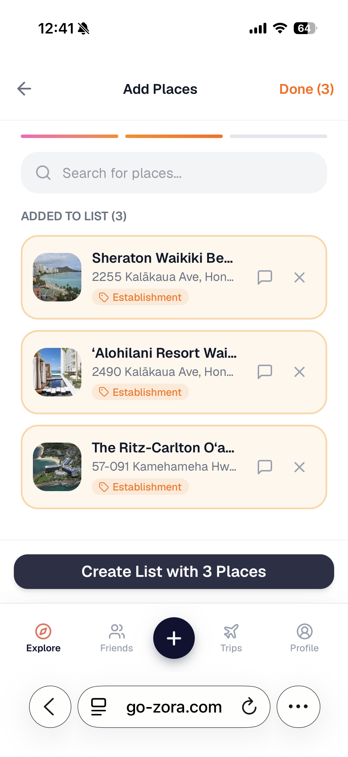
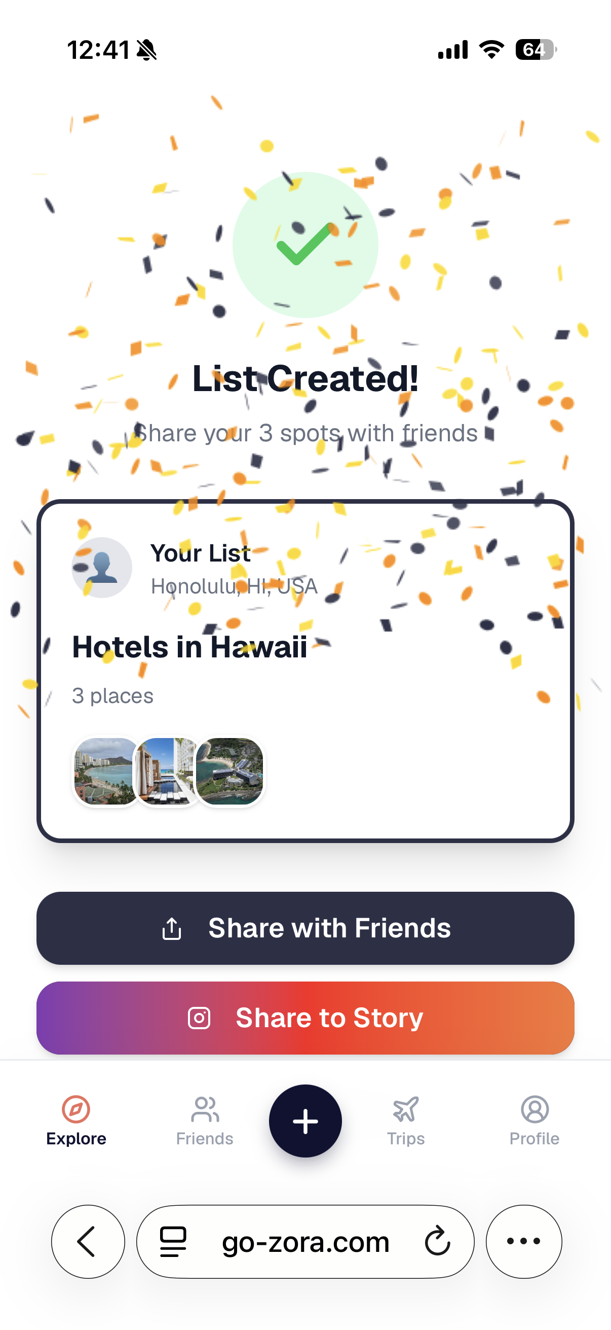
Guide builder · Three steps to share
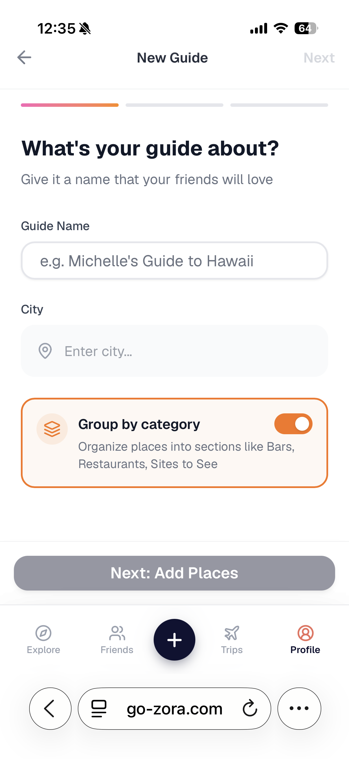
Creating a guide is three screens.
Name it. Pick a city. Search and pin places. Hit Done and get confetti. The confetti isn't fluff. People shared guides BECAUSE of that small joy. Without it, some stopped halfway.
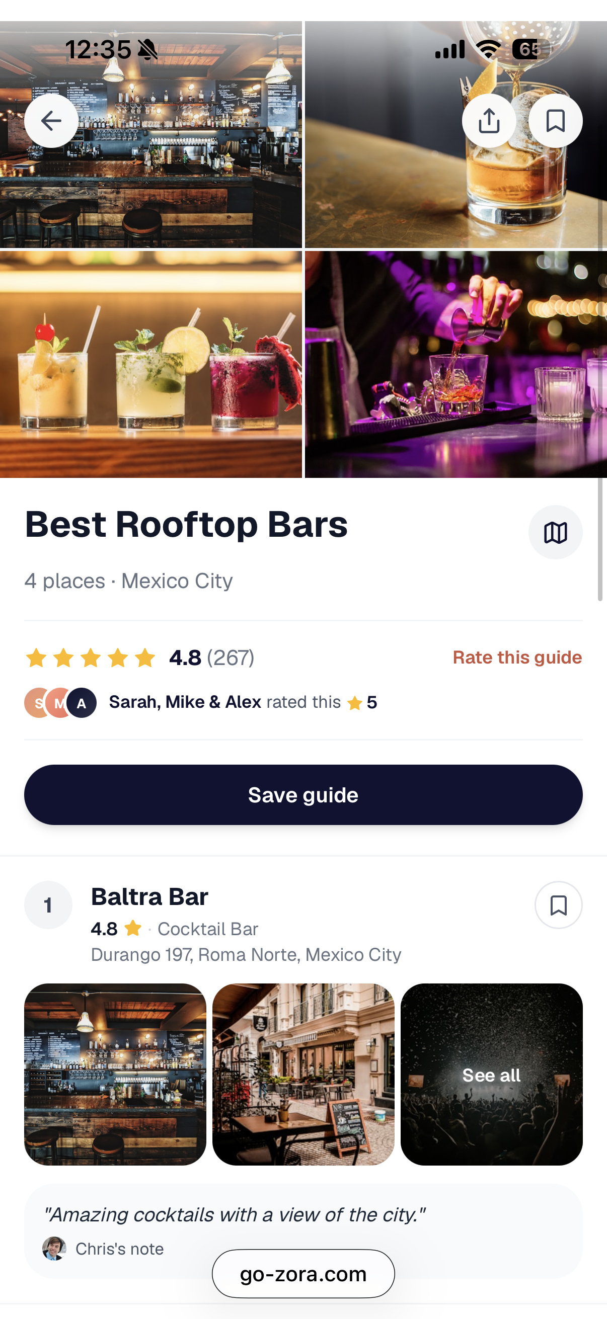
Guide detail · Ratings & notes
The guide is where social happens.
Each guide is its own page. The title, the city, the rating, and who rated it ('Sarah, Mike & Alex rated this 5'). Every place card shows the creator's note, because the note is the whole reason the rec is worth trusting.
Social · Map, guides, places, activity
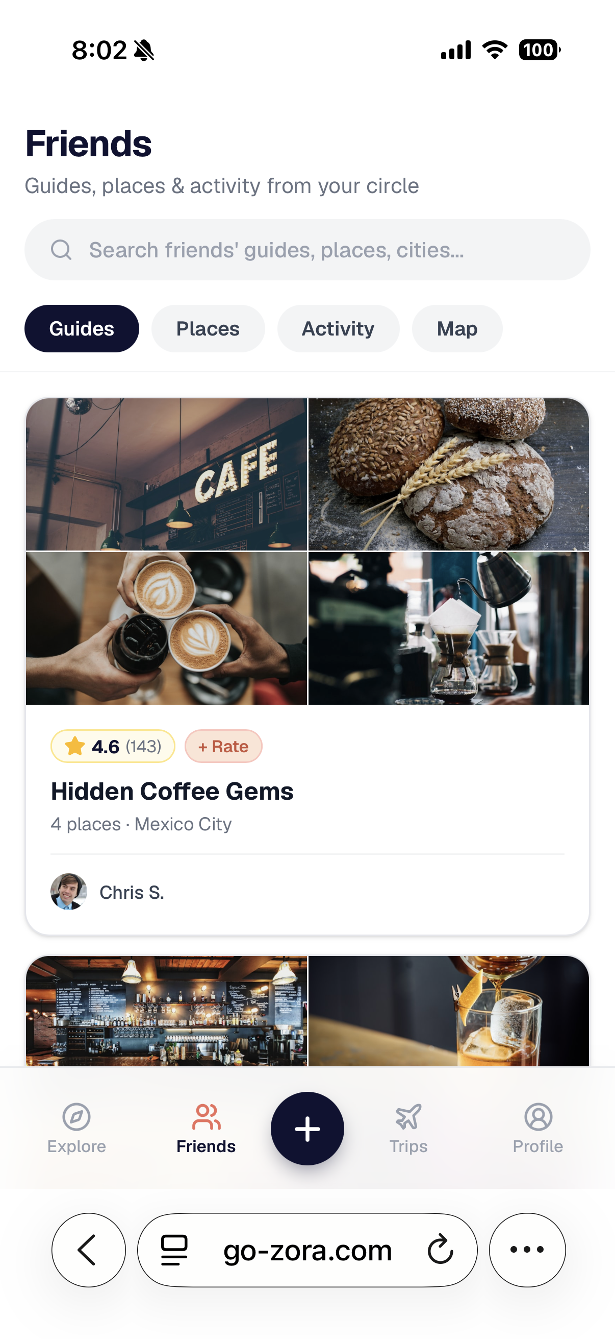
A Friends tab dedicated to your circle.
Everything in the app filtered to just the people you follow. Guides, Places, Activity, and a Map. All scoped to friends. The map is a physical view of what your circle has actually been to.
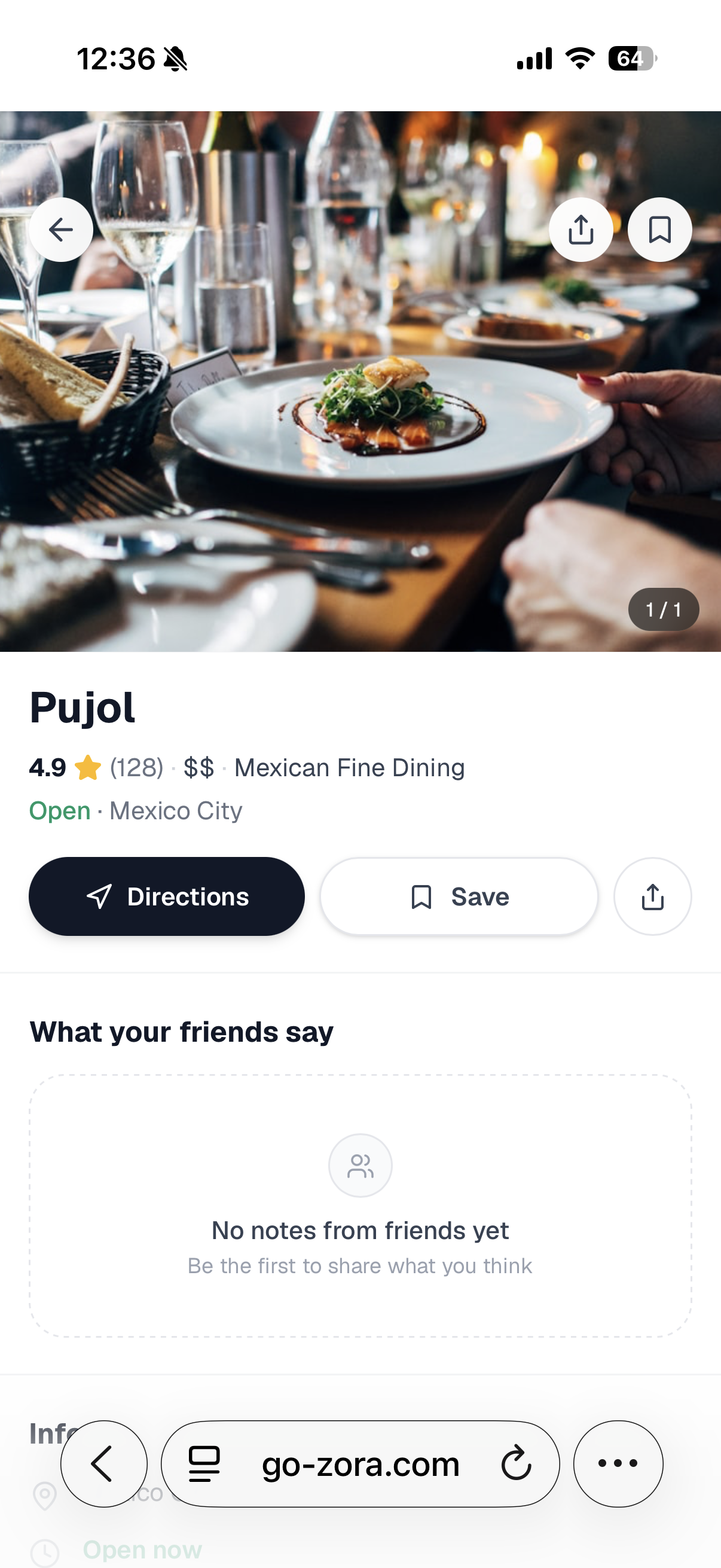
Place detail · Friend notes
Every place carries its social context.
The place view shows 'What your friends say' even when the answer is 'nothing yet'. The empty state invites you to be first. Designing for the empty state mattered more than designing for the full one.
Act 04
Watching people use it.
After the first build, I sat down with real people and watched them try the app. No instructions, no narration. Two insights reshaped the whole product.
Testing · What I saw
Two observations that changed the flow.
Insight · 01
Lists were getting lost.
Users created a whole guide first, then hit sign-up at the end. The list was only saved locally. If they bailed on sign-up, the guide was gone. That friction was quietly killing the thing they'd just built.
Insight · 02
Most users want to consume, not create.
For every person excited to make a guide, several more just wanted to browse. The app leaned too hard on creation. There wasn't an obvious path for 'I just want to see what's good.'
Fix 01 · Sign-up first
Protect the thing they're about to build.
I flipped the flow. Sign-up happens before guide creation, not after. That single change meant every guide a user made was saved to their account from the first tap. No more lost lists. A small structural change, but it stopped users from losing the work they cared about.
Fix 02 · A path for consumers too
Give people who just want to browse a reason to stay.
I added two clear paths into Explore. View all top rated guides from the whole community and rate them yourself. Or filter down to just your circle, where every rec comes from someone you actually know. The app stopped being 'make a guide or go home.' It started being a place to discover too.
Reflections
What user testing taught me
DESIGN THE EXIT, NOT JUST THE ENTRY
The biggest failure point wasn't the fun part, it was the step right before save. Sign-up after list creation felt natural to me, but it was exactly where users lost their work. Testing caught what I couldn't see from inside the flow.
BUILD FOR THE LURKERS
Most users never create content. That's true of every social app. The Zora v1 assumed everyone wanted to make a guide. The rewrite gave lurkers a real reason to open the app. Top rated for the community. Friends filter for the intimate. Both ship value on day one.
CELEBRATION IS UX
The confetti moment after creating a guide seems frivolous. It isn't. People finished AND shared guides because of that small joy. Without it, some stopped halfway. Small joys drive the share trigger.
Act 05
Vibe coded with Claude Code.
I'm a product designer, not an engineer. But I shipped this solo, in production, because of the workflow I built with Claude Code.
FIGMA
Design language. Component library. Brand. Everything visual started here.
CLAUDE CODE
Describe what I want in plain English. Real React code appears. Ship.
SUPABASE + VERCEL
Database, auth, deploys. The back end without a back end engineer.
Engineering · Solo founder stack
Before and after AI native.
Before, Fragmented
Traditional solo path
Designer hires a contractor to build, runs out of money before launch.
Figma only path
Designer stops at mockups. Product never ships. Vision dies in a file.
Code yourself path
Designer spends a year learning full stack dev. Delivery slips past relevance.
After, One System
Design + Claude Code + deploy.
Figma for the design language. Claude Code for implementation. Next.js + Supabase + Vercel for shipping. One person, one iteration loop, live product. This is how solo founders actually ship in 2026.
What this unlocks for designers
Every designer who has had a product idea die in a Figma file, or worse, die waiting on an engineer who never shipped, knows this pain. AI native workflows mean design doesn't stop at handoff. You can own the whole loop. Design, build, ship, learn, iterate. That's the thesis Zora was built on.
Act 06
Live at go-zora.com.
Shipping and iterating. Real guides, real cities, real friends.
See Zora in action.
The real app, running live at go-zora.com. Open it on your phone for the best experience.
Act 07
Reflections
Reflections
What founding, designing, and building solo taught me
DESIGN IS 10% OF SHIPPING
The Figma file was the easy part. Shipping meant the database, the auth flow, the maps API, the image hosting, the empty states, the copy, the deploy pipeline. Design is the first step, not the finish line.
AI NATIVE IS A DESIGN SUPERPOWER
Every designer who ships end to end with AI tools is a product team of one. I used to spec features and hope. Now I prototype, ship, learn. The fastest version of me is the one that doesn't have to hand anything off.
USER TESTING IS FOUNDER'S EDGE
I sat down with real people and watched them struggle. Nothing in any brief, spec, or critique tells you as much as ten minutes of a real person stuck on a real screen. Most of what makes the app usable came from those sessions.
TRUST IS A FEATURE, NOT A FEELING
The thesis, recommendations from people you trust, had to be a product pattern, not a marketing claim. Every design decision (Friends tab, creator attribution, rating UX, scope of discovery) ladders up to one question. Does this make me trust the rec more, or less?
NEXT PROJECT