Thryv Directory Network for Thryv
SUMMARY
Led product design across Thryv's US and international directory network — Yellow Pages, Superpages, DexKnows, and Yellow Pages New Zealand. Starting with the YP homepage redesign (20% CTR lift, $2.4M+ annual revenue), I rolled the same design system to DexKnows, redesigned Superpages' highest-volume surfaces (24% click-to-call, 22% mobile ad CTR), and rebuilt Yellow Pages NZ from the ground up. Along the way, four disconnected legacy stacks became one shared system — four brands, two hemispheres, one design playbook.
Role
Product Designer
Team
1 Designer, 2–3 Engineers, 1 PM
Timeline
2023 to 2026
Tools
Figma, Sketch, Zeplin, Google Analytics, Hotjar
Skills Used
User research, A/B testing, interaction design, visual design, data-informed design, cross-brand & cross-market systems, tech stack consolidation, mobile native design
Annual Revenue
Click to Call
Mobile Ads CTR
Tech Stacks
How do you modernize a sprawling directory network — four brands across two markets, each with its own tech stack — while driving measurable conversion gains and building a design system that scales instead of starts over every time?
Act 01
Starting with who the homepage serves.
Every directory is really two products fighting for the same screen. Consumers want to find a plumber in ten seconds. Business owners want the call that pays their mortgage. The research had to hold both in view.
Research · Method
How I listened before I designed.
Wk 1-2
Analytics audit
Six months of traffic, bounce, and CTR data combed for signal.
Wk 3-5
Consumer interviews
Fourteen 45-minute sessions across three US metros.
Wk 5-6
Advertiser calls
Nine small business owners on what makes a listing pay.
Wk 7
Heuristic review
Three competitor directories audited against our patterns.
Wk 8-12
Usability tests
Eighteen sessions across consumer and advertiser flows.
Research · Insights
Three numbers rewrote the homepage.
Insight · 01
Average time to first search
Consumers gave the homepage seven seconds. If the search bar wasn't the first thing they saw, they left for Google.
Insight · 02
Traffic arriving on mobile
Over half the audience was on a phone. Every design started on the smallest screen and expanded up, not the other way around.
Insight · 03
Listings still unclaimed
Business owners didn't know they could claim their own listing. The 'claim' entry point had to be findable without a search.
The homepage had to earn both of them.
Persona 01
Rachel Lim
Consumer · Looking for a local plumber
“If I can't find who to call in the first screen, I'm back on Google in ten seconds.
Columbus, OH · 34 · Mobile first
- →Finds services on her phone between school pickup and dinner
- →Trusts reviews but won't sort through them
- →Wants to tap-to-call, not fill out a form
Persona 02
Dave Vargas
Advertiser · Owns a 2-truck HVAC company
“I pay for the listing. I'd pay more if I knew how to make it work better.
Phoenix, AZ · 52 · Desktop once a week
- →Advertises on YP because his dad did
- →Claims his listing only if the button is obvious
- →Wants 15 minutes a month to manage, not 2 hours
Framing · Principles
Four principles guided every decision.
Search-bar-first.
The homepage exists to start a search. Every other element earns its place by supporting that single action, not competing with it.
Mobile is the default.
60% of traffic is on a phone. Every screen starts at 375px and expands. Desktop is the responsive variant, not the canonical one.
The claim button is a product.
Hiding 'claim your listing' behind three menus cost Thryv real revenue. Surface it wherever an advertiser might land.
One system, three brands.
Yellow Pages, Superpages, and DexKnows each keep their identity. But the component library, interaction patterns, and accessibility rules are shared.
Ideation · What I killed
Three directions that didn't survive testing.
A Google-style homepage with nothing but a search bar.
Too sparseA full-page hero carousel rotating featured ads every five seconds.
Too loudA 'List your business' link hidden in the footer.
Cost revenueA chatbot assistant 'find me a plumber' as the primary entry point.
No trustIdeation · The Chosen Layout
The homepage that made the three changes that mattered.
- 1
Search bar is the only hero element
Nothing else competes for attention in the first viewport. Location auto-detect keeps the task to a single action.
- 2
Quick-select category grid
A one-tap path for consumers who don't know what to type. Replaced a rotating carousel with a calm grid.
- 3
Claim your listing, above the fold
Moved from the footer to the top-right. The single biggest advertiser-conversion unlock.
Act 02
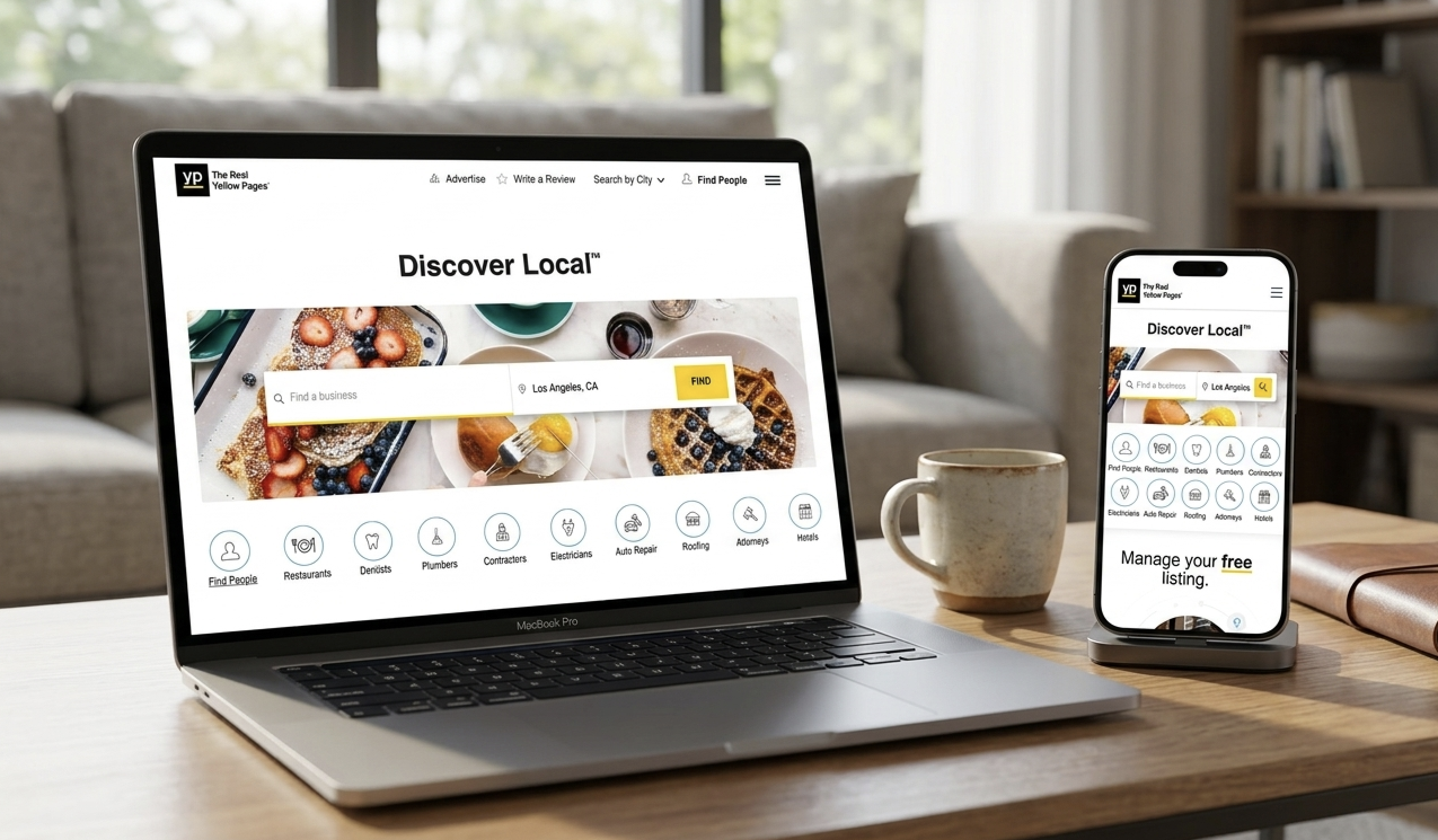
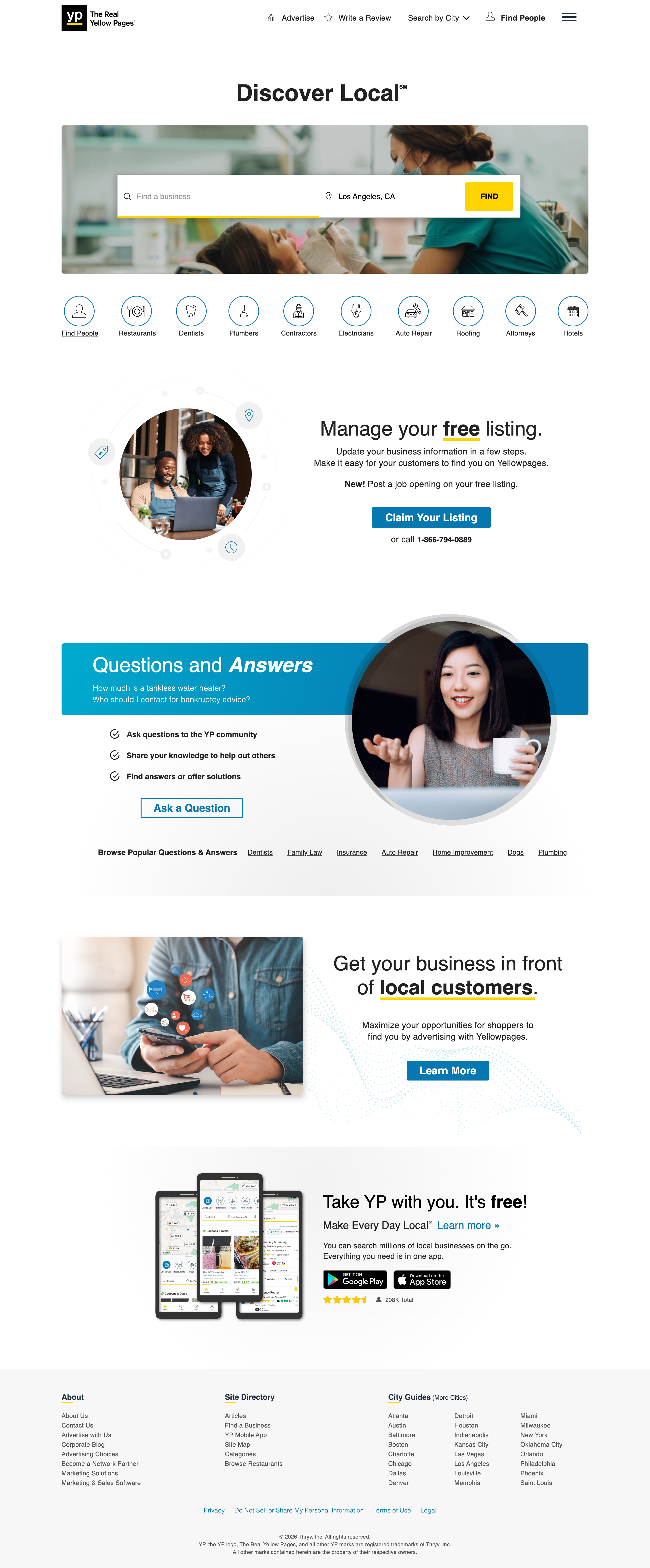
The Yellow Pages homepage.
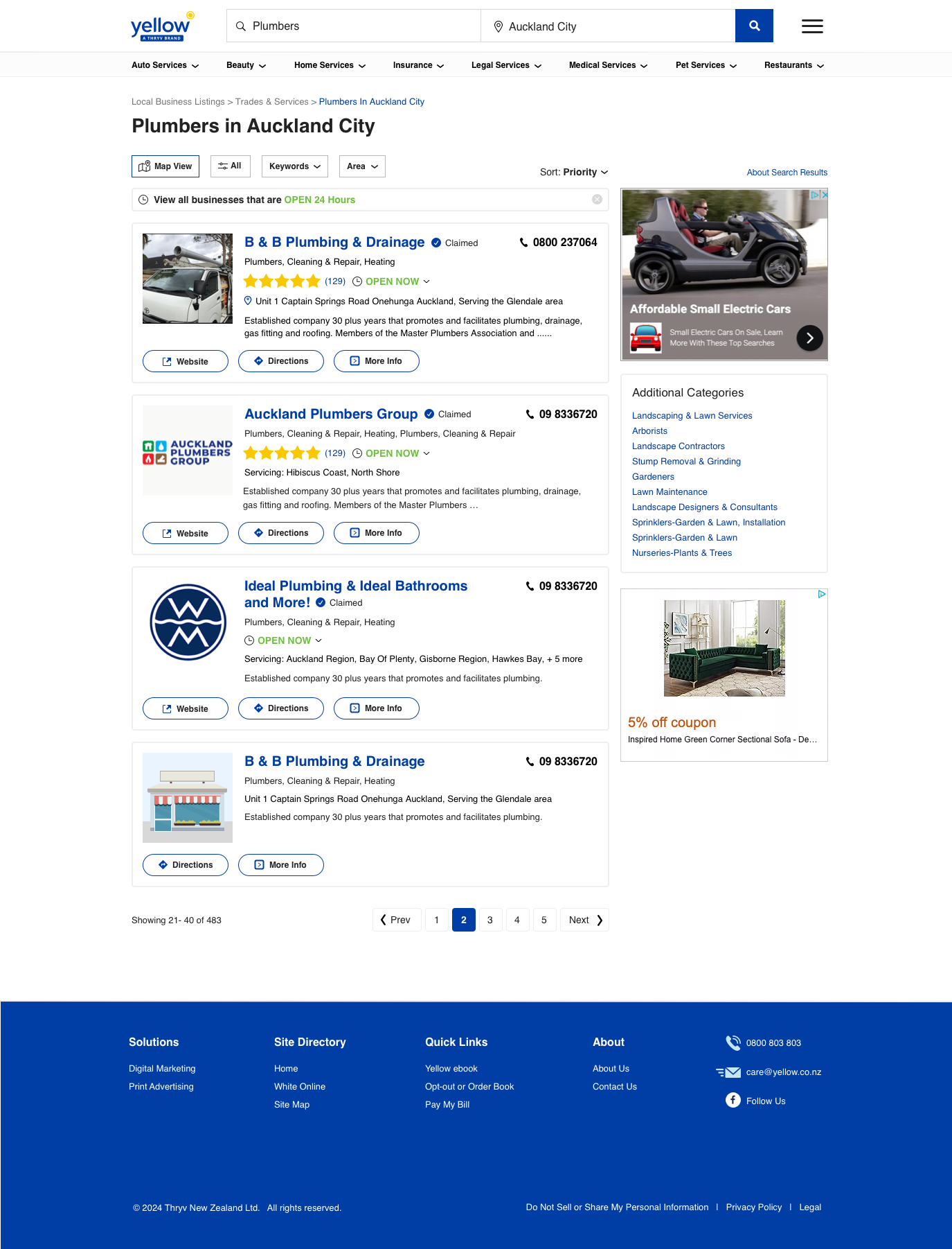
The old homepage was a cluttered mess of CTAs, banners, and rotating featured content. The redesign did one thing well instead of five things poorly.
KEY DESIGN DECISIONS
Three moves drove the 20% CTR lift: the search bar is the only hero element, quick-select categories give consumers a one-tap path without typing, and 'Claim your business' sits above the fold where 41% of unclaimed advertisers could finally find it.
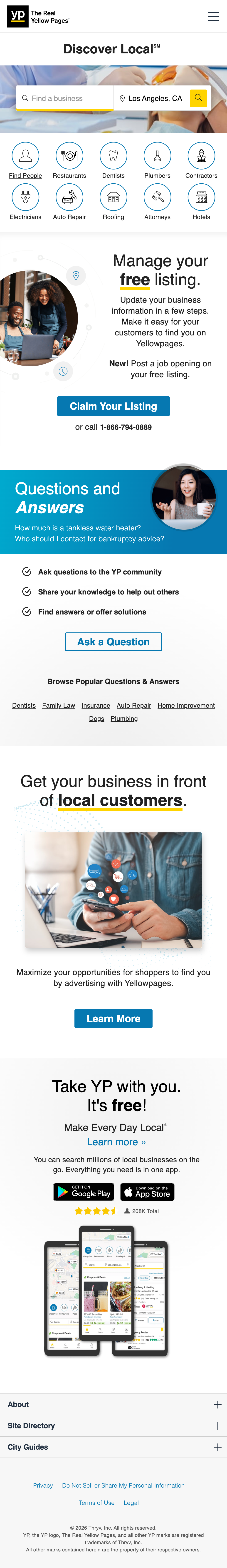
Mobile responsive.
60% of traffic
Mobile wasn't a scaled-down version. The stack order (search bar, categories, claim CTA) held, but every element reflowed for one-handed use. The claim CTA moved from top-right to a persistent row near the top. Category grid collapsed from 6-across to 3-across. Search input grew to fill the width.
Act 03
Then we shipped it again.
Once the YP homepage was proven, I applied the same playbook to DexKnows, a smaller US directory brand in the same network. Same search-first layout, same category grid, same above-the-fold claim CTA, adapted to DexKnows' own brand identity. The shared component library did the heavy lifting. No starting over.
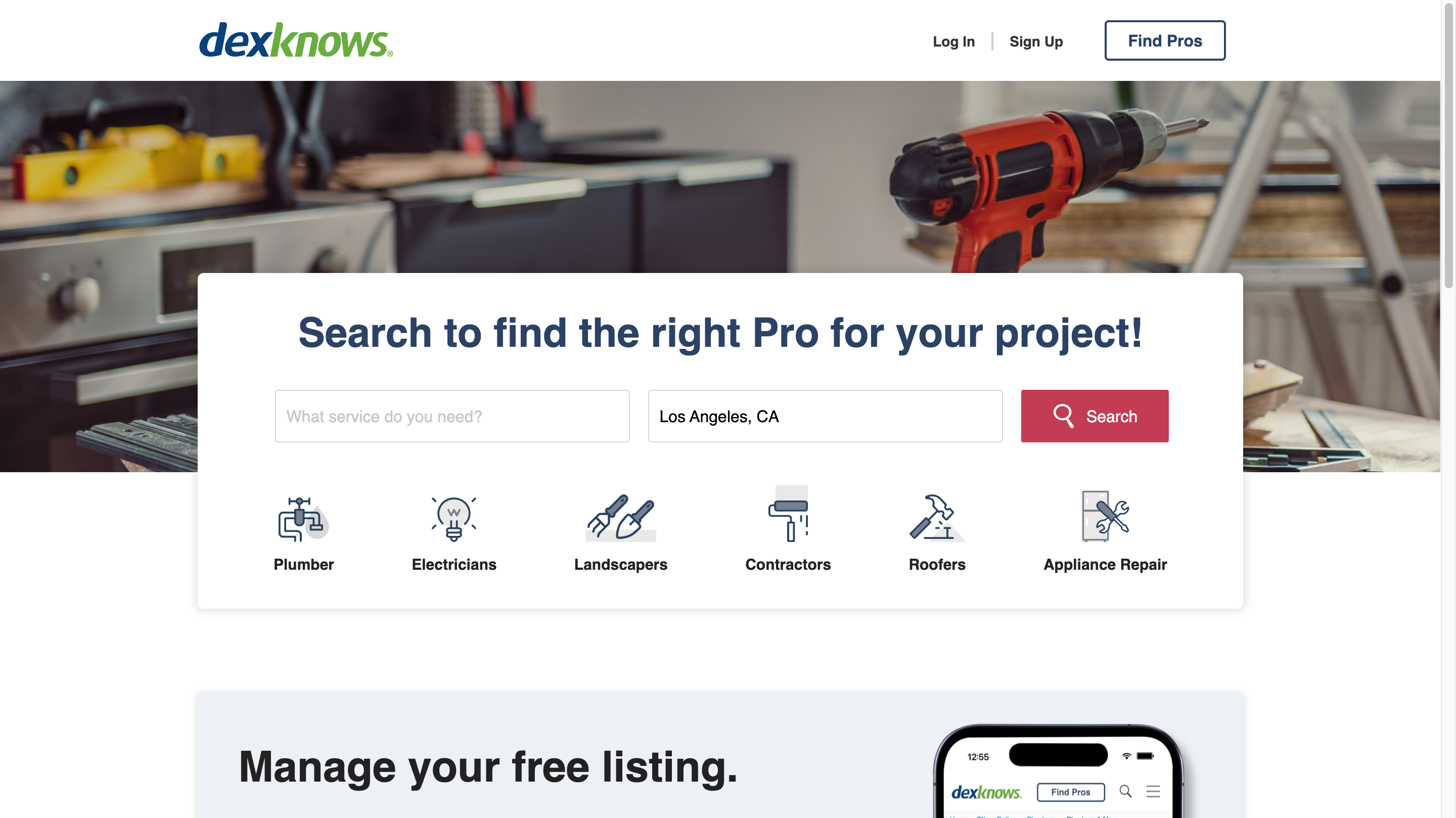
WHY THIS MATTERS
Proving a design on one brand and rolling it to another without re-doing the work is the measure of a system that works. DexKnows shipped in a fraction of the time YP took, with the same conversion-focused layout mapped to a different brand voice. One playbook, two brands shipped.
Act 05
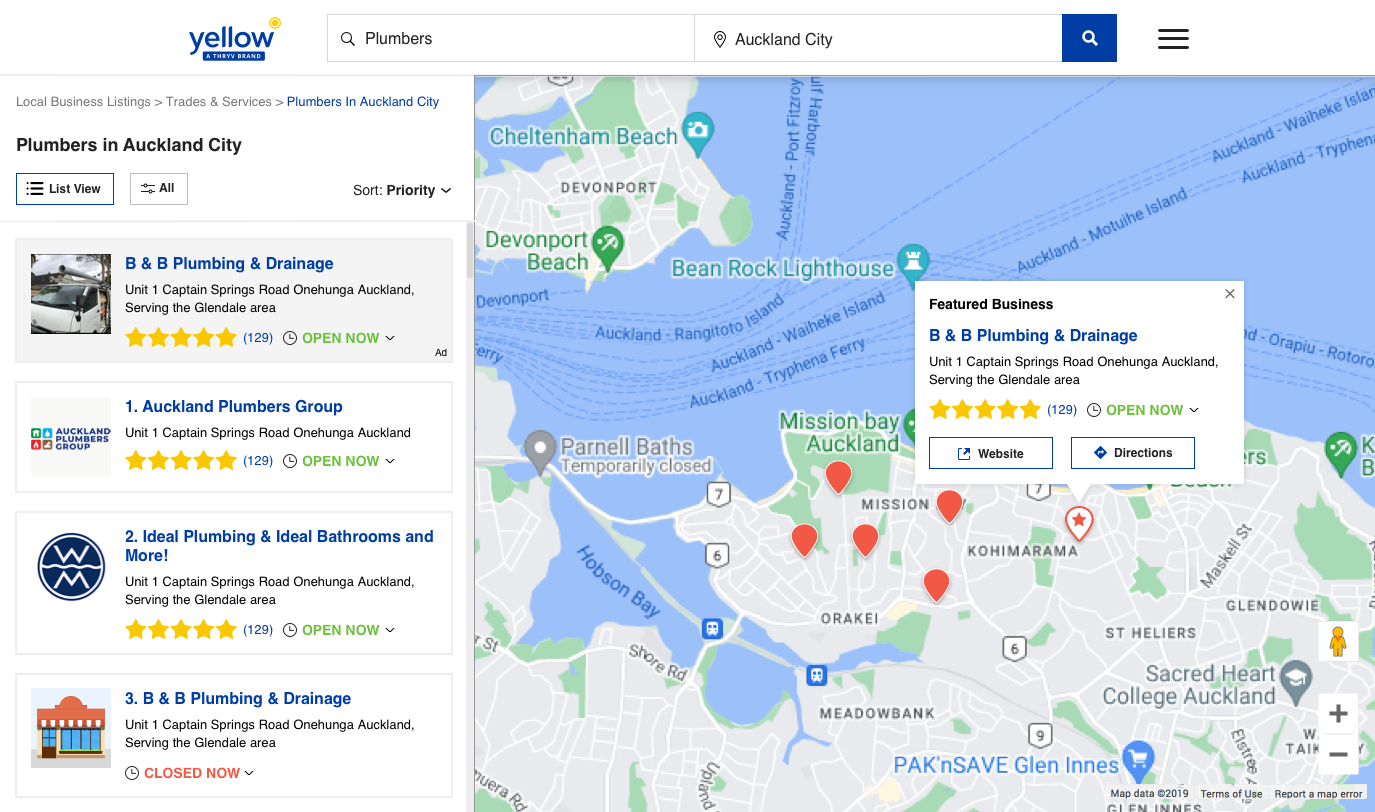
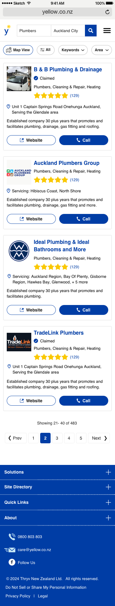
Superpages search results.
Past the homepage, the real revenue lived in the product. The Superpages SERP was the single highest-volume surface in Thryv's US directory network — where ads got seen and clicks got paid. A full information-architecture rethink, with conversion as the only KPI that mattered.
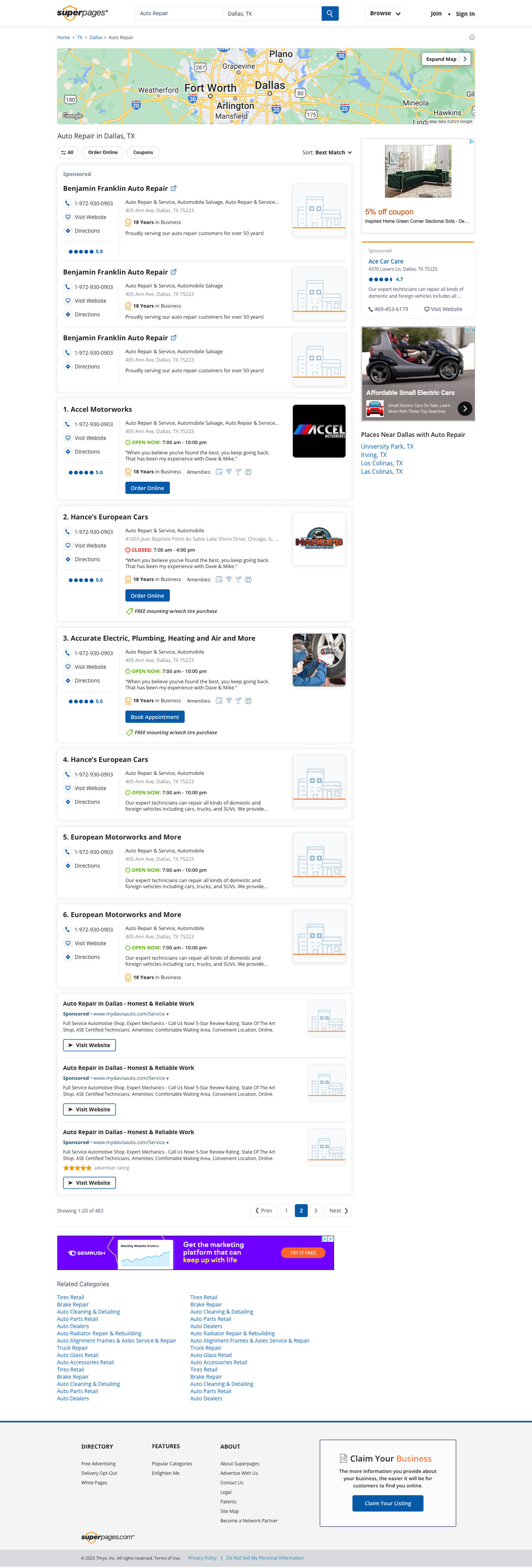
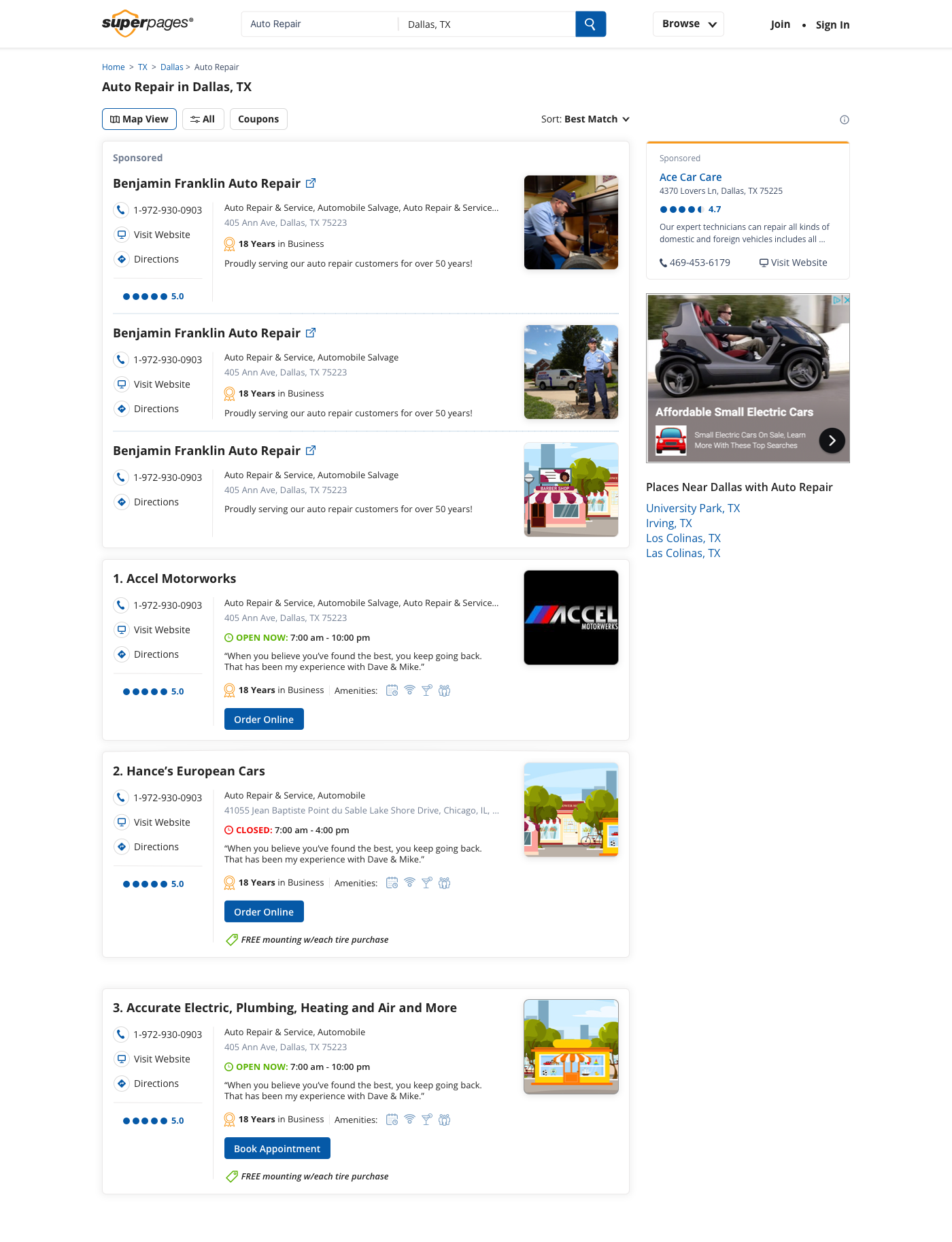
Results · Superpages SERP
What moved the numbers.
Key design decision
Restructured the mobile SERP to reduce map dominance and surface ads above the fold, where advertisers were paying to be seen. One structural change, 22% CTR lift.
Act 06
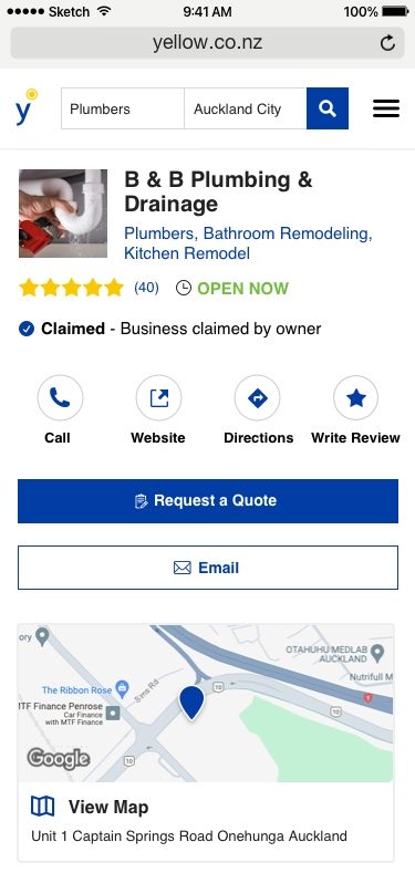
Superpages business profile.
The business profile is where a listing earns its call. I restructured it so the three most valuable actions — call, directions, and quote — lived in the first viewport on every device. Reviews moved up. Photos got their own section. Click-to-call lifted 24%.
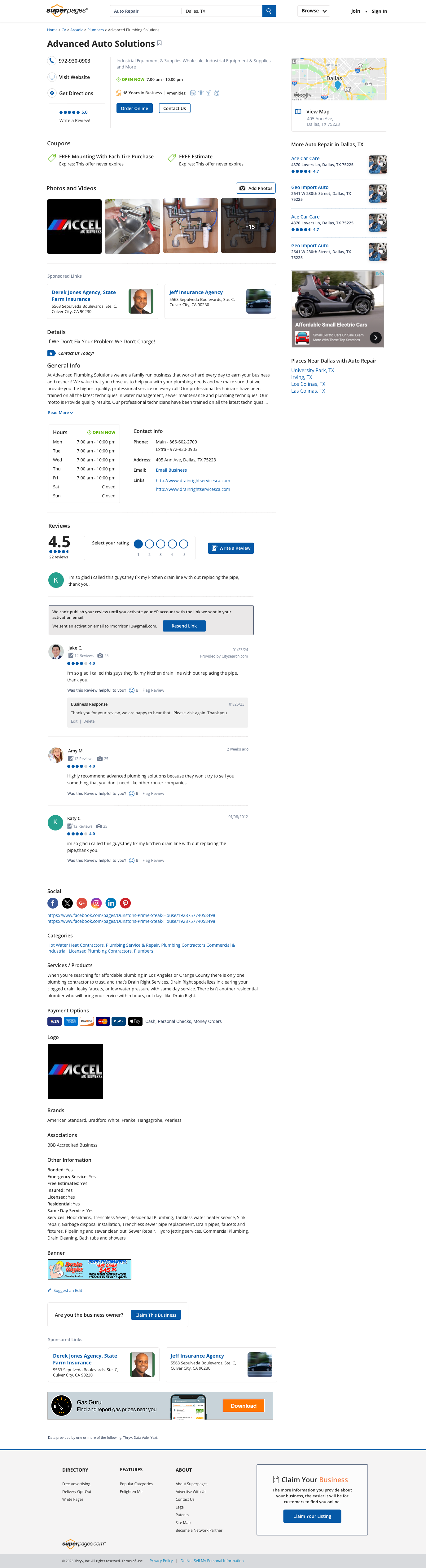

Results · Superpages BPP
What drove the 24% click-to-call lift.
What the 24% refers to
Click-to-call was the most valuable action on any business profile — the moment a listing became revenue. Moving the call CTA above reviews and giving it prominent color in the first viewport drove a 24% increase in click-to-call taps, the biggest conversion win of the entire Superpages redesign.
Act 07
Yellow Pages New Zealand.
Then I took the whole system international. Yellow Pages NZ was a full ground-up rebuild — homepage, search, business profiles, and mobile. Four disconnected legacy stacks had to become one, without sacrificing the market-specific design the NZ audience expected.
Engineering · Stack consolidation
From four stacks to one.
Before, Fragmented
US platform
Yellow Pages, Superpages, DexKnows
NZ codebase
Yellow Pages NZ on its own stack
AU codebase
Yellow Pages Australia on its own stack
Shared components
Each brand maintained its own
After, One System
One component library, four brands, two hemispheres.
Consolidated US, NZ, and AU onto a single design system and shared component library. Brand identity applied as tokens. Same system, localized experience.
Act 08
Reflections
Reflections
What I Learned
SYSTEMS SHIP FASTER
Rolling the same design to DexKnows after proving it on YP took a fraction of the effort. The component library did the heavy lifting — brand identity came in as paint, not structure.
CONVERSION IS A HIERARCHY PROBLEM
The 24% click-to-call lift and the 22% mobile ads CTR lift didn't come from making buttons prettier. They came from deciding, again and again, which element mattered most in each viewport.
CONSOLIDATION BUYS TIME
Merging four stacks into one freed weeks of engineering per release. That time went into research and polish, which compounded into every following launch.
LOCALIZATION IS DESIGN, NOT TRANSLATION
NZ users expected different density, different trust signals, different flows. Same system, different market rules — parameterized into the component library.
DATA TELLS YOU WHERE, USERS TELL YOU WHY
Analytics showed the problems. Interviews explained the behavior. Shipping the right thing needed both — neither alone was enough.