Compliance Platform Redesign for Vere Solutions
SUMMARY
Vere is a compliance platform for regulatory authorities. The founder had built a working backend; the interface on top of it had never been designed. I redesigned the whole surface, in his own code language, so his engineer could build straight from my files.
Role
Product Designer, sole
Team
Direct with the founder and his engineer
Timeline
May 2026 - Current
Tools
Claude Design, Claude Code, HTML / CSS / JS
Skills Used
Enterprise UX, information architecture, responsive design, design systems, engineering handoff
The goal
- An authority licenses places, certifies people and registers equipment
- Each carries its own registrations, inspections and fines
- All three lived in separate corners of the product
- Give an authority one place to see what needs attention, and finish it
The challenge
- The codebase already existed. I designed to his tokens and class names from the first session, not to a blank canvas
- The desktop build becomes the app. It gets wrapped with Capacitor and shipped to the App Store and Play Store, so every screen had to be fully responsive
- One build, no second front end for a team of two to maintain
Compliance tiers
Parishes in the pilot
Tabs on one record
Build, web + iOS + Android
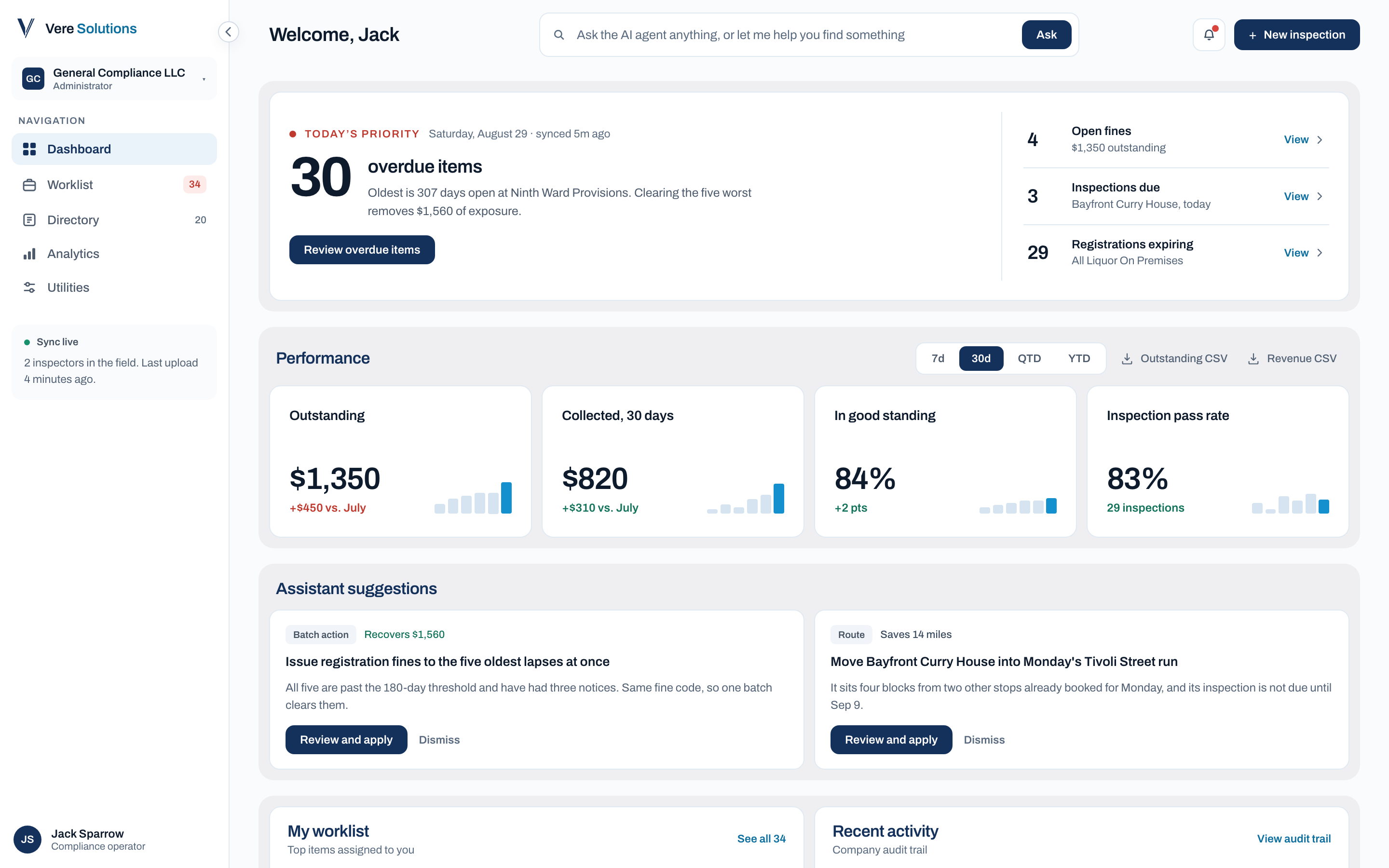
The redesigned dashboard
Open the day, see what is worst, go and clear it.
The work
Requirements
The brief came from recorded sessions, not a spec.
Three things came up in every call with the founder. I worked from those rather than redesigning what looked dated.
- The record page held too much to scroll, seven sections stacked down one column
- The three compliance tiers had no shared home
- Mobile worked, but had no hierarchy
Information architecture
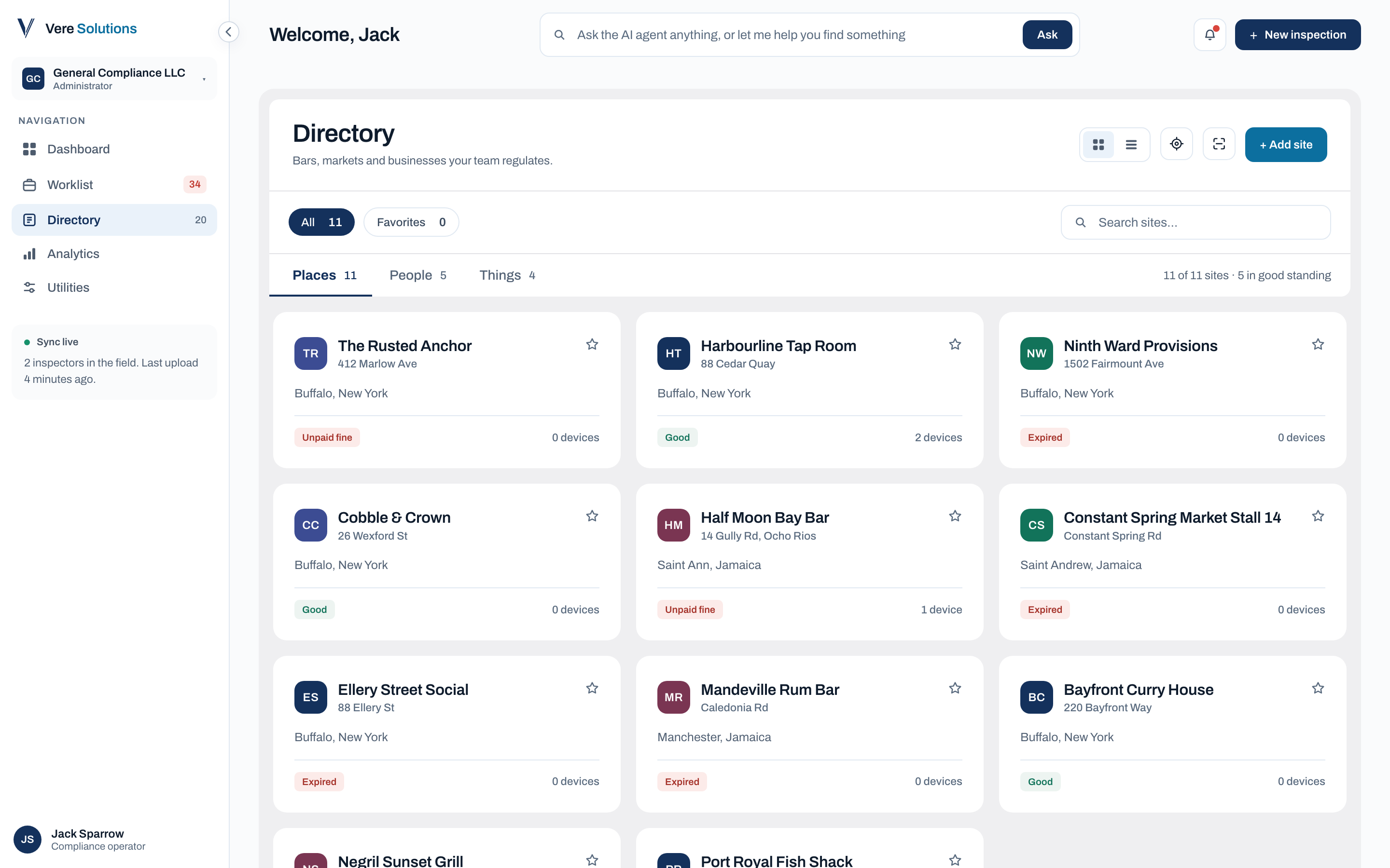
Places, people and equipment, one Directory.
All three behave the same way, so they sit under one destination with three sub-tabs.
- A dropdown asking you to pick a tier first was considered and dropped, it put a decision in front of every visit
- Equipment can sit under a place or move on its own, so the record holds both
- Card and list views toggle, because the team uses each for different work
Before / After
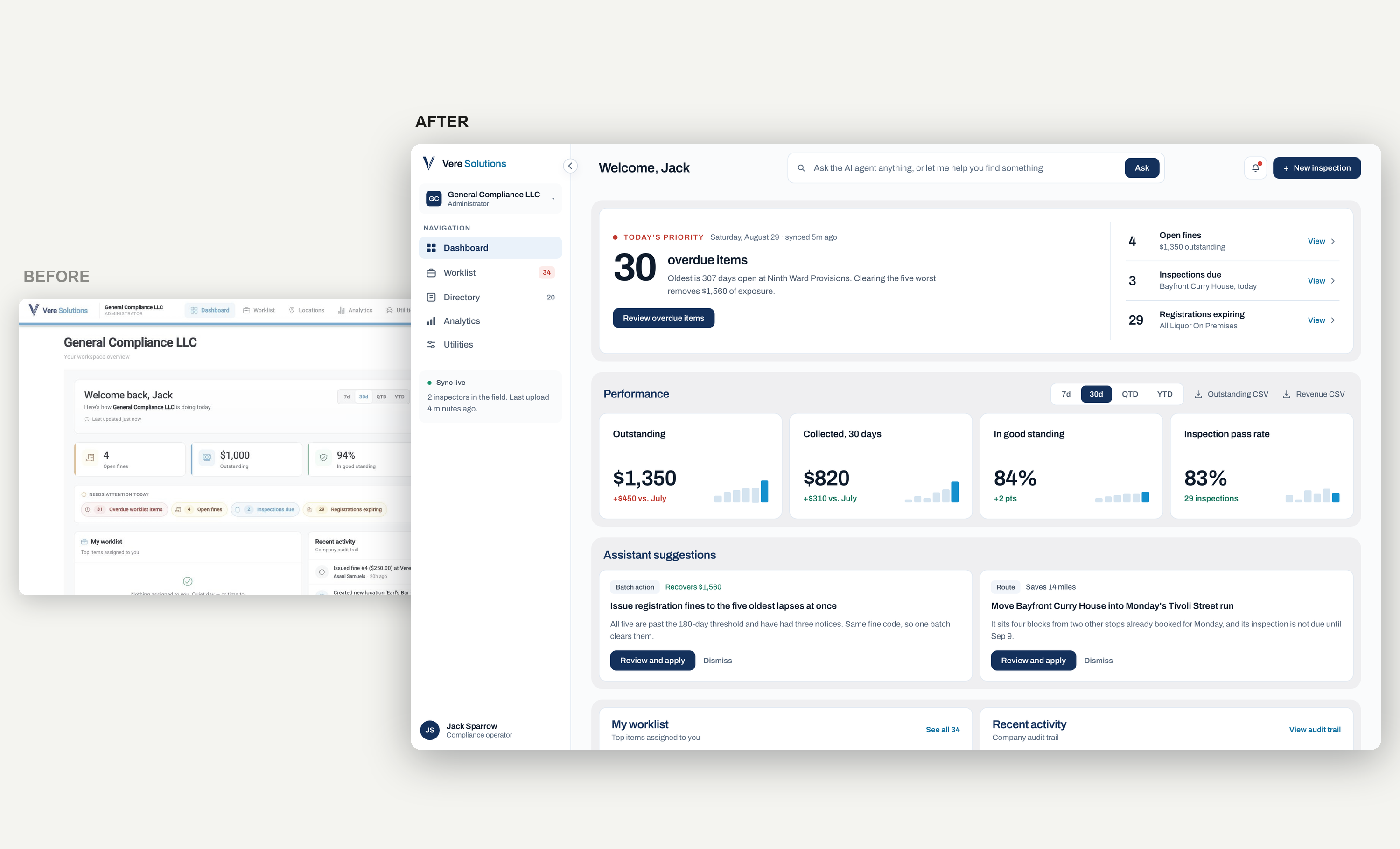
The dashboard said everything three times.
- The same four figures appeared as stat cards, again as attention chips, and again in the panel
- Everything was equally loud, so nothing told you where to start
- It now opens on one sentence, then the performance figures once
Before / After
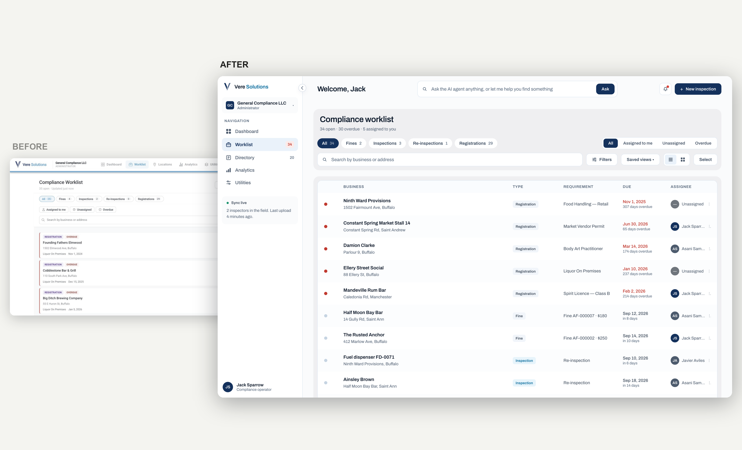
A worklist you can actually work.
- Stacked cards became a table, so 34 open items scan in one pass
- Due dates and assignees sit in fixed columns
- Scope filters became a segmented control that filters, with saved views to return to
Before / After
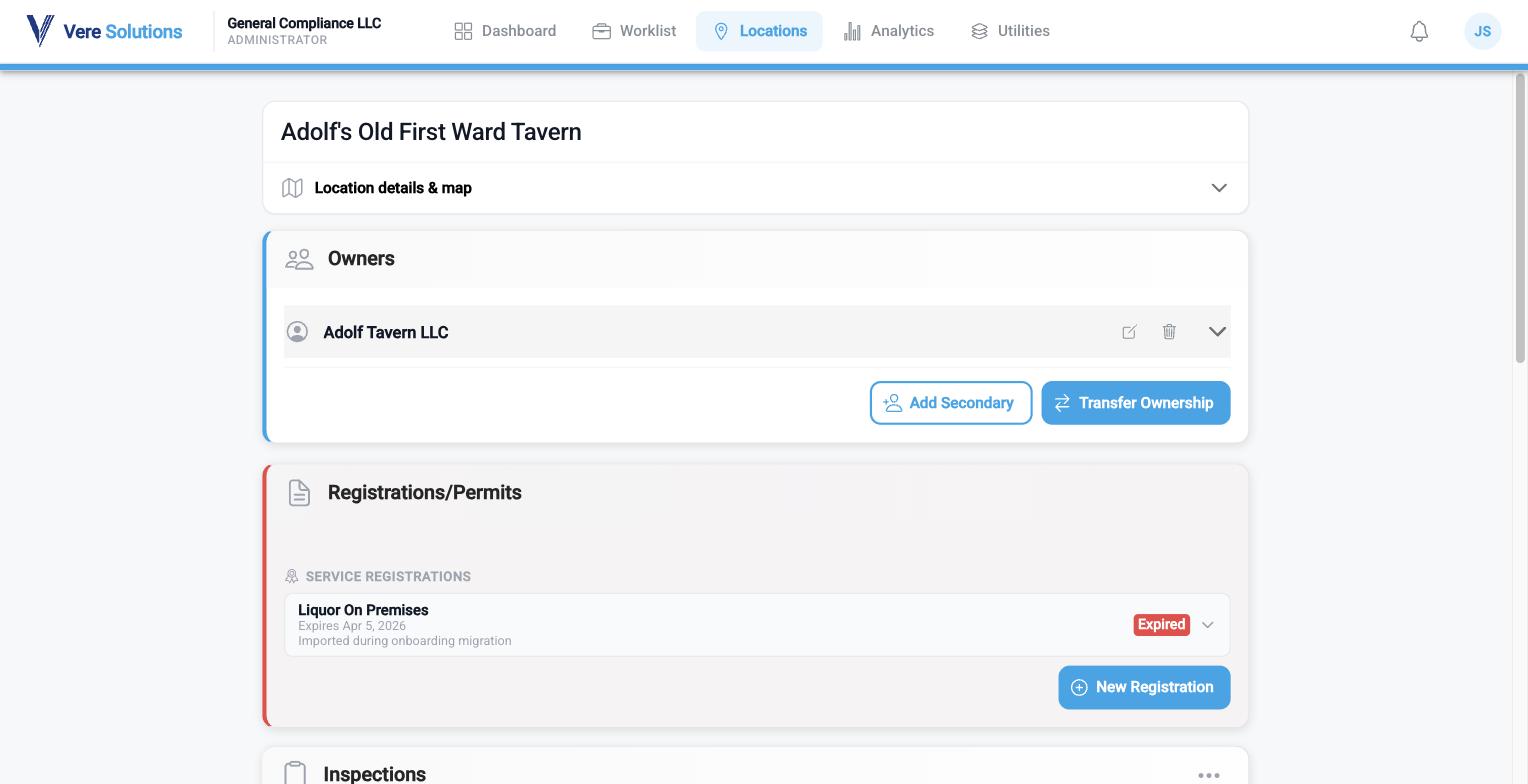
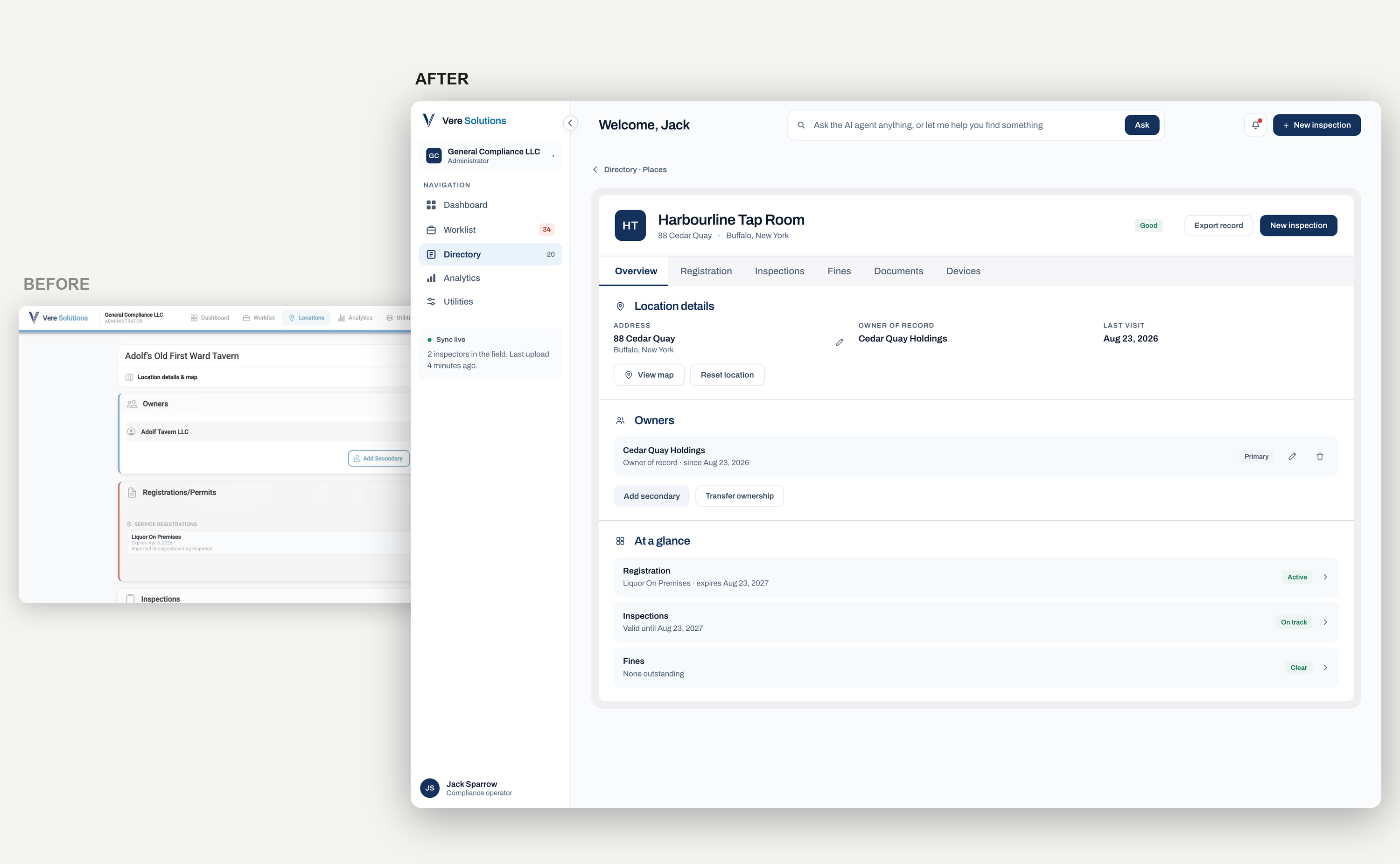
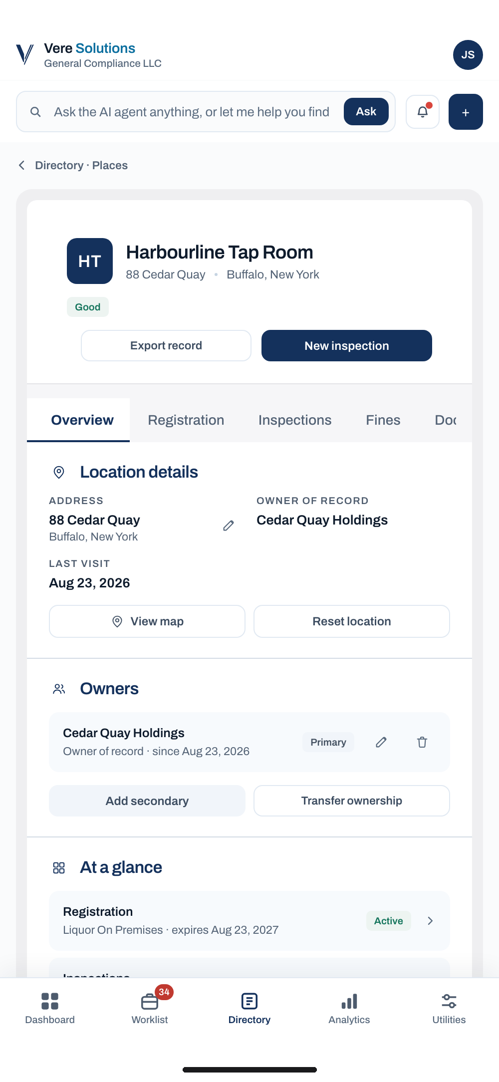
One record, six tabs.
- The founder's main ask, everything about a licensed place used to stack down one long page
- Overview, Registration, Inspections, Fines, Documents and Devices keep it above the fold
- One renderer serves all three tiers, so differences sit in the data, not in three templates
Responsive design
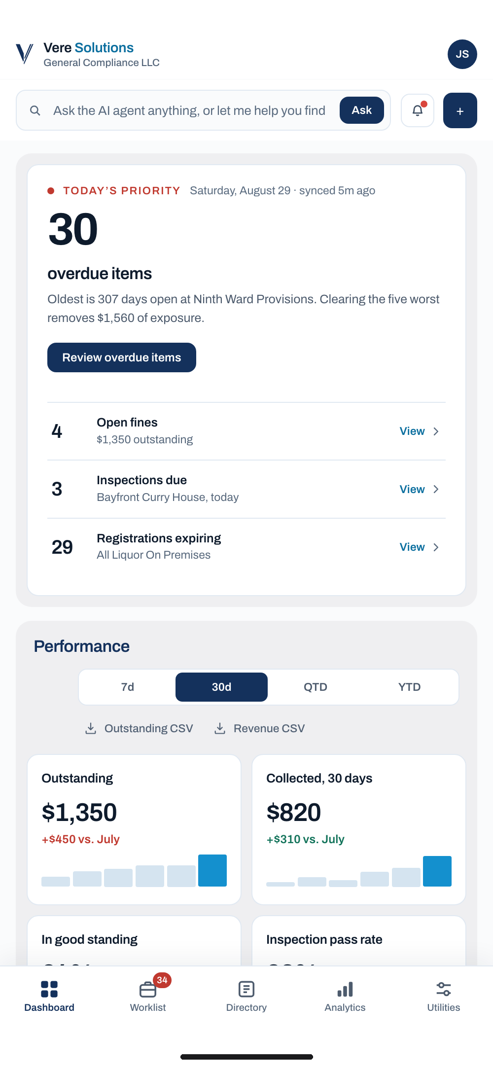
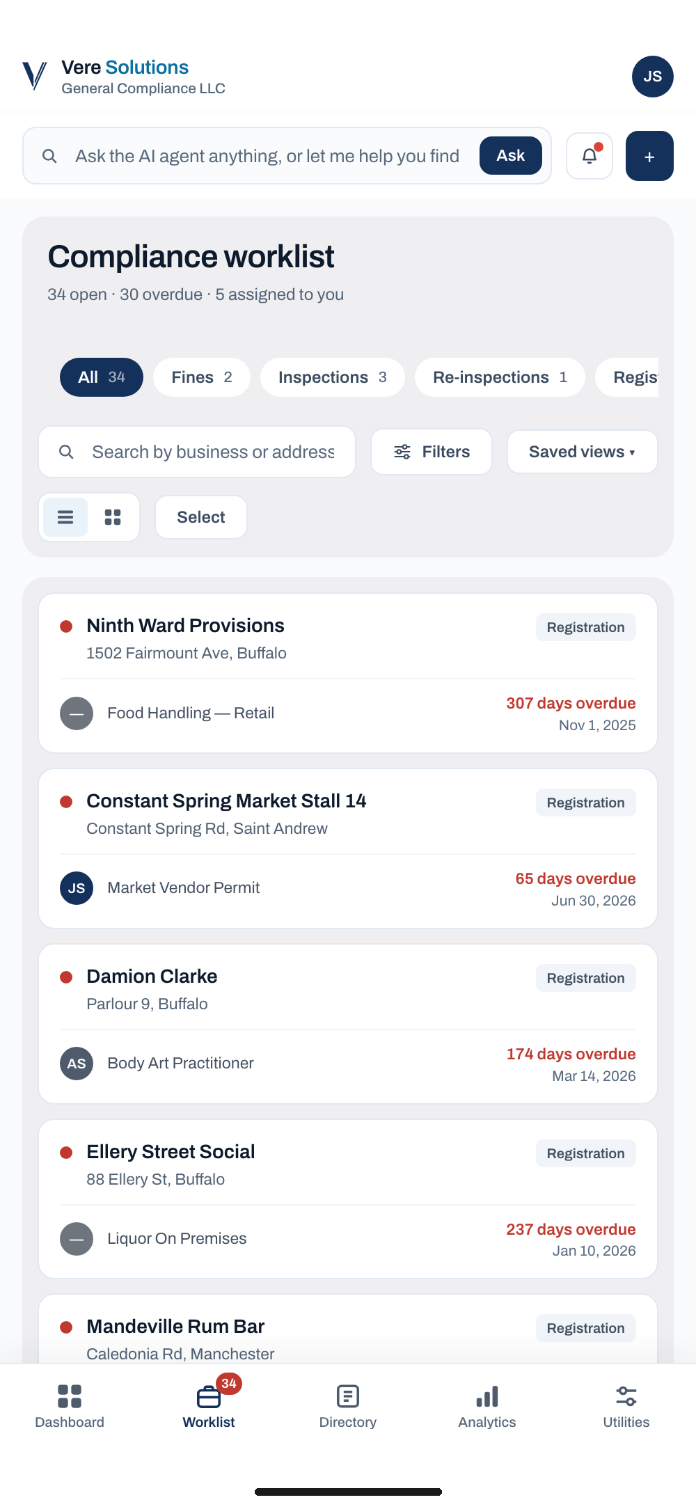
Not a mobile app. The same app.
Inspectors work on site, so the phone is where the product gets used. Nothing is dropped for mobile, it is reordered.
- The sidebar becomes a five item tab bar with safe area insets
- Tables re-render as card lists instead of scrolling sideways
- Drawers become full screen sheets
- Every hover state has a pressed state, since a phone has no hover
Handoff
I hand over HTML, not a redline.
- Built with his tokens and class names, so the engineer lifts the markup instead of rebuilding from a picture
- Every screen is clickable, so he can see the state a control leads to before he writes it
- One file, no build step, no dependency for him to adopt
Live · Prototype
The file the engineer builds from.
Every screen is reachable. All data is invented.
The impact
In build now, on the existing backend, ahead of a pilot presentation to the Jamaican government.
- One record page instead of a page you scroll to the end of
- Places, people and equipment reachable in a single click
- A worklist an inspector can filter, assign and clear
- A desktop build that ships as the iOS and Android app, with no second front end
- Design delivered as buildable HTML in the team's own code language
NEXT PROJECT