Rebrand & Redesign for Beverage Factory
SUMMARY
Beverage Factory is a leader in retail beverage dispensing equipment and storage for residential, commercial, B2B, and third-party retailers. I led the complete rebrand and website redesign,from research and user interviews through logo design, color branding, wireframing, user testing, and final high-fidelity UI. The challenge: update the brand and website but maintain familiarity for loyal customers.
Role
Lead Designer,Logo, Branding, Interviews, Survey, Low-fi & Hi-fi Prototyping
Team
Lead Designer (self), 2 Junior Designers, Software Engineer
Timeline
2020 - 2021
Tools
Illustrator, Photoshop, Adobe XD
The Challenge
Beverage Factory's existing brand and website felt dated. The navigation was cluttered with a sidebar full of categories, the visual design didn't convey the quality of the products, and the checkout experience had friction points causing cart abandonment. The challenge was clear: update the brand and website to feel modern and trustworthy, but maintain enough familiarity so loyal customers wouldn't feel lost.
My Process
Research-driven from start to finish
I followed a structured design process to make sure every decision was backed by data, not assumptions.
- Empathize & Research,Surveys and user interviews to understand our audience
- Prototype,Product roadmap, user flows, and sketches to explore ideas quickly
- Test,Usability testing with real users before committing to development
- Design,High-fidelity screens in Adobe XD, informed by everything we learned
Research & Personas
Understanding who we're designing for
I used data from AIP (Audience Insights Premium) and Google Analytics to develop detailed personas. Our research revealed that roughly 65% of customers were male, mid 30s to mid 50s, married homeowners with a median income of $70K–$90K. These personas played a major role in design and functionality decisions throughout the entire project.
- Holly,45, nurse from New Jersey, married homeowner with income of $90K. Looking to remodel her kitchen and add a home bar. Values luxury look and quality products, enjoys hosting dinner parties
- Craig,55, sales manager from San Diego, married homeowner with college education, income $75K–$100K. Home brew hobbyist who wants quality products at a good price. Still learning and looking for guidance
- Data analytics drove persona development. Not assumptions
- The personas gave inspiration for the new brand colors and overall look of the website
- We reflected back on the personas many times throughout the project, especially during logo, color, and layout decisions
Logo & Brand Redesign
Grounded in color psychology
Based on our user personas (about 65% male, mid 30s to mid 50s), I made deliberate color choices backed by research. Purple is the least desired color by men, so that was out. Blue is seen as trustworthy and dependable,critical for an appliance purchase. Every shade of blue evokes a different emotion: I used dark blue for strength and reliability, accented with light blue which is inviting and friendly. It also attracts more to the male audience. The familiar drop icon from the original logo was maintained but modernized for a cleaner, more contemporary feel.
Website Mapping
Creating the layout and flow
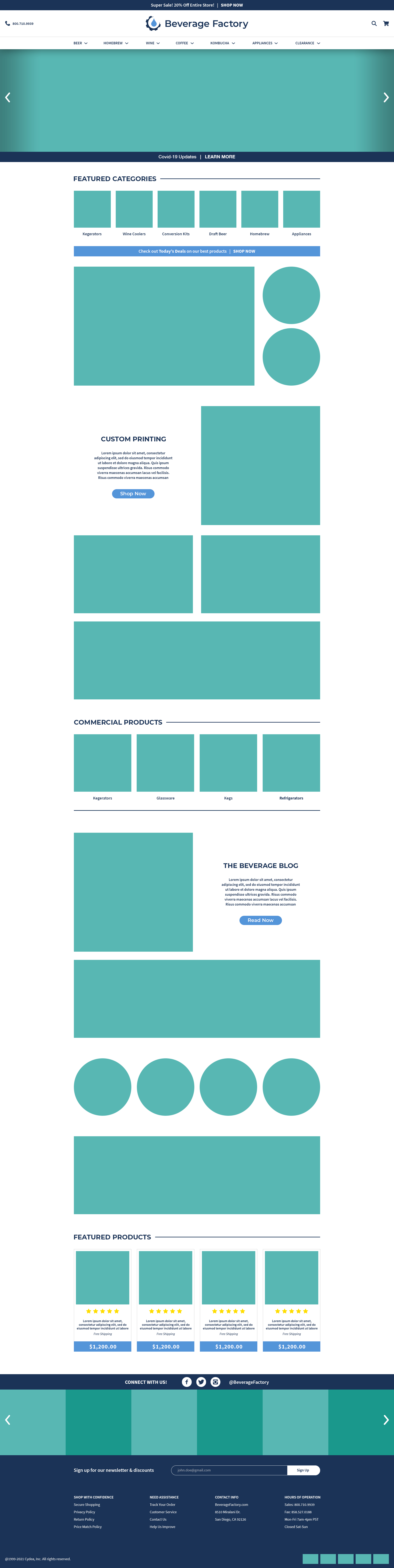
I mapped out the entire site structure, creating homes for categories that were previously buried in the sidebar menu. The goal was to clean up pages, organize categories intuitively, and make it easy for users to find what they need. The navigation was restructured with clear top-level categories,Beer, Wine, Home Brew, Appliances, Coffee, Kombucha, Clearance,with logical subcategories underneath each.
Customer Journey
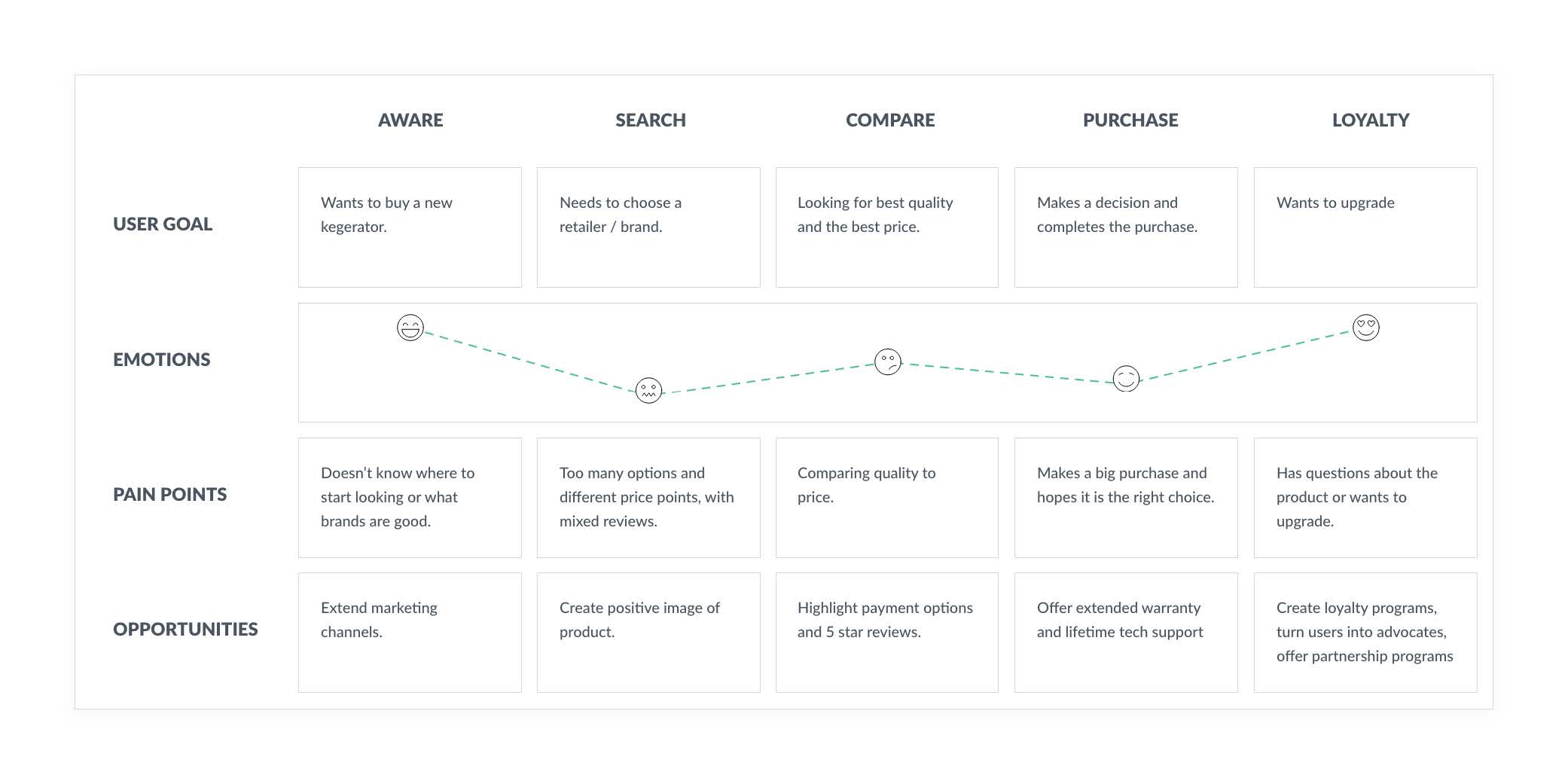
Mapping every touchpoint
I mapped the full customer journey across five stages,Aware, Search, Compare, Purchase, and Loyalty,to identify pain points and opportunities at each step.
- Aware,Users don't know where to start looking or what brands are good. Opportunity: extend marketing channels
- Search,Too many options and different price points with mixed reviews. Opportunity: create positive image of product
- Compare,Difficulty comparing quality to price. Opportunity: highlight payment options and 5-star reviews
- Purchase,Making a big purchase and hoping it's the right choice. Opportunity: offer extended warranty and lifetime tech support
- Loyalty,Has questions about the product or wants to upgrade. Opportunity: create loyalty programs, turn users into advocates, offer partnership programs
Wireframes
Low-fidelity explorations
Low-fidelity wireframes were created first to consider different layout options for the new website design. This let us test structural ideas quickly and get alignment with the team before investing in polished designs. We iterated through several rounds, each time tightening the layout and user flow.
User Testing
Validating before building
Before launching, we tested the new website in-house with interviews and feedback.
- We wanted to test usability and function
- This test was completed after the high-fidelity prototypes were created
- Remote testing was done with employees followed by interviews and receiving feedback
- We received insights in regards to fixing a few design elements and adding/reorganizing certain categories
- We made the updates and repeated the testing process
UI Design
Modern, sophisticated, and built for trust
Once a final layout was decided on, I started creating high-fidelity mockups in Adobe XD. We wanted a modern, sophisticated, clean design with a friendly presence. Based off research and user personas, we developed a design style that would create trust and interest in customers.
Psychological Pricing Techniques
Designing the product grid with intention
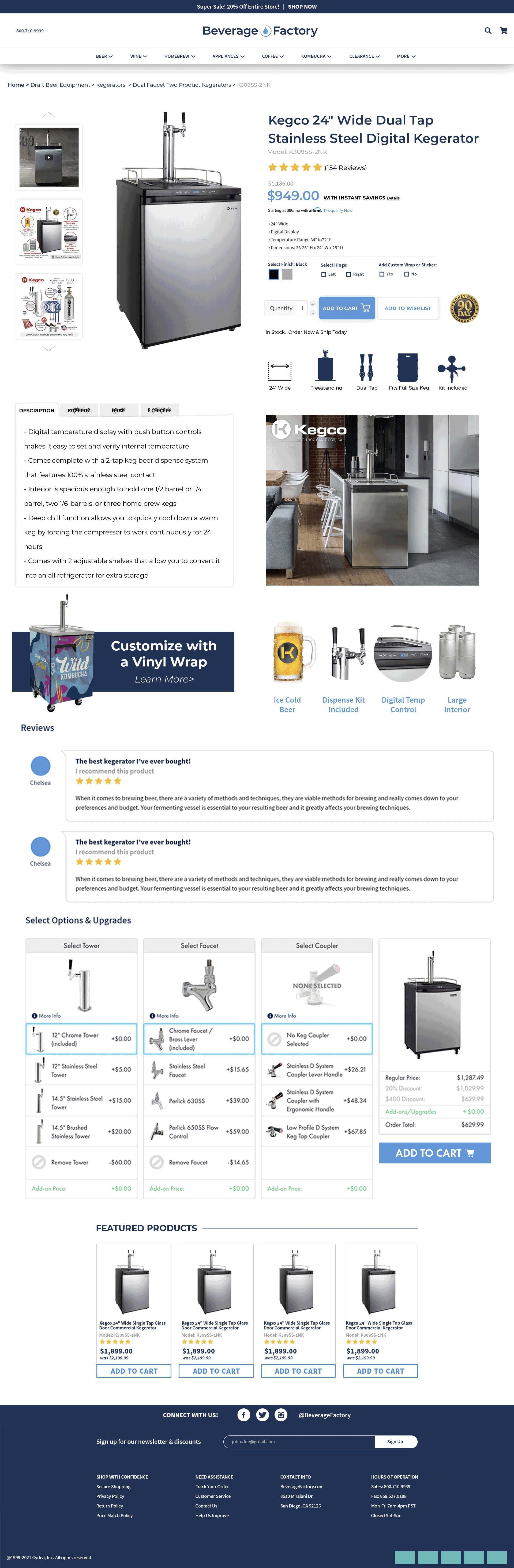
I considered psychological pricing strategies when designing the product grid layout to attract customers. Small visual details in how prices are displayed can have a big impact on purchase decisions.
- Make sales price look visually different from regular price
- Add space between the discounted price and original price
- Place sale price below the original price
- Show savings amount in green to signal a good deal
- Show cents in superscript to make the dollar amount feel smaller
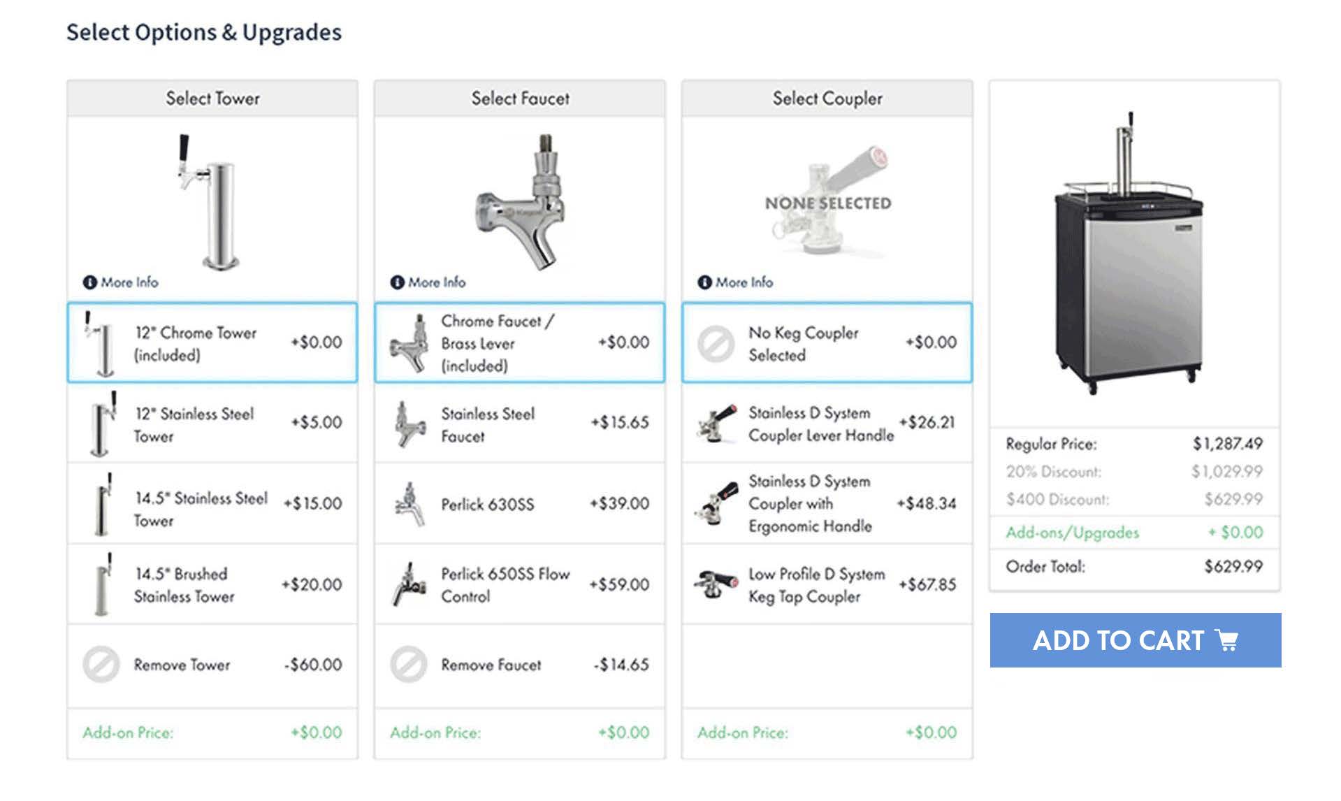
Options & Upgrades
Customizable cards for complex products
Some products offered upgrade and customizable options like tower type, faucet style, and coupler selection. I designed a card-based system where users could see all upgrade options,Select Tower, Select Faucet, Select Coupler,alongside the updated price as they added items. With this feature, users can build a custom product that fits their needs and budget with no surprises at checkout.
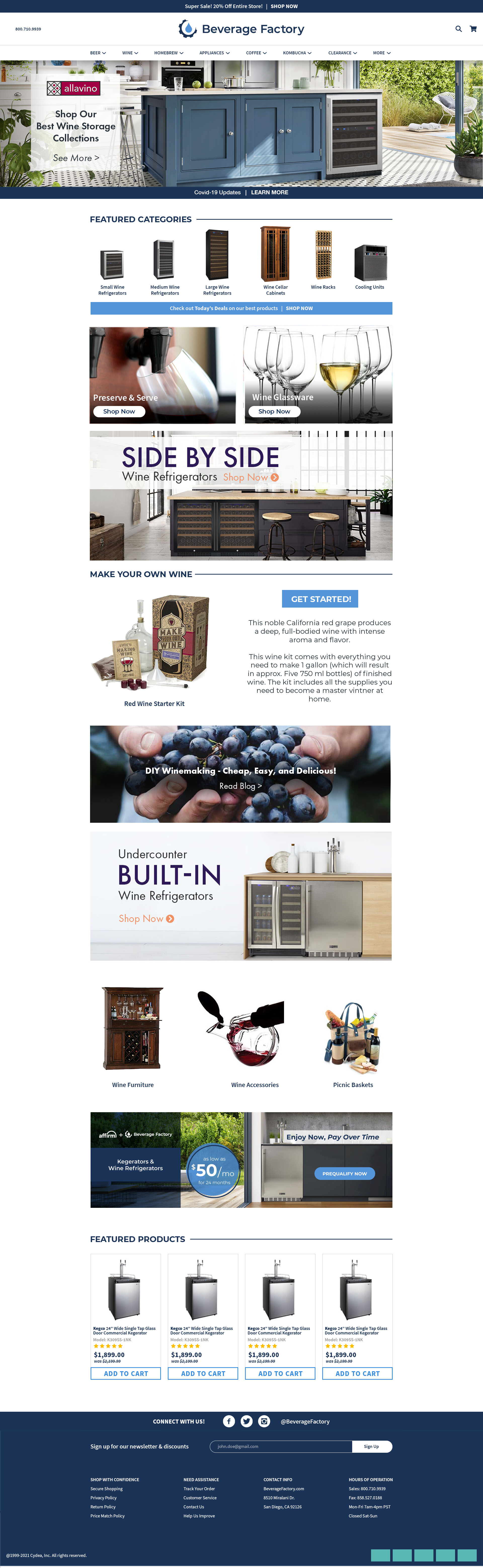
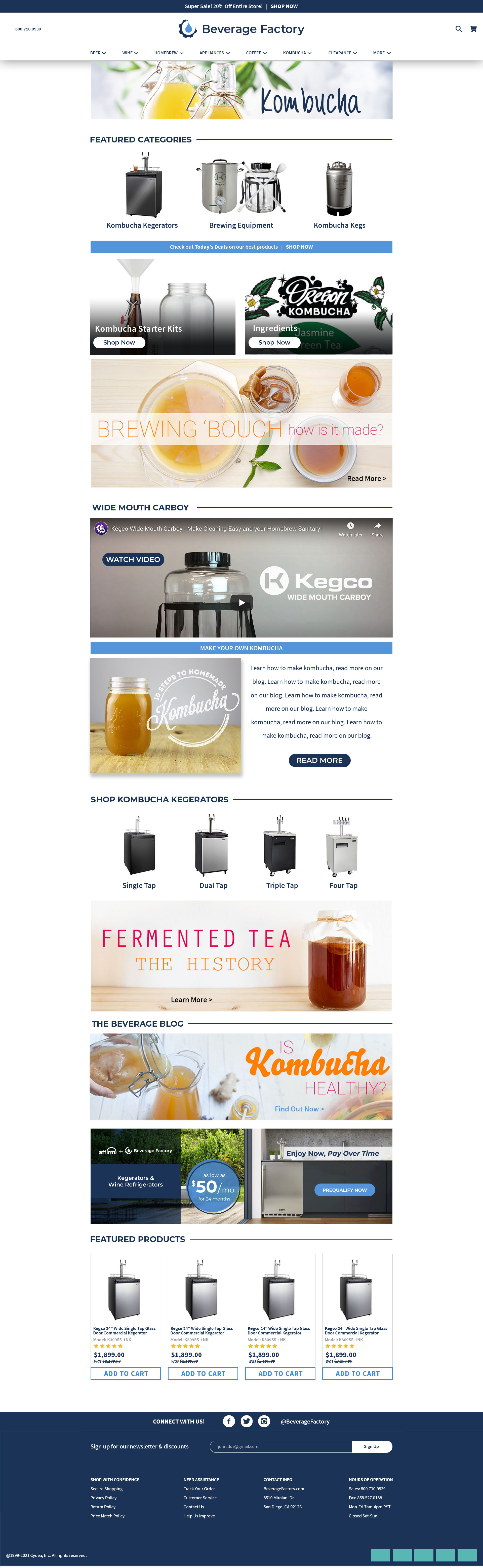
Final Designs
Product page, category page, and homepage
The final high-fidelity designs brought everything together,a clean, modern e-commerce experience that felt trustworthy and easy to navigate across desktop and mobile.
“Looks great, has a nice fresh and modern look”
Stakeholder feedback during review
What I Learned
This project allowed me to lead and manage the design team and processes. As a leader, it's important to keep in mind the pain points of users, managers, engineers, and founders while focusing on the end goal and maintaining functionality and clean design.
- Challenge: With a retailer that offers a variety of products and customizable components, it was a challenge to create one design solution that was adaptable to all products
- Solution: Create cards for customizable components that can be applied to specific products, offering a variety of solutions
- Understanding the psychology of pricing, colors, and CTA button placements was important in this project
- Guiding the user throughout the entire shopping experience is crucial to avoid shopping cart abandonment
- Simple frustrations, surprises, or confusion can cause users to leave,keeping the shopping process fluid was the key factor in this project's success
NEXT PROJECT