Wealth Management Dashboard for New Edge
SUMMARY
New Edge Wealth is a financial advisory platform serving high-net-worth clients and wealth managers. I designed the full dashboard experience from the ground up, five focused product surfaces built for focused advisor work, and fully responsive across desktop and mobile. The challenge was making complex financial data feel clear, actionable, and trustworthy in every context an advisor works in.
Role
Product Designer
Team
1 Product Designer, 2 Product Managers, 4 Engineers
Timeline
2024 - 2025
Tools
Figma, FigJam, Figma Make
Skills Used
Dashboard design, data visualization, financial UX, responsive design, design systems, prototyping
Assets Managed
Product Surfaces
Screens Designed
Responsive
How might we give wealth advisors a single, intuitive dashboard to manage multi-million dollar portfolios, across every device, any time of day, without sacrificing clarity?
Act 01
Listening Before Designing
Three weeks embedded with the people who'd actually use this, advisors, operations leads, and compliance officers across three firms.
Research · Method
A double diamond, four lenses, one question.
Interviews
9 advisors & ops leads
Shadowing
3 half-day sessions
Audit
8 competitor teardown
Diary study
5 days of logged lookups
Co-design
2 workshops with advisors
Research · Mapping
A day in the life, mapped end to end.
Morning Scan
Client Prep
Client Meeting
Rebalance
Report Out
EOD Review
Time
5 min
30 min
60 min
15 min
10 min
5 min
User Actions
Front Stage
Back Stage
Support Process
The user at the center
Designed for Marcus.
Primary persona
Marcus Reeves
Senior Wealth Advisor·Chicago, IL · Mid-size RIA
“I do half my client prep on my phone at 10pm the night before a meeting. Don't pretend I'm always at my desk.”
Experience
HNW Households
AUM
Framing · Principles
Four principles guided every decision.
Clarity over density.
Advisors wanted more data, not less. Every number earns its place through hierarchy, one headline, context, then detail on demand.
Designed for the long session.
Ten-hour days are the norm. Deep navy surfaces, restrained color, and precise contrast built for focused work, not dashboard aesthetics.
Designed for 47%.
If nearly half of lookups happen on mobile, mobile isn't adapted-down desktop. It's a distinct product with its own IA, nav, and density rules.
Precision as trust.
Financial data lives or dies on precision. Every pixel, rounded numbers, ambiguous color, blurred edges, costs or earns credibility.
Ideation · Wireframes
From low-fi flows to the full dashboard.
Primary
Advisor Flow
Frame 01 · Overview
Frame 02 · Clients
Frame 03 · Portfolio
Frame 04 · Allocation
Track
and Deliver
Frame 05 · Cash Flow
Frame 06 · Reports
Frame 07 · Client detail
Act 04
A System Before the Screens
Before polishing ten screens, I built the system they'd be assembled from. Every color, type ramp, spacing unit, and component is documented in Figma as the design source of truth, then mirrored in a live, coded Storybook so engineering builds from the exact same parts.
One source of truth, two surfaces
Design System
Buttons, inputs, cards, data tables, and chart primitives each have documented states, dark-mode variants, and accessibility notes. The payoff is a shared language: when I say *'primary button, disabled, dark'*, design and code mean exactly the same thing, which is what kept ten dense screens consistent.
Live · Storybook
The component library, running in your browser.
Browse the real Storybook — open any component, flip through its states, and see the tokens and docs behind it.
Explore the design system
Open the full system, components, tokens, and documentation, in Figma or browse the coded library in Storybook.
Act 05
Designing the Platform
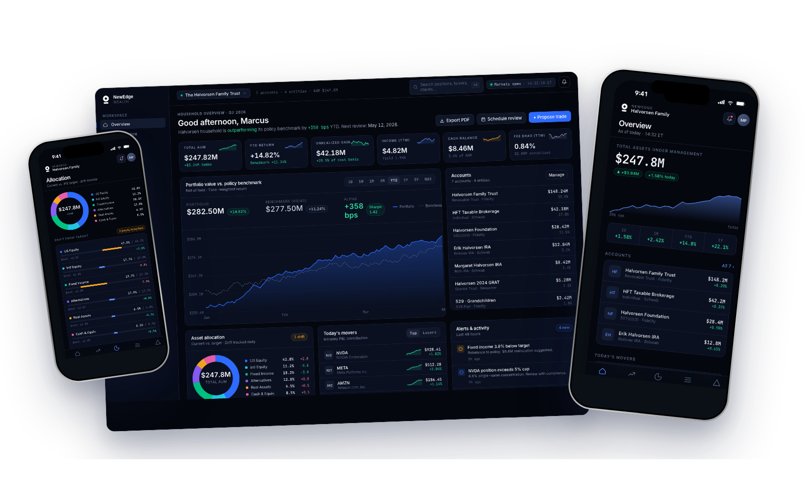
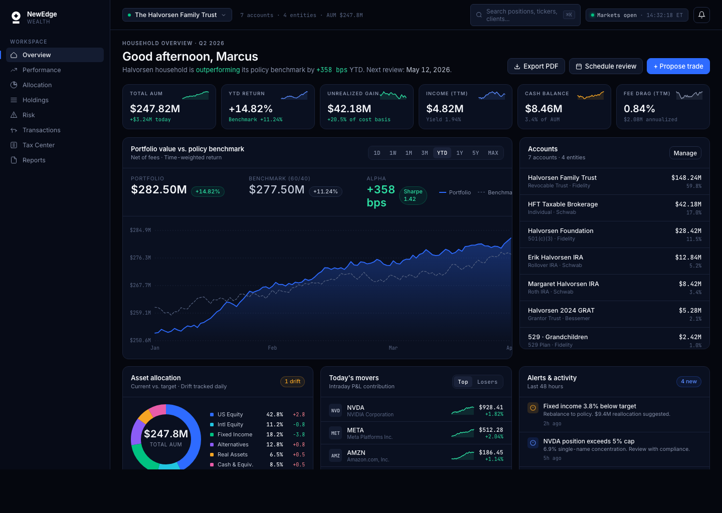
What shipped is five focused product surfaces, each with a desktop workstation and an iPhone companion. Below: every screen, the decision behind it, and how the advisor flow holds together across devices.
Overview
30 seconds to household health
The advisor's home base. A greeting, a household-level headline (is this portfolio outperforming its policy benchmark, and by how much?), and six stat cards, Total AUM, YTD Return, Unrealized Gain, Income TTM, Cash Balance, Fee Drag, that answer the 'is everything OK?' question without scrolling. Below: a time-weighted portfolio-vs-benchmark chart with alpha in basis points, and a live accounts list across every custodian. Every advisor interviewed said they wanted to assess a client's state in under 30 seconds. This layout does it in under ten.
KEY DESIGN DECISION
The headline is a sentence, not a number: *'Halvorsen household is outperforming its policy benchmark by +358 bps YTD.'* Raw numbers make advisors compute the story. Language delivers it. The dashboard answers the question before the advisor has to ask it.
Performance & Attribution
Not just *what* returned, but *why*
Advisors don't just report returns, they explain them. This surface plots growth of $1 against a configurable benchmark (MSCI ACWI, 60/40, custom), with every period return broken out by contribution and selection effect. Risk-adjusted metrics sit to the right, Sharpe, Sortino, Alpha, Beta, Max Drawdown, Volatility, Information Ratio, so an advisor can pull the full story in one glance. Sector attribution and contributor/detractor ranking anchor the bottom: which three positions earned the quarter, which three cost it.
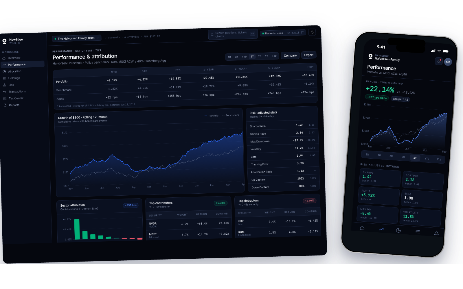
WHY A SOLID LINE VS A DASHED ONE
The portfolio line is a filled gradient; the benchmark is a dashed line. One visual weight rule carries the full meaning, *the solid thing is yours, the dashed thing is the market.* Advisors read the shape of the gap instinctively, without a legend lookup.
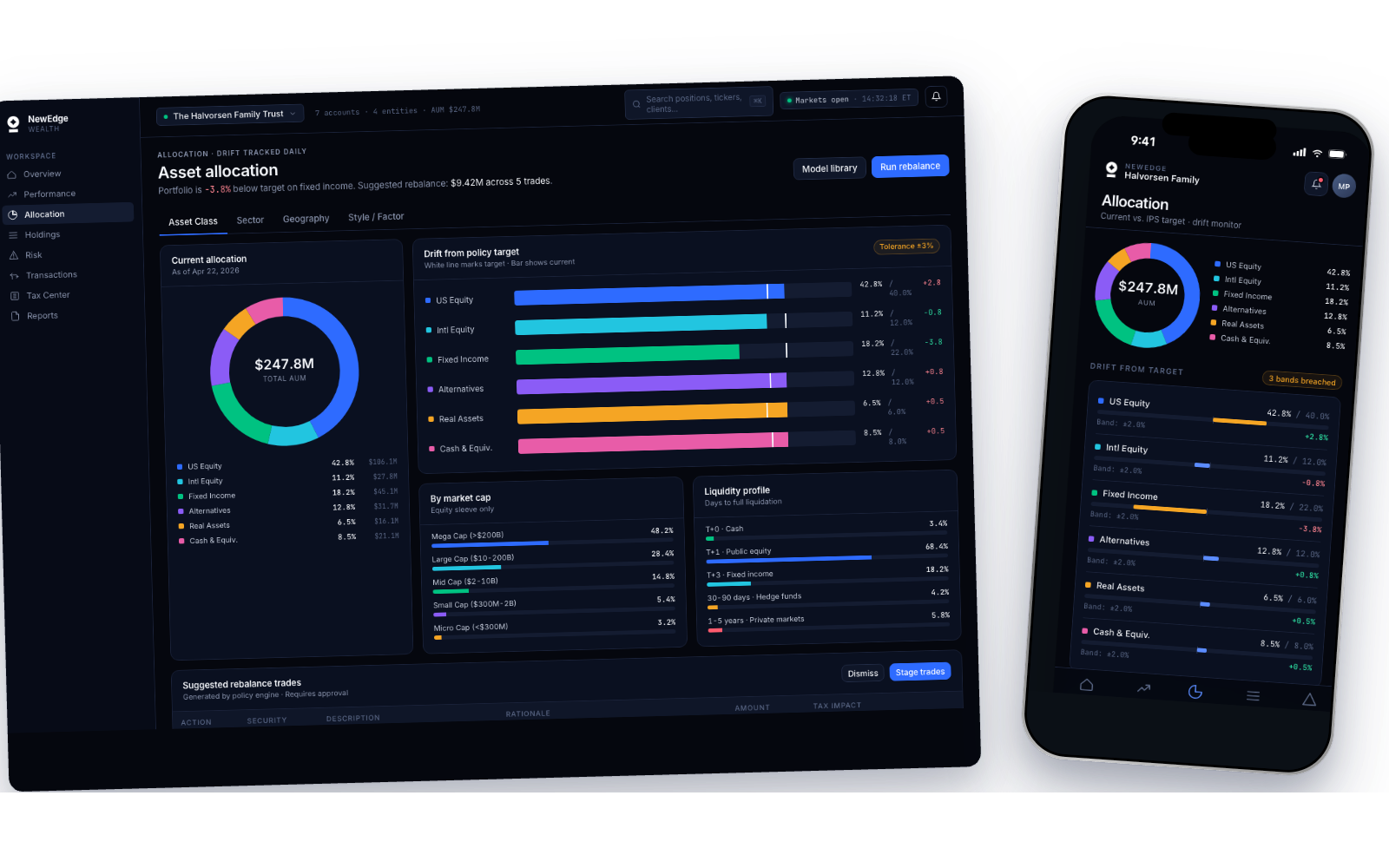
Allocation & Drift
Current vs target, tracked daily
A dual-lens view of asset allocation. The donut answers *what do I own right now?*; the drift bars answer *how far off policy am I, and where?*. White tick marks on each bar show the IPS target; the filled bar shows current position, and color shifts to amber when drift exceeds the tolerance band. The header surfaces the portfolio's most breached sleeve (*'Fixed Income is -3.8% below target'*) and a concrete next step (*'Suggested rebalance: $9.42M across 5 trades'*). Tabs drill into Sector, Geography, and Style/Factor views without leaving the page.
Holdings
Density, without the spreadsheet tax
The screen that replaced Excel. 81 positions across equities, fixed income, alternatives, and real assets, every row showing ticker, sector, value, weight, cost basis, day-move, YTD, and drift. Click any row and the right-side panel slides in: position sparkline, full cost-basis breakdown, tax lots, recent buys and sells. Search and sticky asset-class filters live at the top, so the table narrows as fast as the advisor can think.
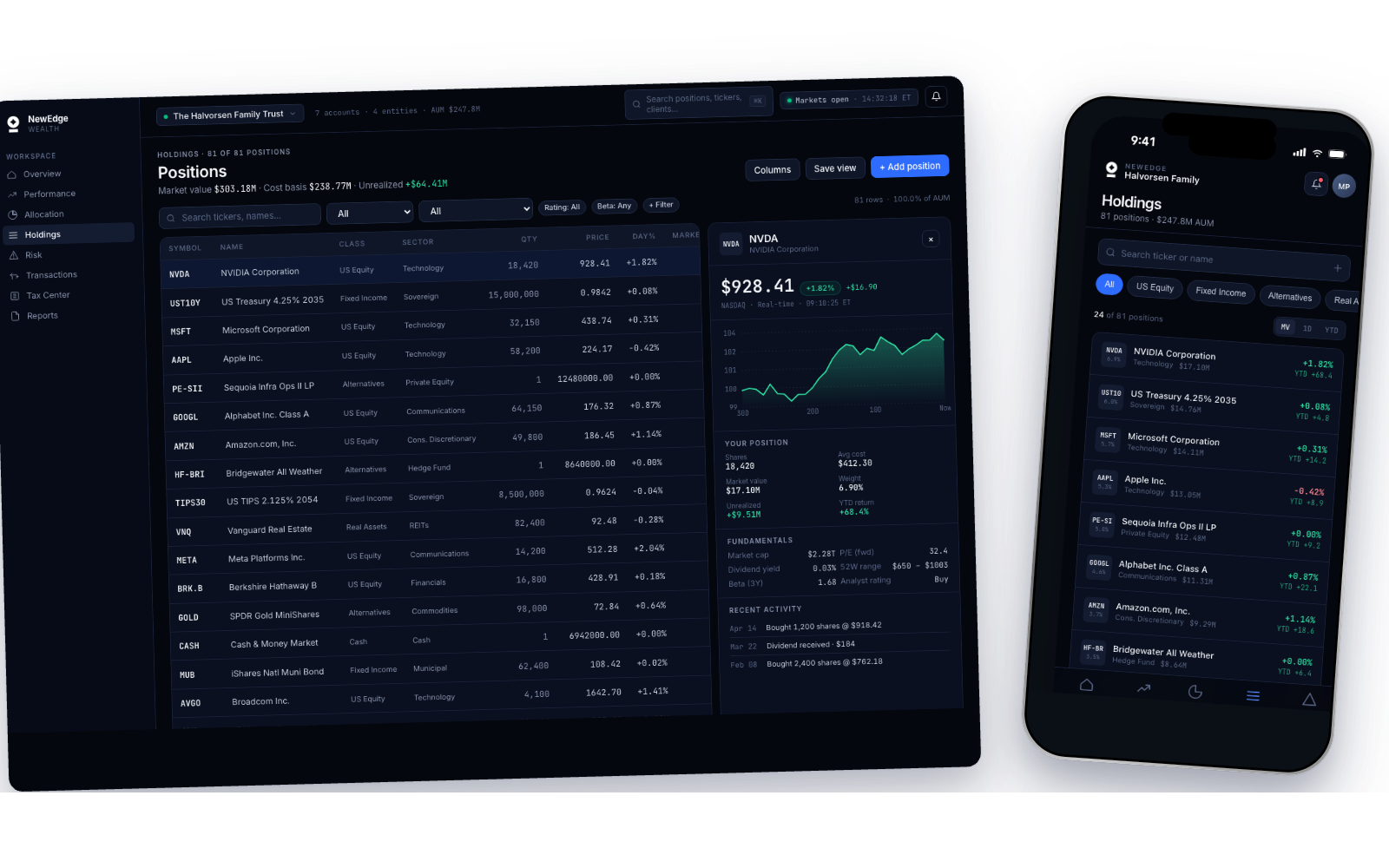
WHY THE TABLE FEELS QUIET
Dense tables fail when every cell screams. Here, only the numbers that matter for the current task have full weight, everything else drops to a secondary text color. Advisors scan 80+ rows in seconds because the typography does the filtering, not their eyes.
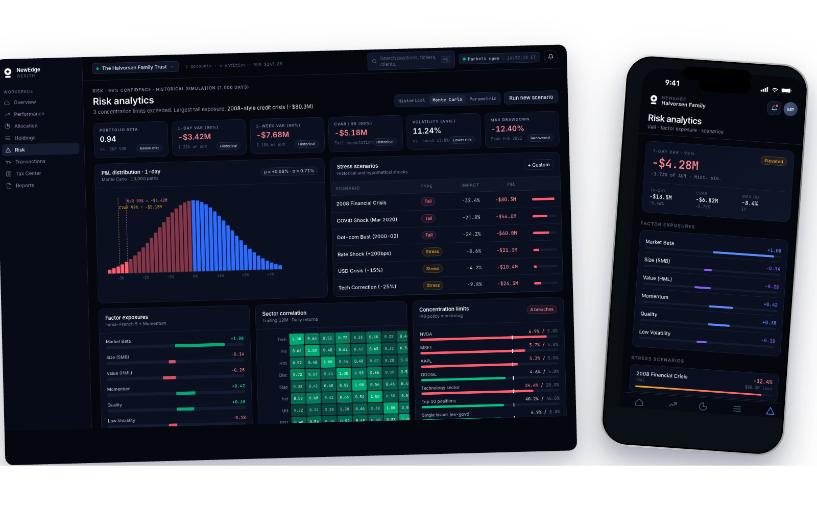
Risk Analytics
VaR, factor exposure, scenario testing
The surface advisors pull up when a client asks *'what happens if things go bad?'*. 1-day 95% VaR and CVaR sit front and center, with the P&L distribution (1,000 Monte Carlo iterations) rendered as a histogram, losses shaded red, gains green, the VaR line marked explicitly. Factor exposures (Market Beta, Size, Value, Momentum, Quality, Low Volatility) show how the portfolio is tilted. Stress scenarios replay 2008, COVID, 2022 rate shock, and dot-com crash against the current book, so an advisor can answer the bad-year question with numbers, not a shrug.
Act 06
Reflections
Reflections
What I Learned
RESEARCH IS THE DESIGN
The three concepts I killed weren't wasted, they were the research. You can't reject 'the spreadsheet grid' until you've designed it and watched a real advisor struggle with it.
DESIGN FOR ACTUAL CONTEXT
The 47% mobile stat rewrote my entire plan. If I'd designed desktop-first and adapted down, which is the default instinct, I would have shipped a product that failed half its users half the time.
DARK MODE IS UX, NOT AESTHETIC
In a professional tool used for ten hours a day, dark mode isn't a stylistic choice, it's a workflow choice. Deep navy surfaces, restrained color, and tight contrast discipline aren't what the product *looks* like, they're how it *performs* in the sessions that matter.
TRUST IS VISUAL
The single biggest lesson: in a tool where people bet their clients' retirement, every pixel reinforces or erodes trust. Rounded numbers, blurred edges, or ambiguous color, all of it costs you. Precision in visuals is precision in promise.
NEXT PROJECT