Brand & Product Design for Laurentum
SUMMARY
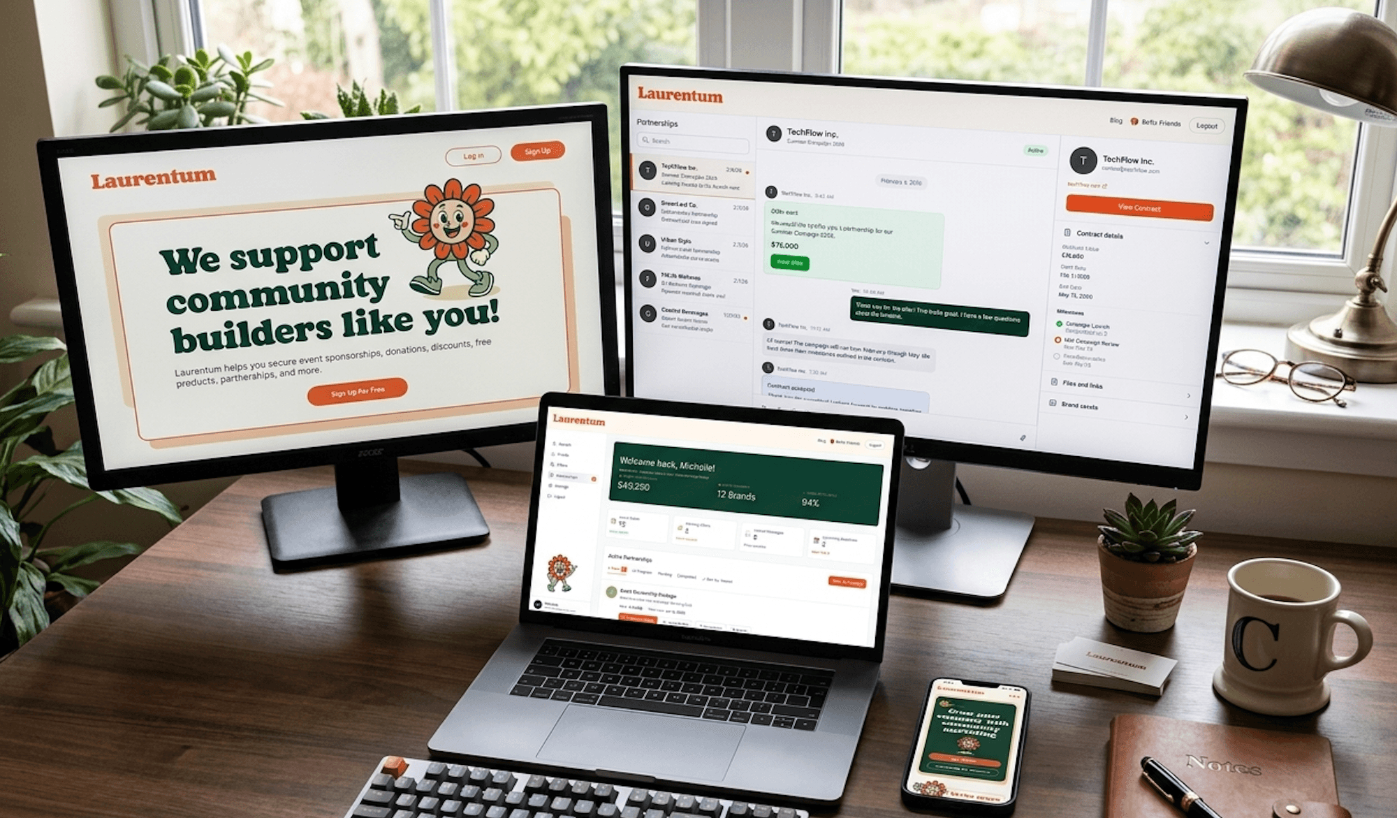
Laurentum is a community marketing platform that helps companies grow through authentic community engagement. As the sole designer, I built everything from the ground up: brand identity, a multi-page marketing website, a full-featured brand and organization dashboard, and a comprehensive design system with 100+ components. This project spanned branding, web design, product design, and systems design across months of work.
Role
Sole Product Designer
Team
Sole Designer, working with Founders and Engineering
Timeline
2023 - 2024
Tools
Figma, FigJam, Illustrator
0
Screens designed end-to-end
0
Design system components
0
Dashboard platforms (Brand + Org)
0
Designer, full ownership
The Challenge
Laurentum was an early-stage startup with a vision but no visual identity, no website, and no product design. They needed everything: a brand that communicated trust and community, a marketing site that converted visitors into customers, and a dashboard platform where brands and organizations could manage their community marketing efforts. All of it needed to feel cohesive, professional, and scalable.
My Process
From zero to a complete product ecosystem
I approached this project in four phases, each building on the last. First, I established the brand identity and visual language. Then I designed the marketing website to attract and convert users. Next came the complex dashboard platform for both brands and organizations. Finally, I documented everything in a comprehensive design system for the engineering team.
- Phase 1: Brand identity, logo, color system, typography
- Phase 2: Multi-page marketing website (desktop + mobile)
- Phase 3: Brand Dashboard + Organization Dashboard (30+ screens)
- Phase 4: Design system with 100+ reusable components
Brand Identity
Building trust through warmth and authenticity
I developed a complete brand identity system grounded in warmth and approachability. The color palette centers on deep forest green (#0b3f30) for trust and authority, accented with warm cream (#fff9f1) and burnt orange (#ed572b) tones that feel inviting and human. The typography uses Poppins for its friendly yet professional character. A custom sunflower mascot character was created to give the brand a memorable, playful personality while reinforcing the community-first message.
Color System
The palette was intentionally chosen to feel different from the typical cold SaaS blue. Deep greens communicate growth and trust. Warm creams and oranges create an approachable, human feel. The system includes primary, secondary, neutral, and semantic colors (success, warning, error) all calibrated to work together across web, dashboard, and marketing materials.
- Primary: Deep forest green (#0b3f30) for trust and authority
- Secondary: Burnt orange (#ed572b) for energy and action (CTAs, highlights)
- Neutral: Warm cream (#fff9f1) and soft grey (#e9e9e9) for backgrounds
- Semantic: Green for success, amber for warning, red for error states
- Dark accents: Rich charcoal (#4f5052) for text and borders
Design System
Documented in Figma, shipped as a live Storybook
Before building 30+ product screens, I set down the system they'd be made from. Not just a UI kit, a complete system with documented patterns, spacing scales, and interaction states, designed in Figma as the source of truth and mirrored in a live, coded Storybook so design and engineering build from the exact same parts.
Live · Storybook
The component library, running in your browser.
Browse the real Storybook — colour, typography, and the Button and Text Field components with every documented state.
Explore the design system
Open the full system, components, tokens, and documentation, in Figma or browse the coded library in Storybook.
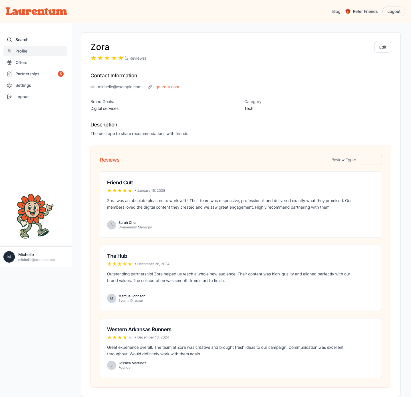
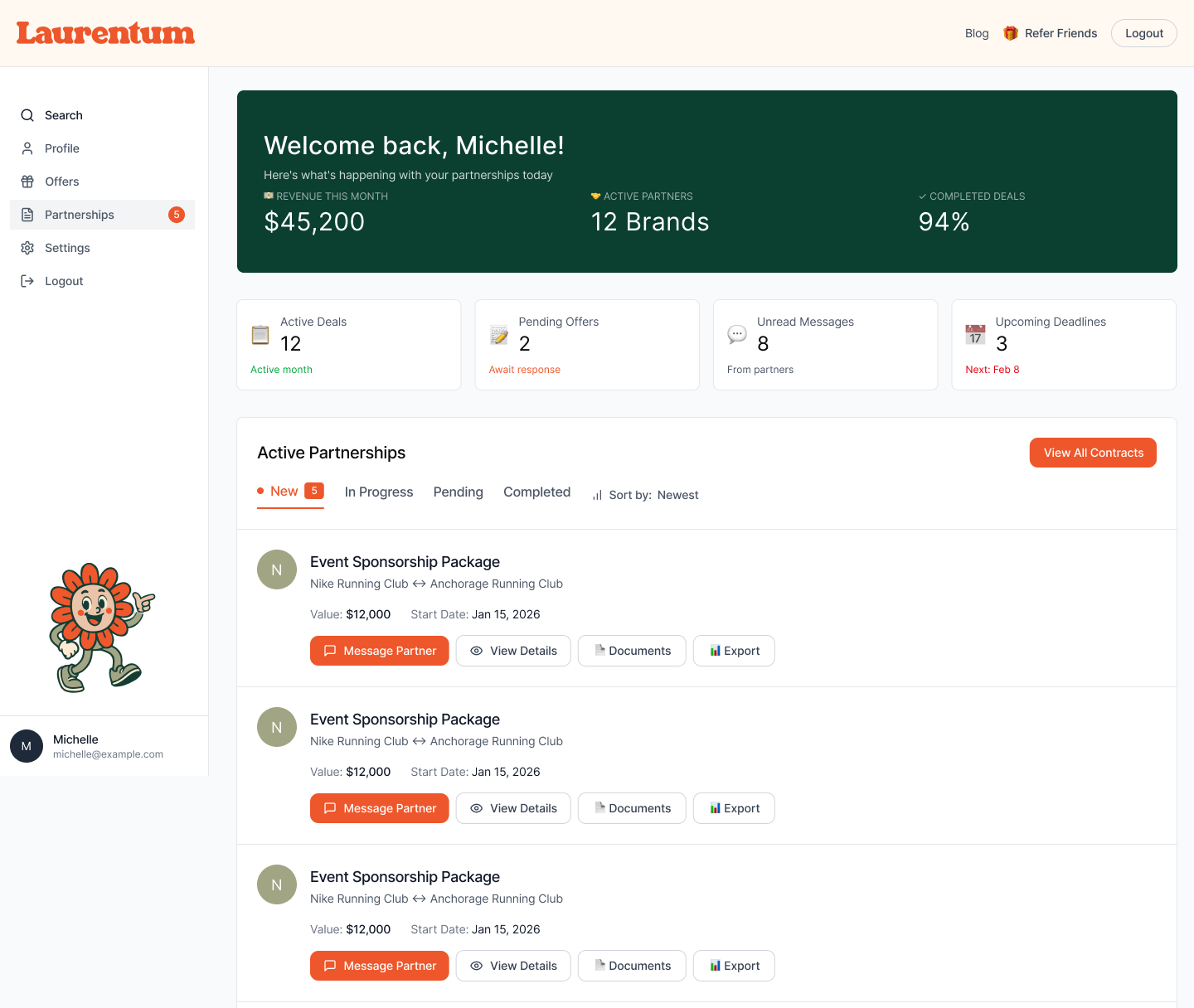
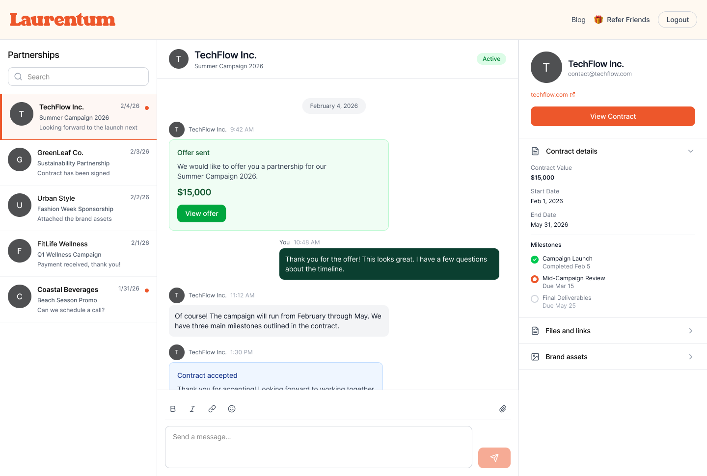
Dashboard Platform
Where brands manage their community marketing
The dashboard was the most complex part of the project. I designed two distinct experiences: a Brand Dashboard where companies manage their community campaigns, offers, events, and analytics, and an Organization Dashboard for managing partnerships and community growth. This was the core product, 30+ screens designed end-to-end.
Offer Creation Flow
Designing for complex inputs
Creating an offer involves multiple steps and form fields. I designed a scrollable creation flow that breaks complexity into manageable sections, keeping users oriented with clear labels and progressive disclosure.
User Onboarding
Making first impressions count
The onboarding flow was designed as a two-step process. Users first choose their role (Brand or Organization), then fill in their company details. The flow uses large, friendly cards with the mascot illustrations and a clear progress indicator at the top. The design keeps friction low while collecting the information needed to personalize the dashboard experience.
Marketing Website
Converting visitors into believers
The marketing site was designed to tell Laurentum's story clearly and drive signups. I created a full-page experience with a bold hero section, a breakdown of partnership types, social proof with 1,800+ organizations and 2 million+ members, and a clear step-by-step 'How It Works' flow.

Key Design Decisions
Several intentional design decisions shaped the final product:
- Warm green + orange palette over typical SaaS blue to differentiate and feel more human
- Custom sunflower mascot character to make a B2B platform feel approachable and memorable
- Sidebar navigation for the dashboard to maximize content area for data-heavy screens
- Card-based campaign management with clear status indicators for at-a-glance scanning
- Progressive disclosure: showing complexity only when users need it
- Mobile-first marketing site, desktop-first dashboard (matching real usage patterns)
- Two-step onboarding that personalizes the experience from the first interaction
Mobile Experience
The marketing website was designed mobile-first, with a fully responsive layout that maintains the same visual impact on smaller screens. The hero section, partnership cards, organization grid, and 'How It Works' flow all adapt gracefully. The mobile navigation uses a hamburger menu, and CTAs are sized for thumb-friendly tapping. The dashboard was designed desktop-first since usage data showed brands primarily manage campaigns from their computers.
“Michelle took our vision and turned it into something we're genuinely proud of. The brand feels like us, and the dashboard actually makes sense for our users.”
Laurentum Co-founder
Results & Impact
I delivered a complete, cohesive brand and product experience from zero. The founders had a professional brand identity, a marketing site ready to drive signups, a full dashboard platform ready for development, and a design system that would scale with the product. The scope of this project, from logo to design system to complex dashboard flows, demonstrated the range of what a single dedicated designer can own and deliver.
What I Learned
Laurentum reinforced that the best products come from understanding the whole picture, not just individual screens. Designing the brand, the marketing site, and the product dashboard together meant every piece informed the others. The design system became the connective tissue that tied it all together. Working as the sole designer also taught me to be disciplined about prioritization: when you own everything, you have to be strategic about where to go deep and where to keep things simple.