← Back

Founded, designed and built for Zora

0 to 1Consumer Mobile OnboardingUser Testing iOSAI-native build

Summary

Zora is a social discovery app built around guides from people you actually know. I started it because the best recommendations kept dying in text threads. I designed it, built it solo with Claude Code, tested it on real people, and changed what it was about twice. Live at go-zora.com and wrapped for iOS in TestFlight.
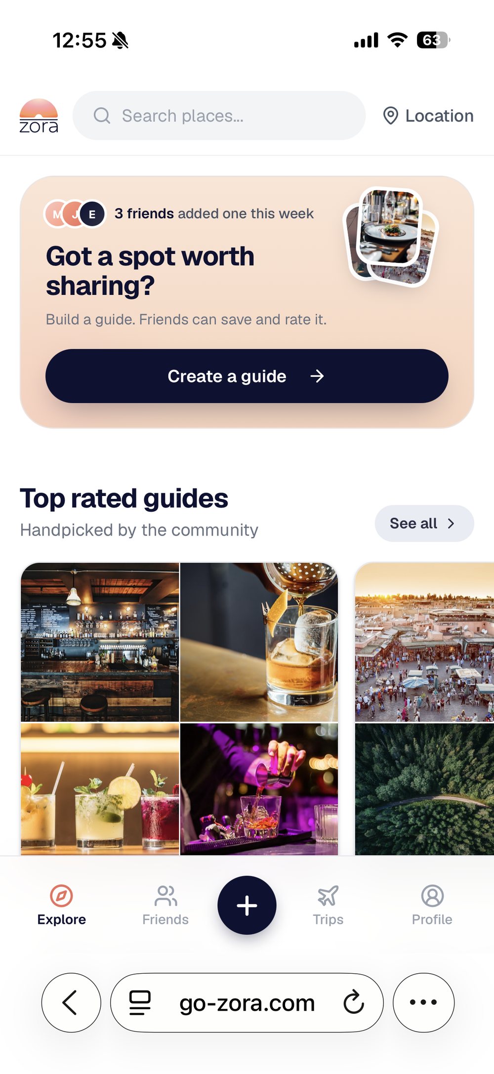
Zora home screen

↑ Live. Interact with the real app.

Role

Founder, designer, developer

Team

Solo

Timeline

2025 to 2026

Tools

Figma, Claude Code, Next.js, Supabase, Capacitor

Skills used

Product strategy, user testing, information architecture, mobile-first design, onboarding and activation, front-end development, native app packaging

Part 01

Discovery

Got any recs for Mexico City? Send me that list you made! Where should I eat in Tokyo?

Discovery

How people share recommendations today.

Before designing anything I looked at what people already do when someone asks them where to go. Three patterns, all of them workarounds.

The shared pain point: the person who knows does the work repeatedly, and the person who asked ends up with something they cannot act on, cannot search, and cannot pass on.

First version, explore screen

First build, explore

First build

Search-led IA, single content source.

  • Search occupied the primary positionQuery entry above the fold. Guide discovery pushed below it.
  • Thumbnail-scale imageryFour small tiles per guide card. Places carried no visual weight.
  • Five-tab barExplore, Friends, Trips, My Lists, Profile. Guide creation nested two levels down.
  • One content sourceFirst-degree connections only. Empty state on install.

Product principles

Four things, all non negotiable.

01

Create a guide in minutes

If it took longer than sending a text, nobody would do it. The whole product depended on people being willing to make one.

02

Share it like anything else social

To one friend, to a group, to a story. The guide had to move through the channels people already use.

03

Your circle first

Top rated matters, but the feed leads with what your people saved. Strangers second.

04

Rating and saving as trust signals

Ratings turn a personal list into a guide worth using. Saves turn a guide into a trip.

Part 02

The content supply problem

What testing found

Assumption

Users supply the content

Each new account brings guides from its own circle.

Not supported. Participants opened the app to read, not to publish.

Consequence

Cold start with no inventory

First-degree supply only. New accounts landed on an empty feed.

Retention risk at first session, before any value is delivered.

Decision

Widen supply, keep the trust signal.

  • KeptFirst-degree guides remain the core object and the reason to return.
  • Added second-degreeWhat friends of friends save and rate.
  • Added popular and editorialTop rated guides and hand-built city guides, so first session is never empty.
  • Ratings as attributionEvery guide shows a star average and which of your friends rated it.
Top rated guides

Top rated, seeded so the feed is never empty

The premise did not change. A recommendation still arrives with a name attached. The rating layer carries that attribution to content sourced outside a user's own circle.

Interface changes

Guide card promoted to primary object.

Before
Before
After
After
  • Create moved to the landing surfaceFrom a nested tab to a persistent prompt at the top of Explore.
  • Imagery scaled upThumbnail grid replaced with full-width photography on the guide card.
  • Place cards reduced, map expandedArea browsing became a primary discovery path.
  • Rating affordance on every cardStar average, count, and an inline rate action.
  • Five tabs to four plus a create actionExplore, Friends, create, Trips, Profile.

Discovery paths added

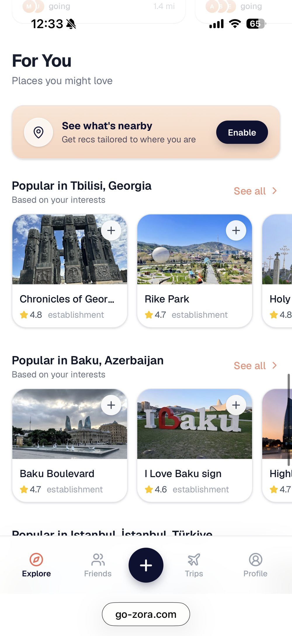
For You

For You. Location permission, then popular by city and interest.

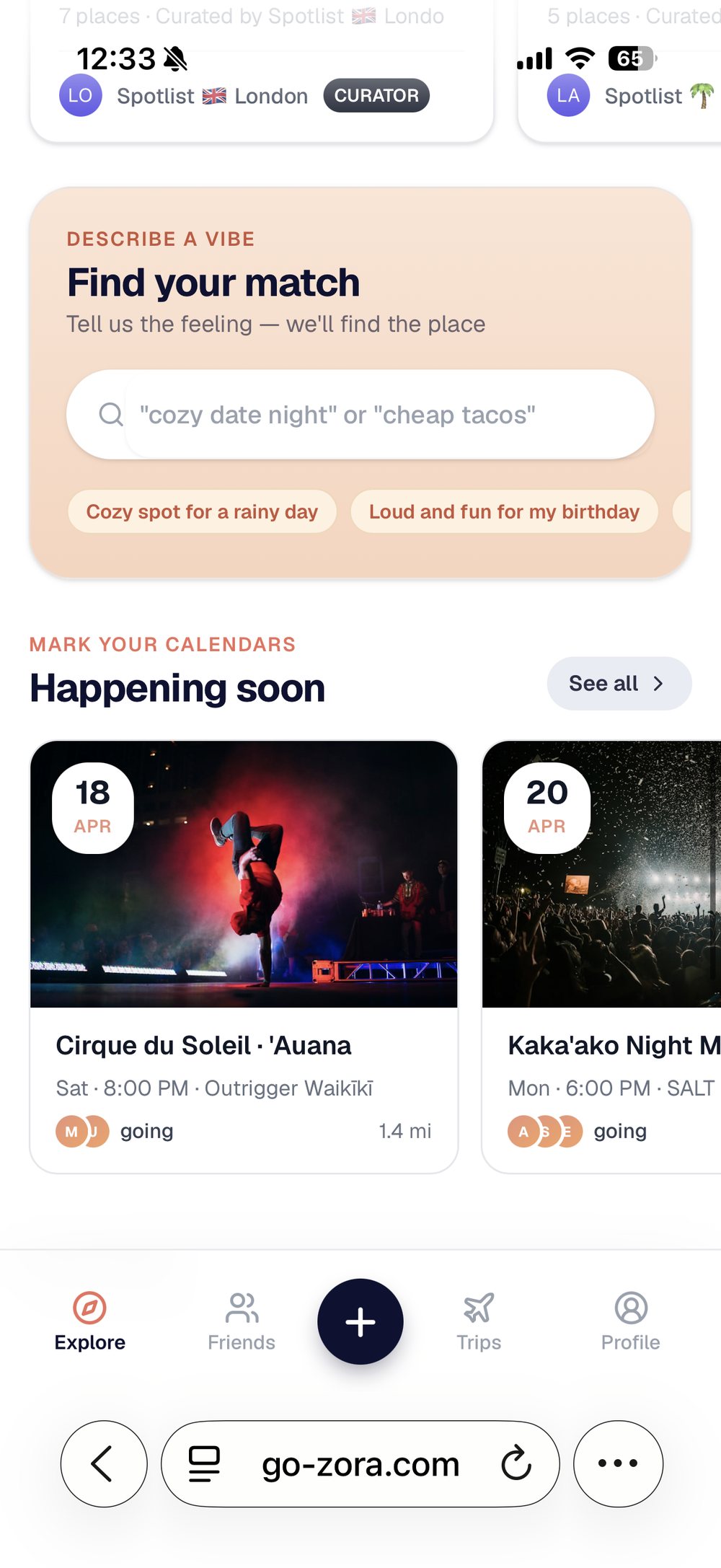
Vibe search

Vibe search. Natural language entry for users who cannot name a category.

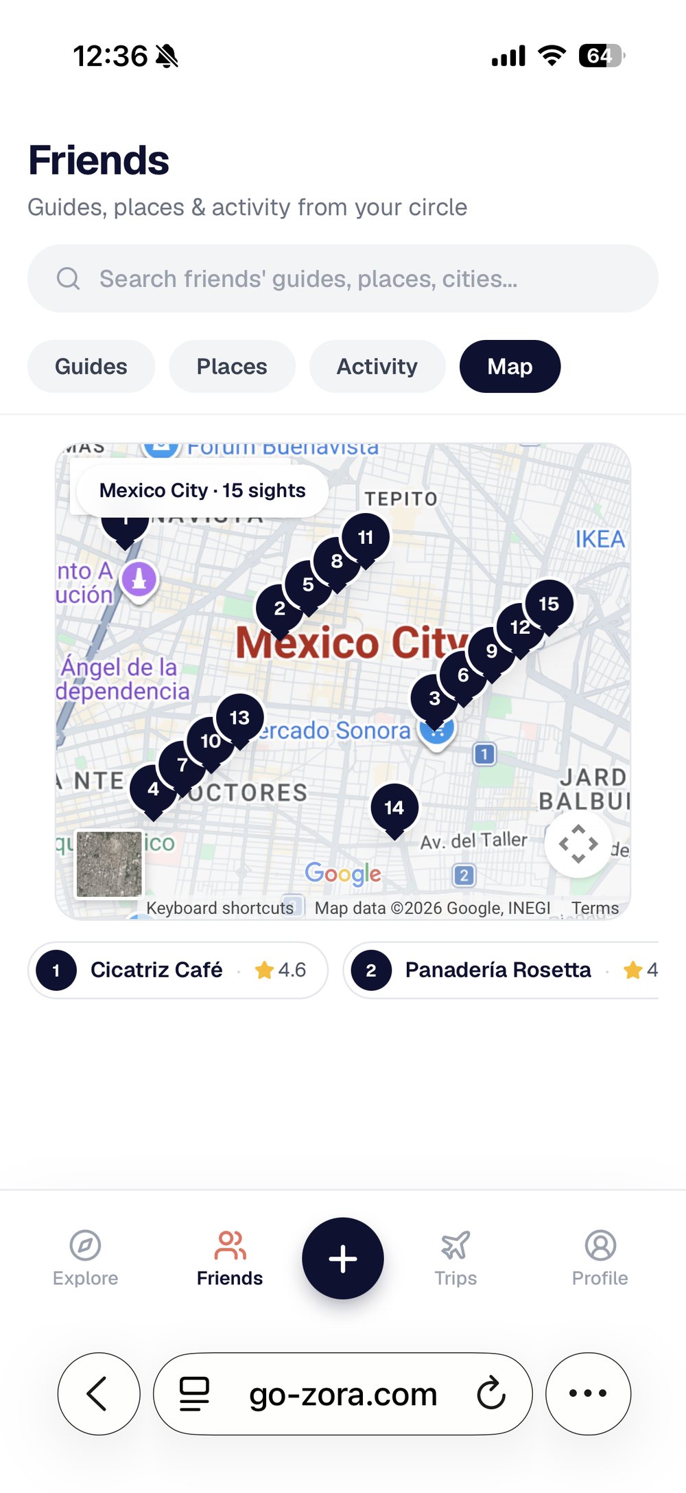
Friends map

Friends map. Spatial browsing of first-degree saves.

Research

Five moderated sessions, plus interviews with product owners in the category.

5 moderated sessionsSat with people while they used it. Task given, no prompting.
Interviews in the categoryProduct owners running comparable consumer products.
Observed, not askedWhat people did with the product, not what they said they would do.

Part 03

Sign-up and saving guides

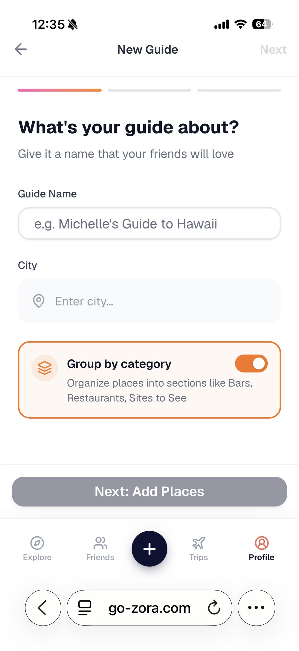
Guide creation, step one

Guide creation, three steps, sign-up first

Problem

Sign-up came last. Guides were saved to the device, not the account.

  • How I found itFive sessions, sitting with people while they made a guide.
  • What happenedPeople finished a guide, signed up, and landed in an empty account.
  • CauseThe guide lived in the browser, not the database. There was nothing to move across at sign-up.
  • ResultThe work was gone at the exact moment they cared most about it.

Finding

Delaying sign-up did not remove friction. It moved it to a worse moment.

Signing up costs a few seconds before someone has invested anything. Losing a finished guide costs you the person.

Sign-up last

Zero cost to start. Everything lost at the end.

Sign-up at create

One tap up front. Nothing lost after it.

Solution

Sign-up moved to the moment someone taps create.

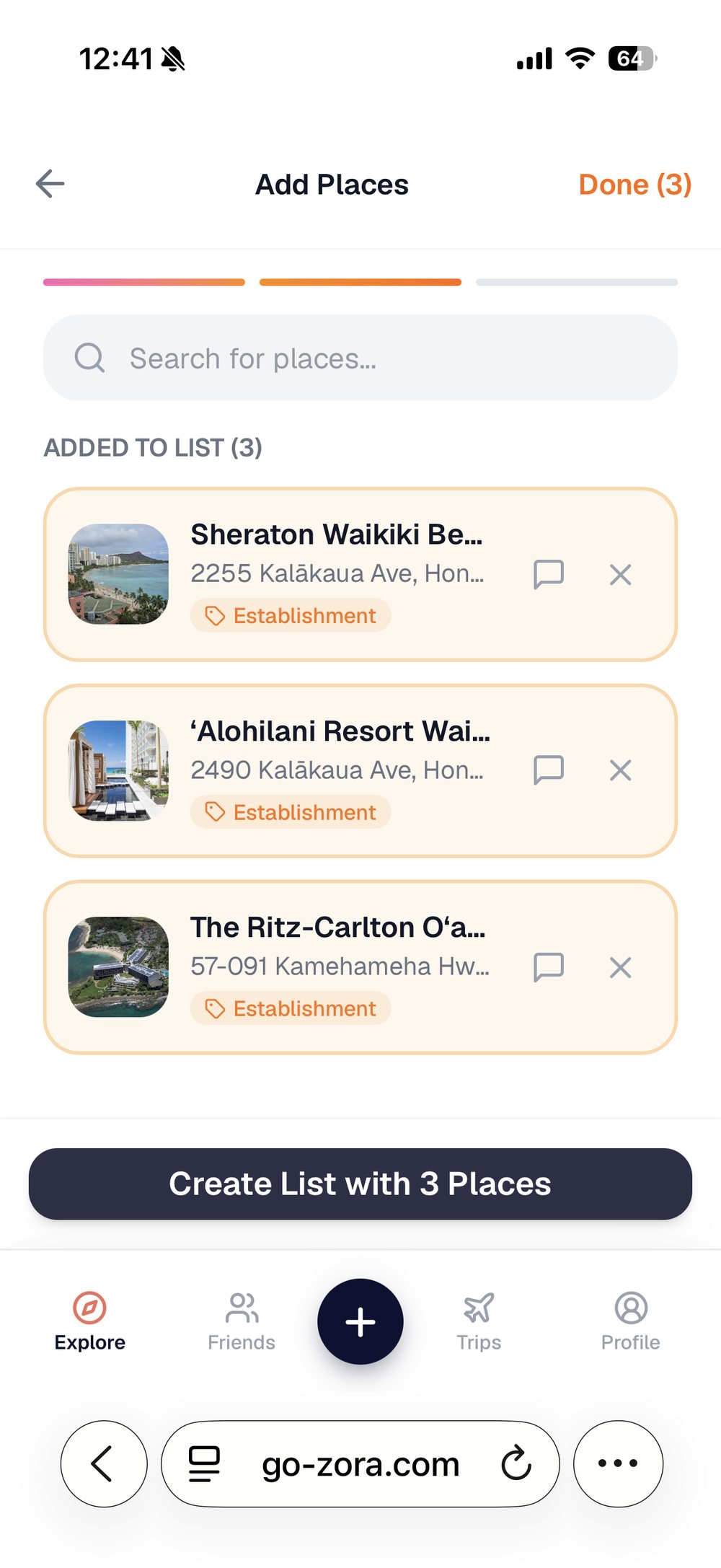
Create→Sign up with Google→Name and city→Add places→Persisted
Adding places
Places written to the account as they are added
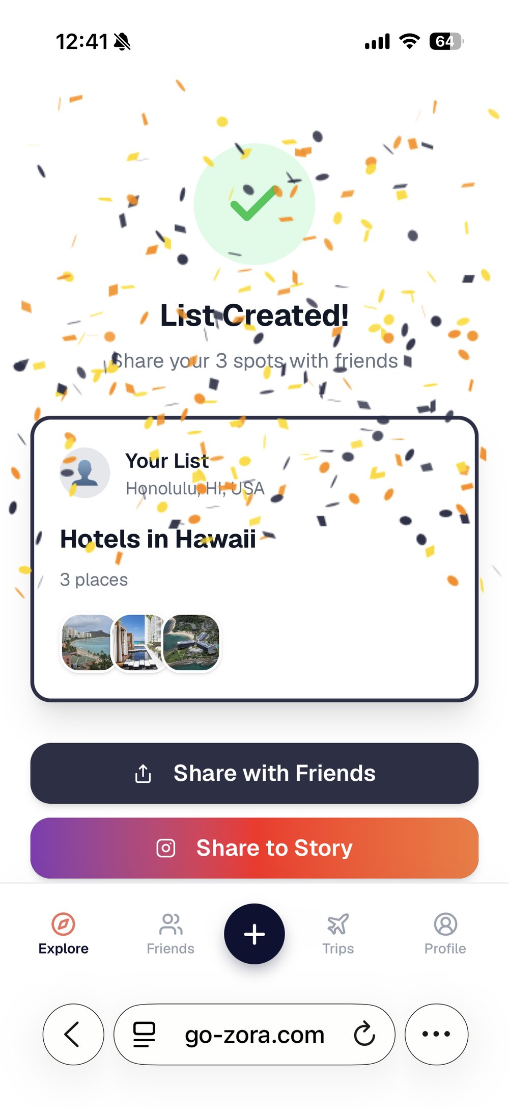
Completed guide
Completed guide, owned and shareable
  • Asked at the right momentSign-up is requested once someone has chosen to create, not while they are still browsing.
  • One tap to sign upGoogle only. No password to set, no email to verify.
  • Saved to the account from step oneThe guide exists in the database before a single place is added.
  • Browsing stays freeReading, searching and viewing guides still need no account at all.

Reducing the cost of creating

Import a list instead of building one.

Adding places one at a time is the real barrier to a first guide. Most people already have the list somewhere. Paste from Notes takes that raw text, extracts the place names, and resolves each one against the places API.

Pasted from Notes

Contramar
Pujol
Rosetta
Licoreria Limantour
Maximo Bistrot
→

Resolved places

Contramar Roma Norte · 4.6
Pujol Polanco · 4.7
Rosetta Roma Norte · 4.5
Licoreria Limantour 2 matches
Maximo Bistrot Roma Norte · 4.6

A list that took months to gather in Notes becomes a structured, rateable, shareable guide in one paste. That is the difference between asking someone to start and asking them to move.

Part 04

Building it solo

How it was made

  • Designed in Figma
  • Built with Claude Code, no dev team
  • Next.js, Supabase, Tailwind, Vercel
  • Shipped to production continuously

Why it matters

  • A design decision could be live the same day
  • Testing happened on the real thing, not a prototype
  • Nothing was lost translating design to build
  • The constraints were real ones, not imagined
Figma→ Claude Code→ Next.js + Supabase→ Vercel→ Live, same day

Designing and building the same product changes what you decide. A layout that would have been a conversation with an engineer became a thing I could try, look at, and keep or throw away the same afternoon. Most of the changes in Part 02 happened that way.

The product now

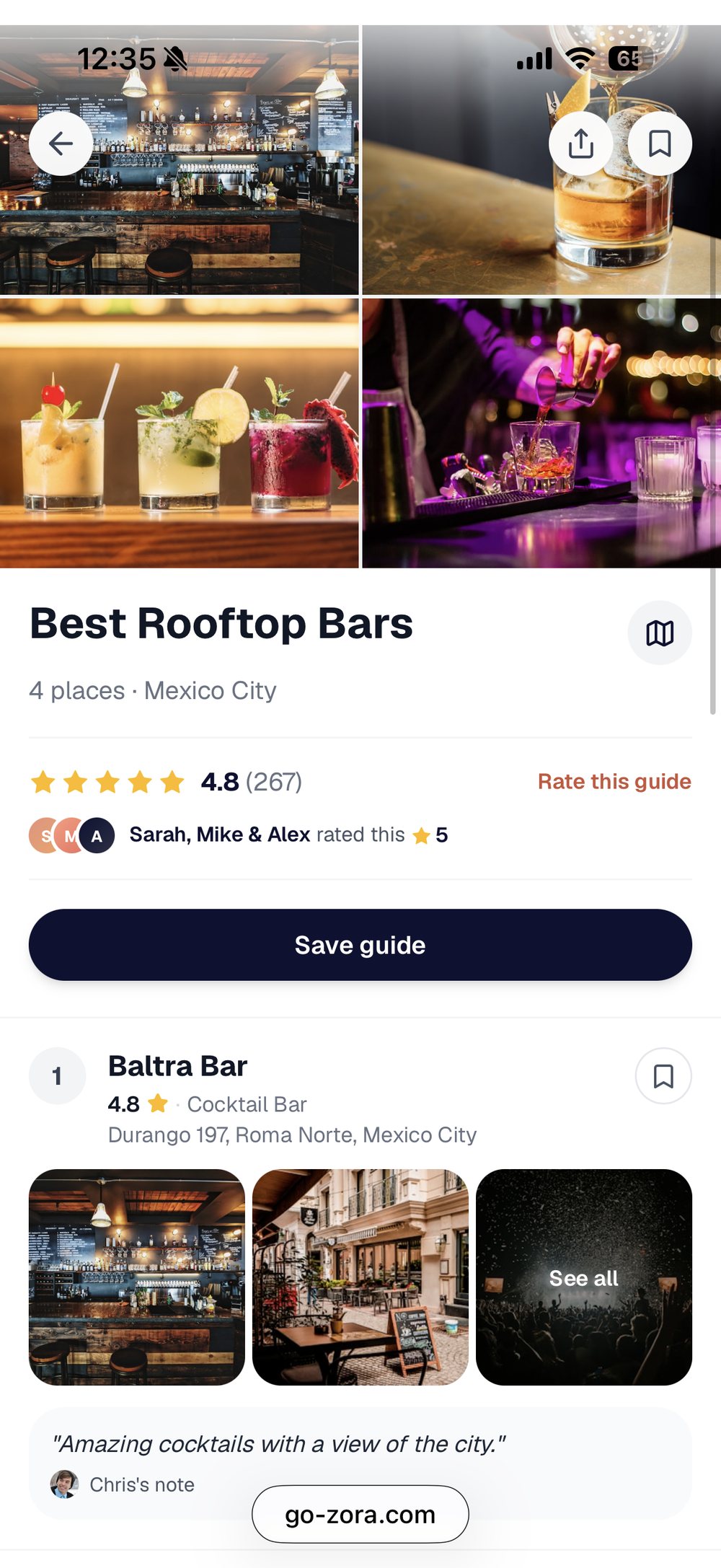
Guide detail

Guide detail with ratings

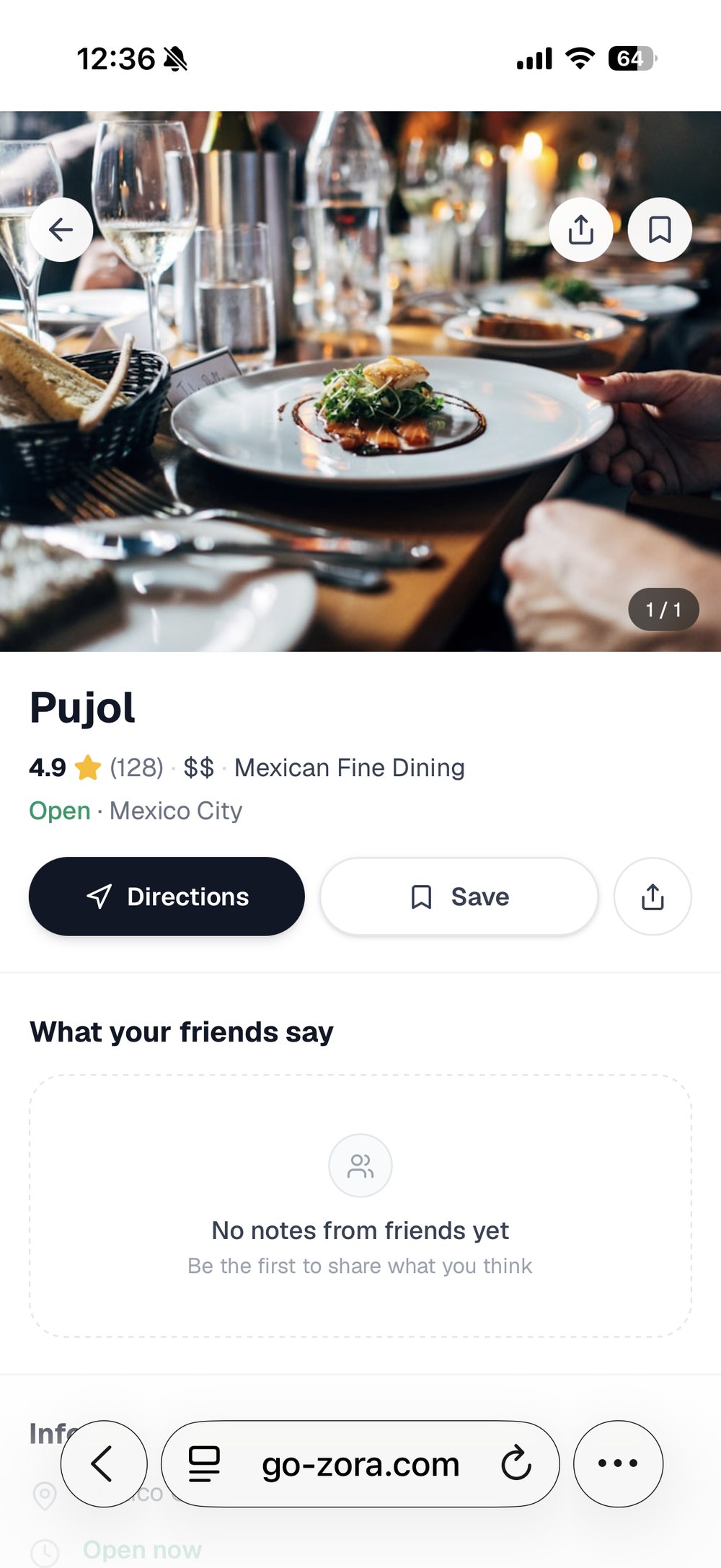
Place detail

Place detail

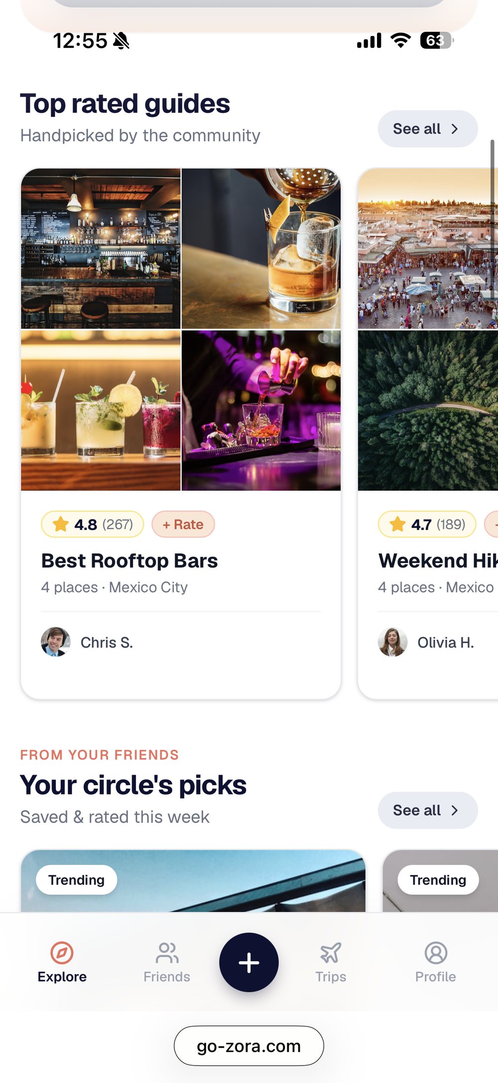
Circle picks

What your circle picked

Part 05

Taking it native

Where it is

Web app on the internet, wrapped app in TestFlight.

Zora runs at go-zora.com and the same product is wrapped for iOS with Capacitor. It is in TestFlight now, with App Store submission next. One codebase serves both.

One codebaseNext.js and Supabase, server-backed
go-zora.comWeb, live
Capacitor shelliOS, TestFlight

Why a wrap, not a rewrite

  • The app needs a live server. It cannot be packaged as static files
  • Sign-in runs on cookies that only work against the real domain
  • The shell points at the live deployment
  • A rewrite would have been a second product to maintain

The tradeoff I accepted

  • A web change ships to the app with no App Store review
  • Only shell changes need a new build
  • Fast to ship, and a real dependency on the deployment being up
  • The offline state had to be designed, not defaulted

Clearing review

Apple rejects a website in a box.

Guideline 4.2 is the one that catches wrapped apps. The answer was to make it genuinely native where being native matters.

GeolocationFeeds nearby recommendations, not a browser prompt.
Camera and share sheetAdding places and sending guides the way the phone expects.
Haptics and network stateSmall signals that separate native from wrapped.
Branded offline screenReviewers test with the network off. A blank page is a rejection.

Named Go Zora, because plain Zora is likely taken in the App Store by a crypto product. Worth checking before you design an icon around a name.

Where it stands

Live

go-zora.com, in public use

TestFlight

iOS build installing on devices

Next

App Store submission

What I would tell someone starting one

  • Design the exit, not just the entryThe failure point was not the fun part. It was the step right before save, which is exactly where people lost their work.
  • Build for the people who never postMost users never create anything. The first version assumed everyone wanted to make a guide.
  • Design is a fraction of shippingThe Figma file was the easy part. The database, sign-in, maps, image hosting, empty states and deploys were the rest of it.
  • Trust had to be a pattern, not a claimAttribution, the friends filter, the rating UX. Every decision answered one question: does this make me trust the recommendation more, or less?