georgiajean
A meeting agent that leaves you with something to build, not something to read.
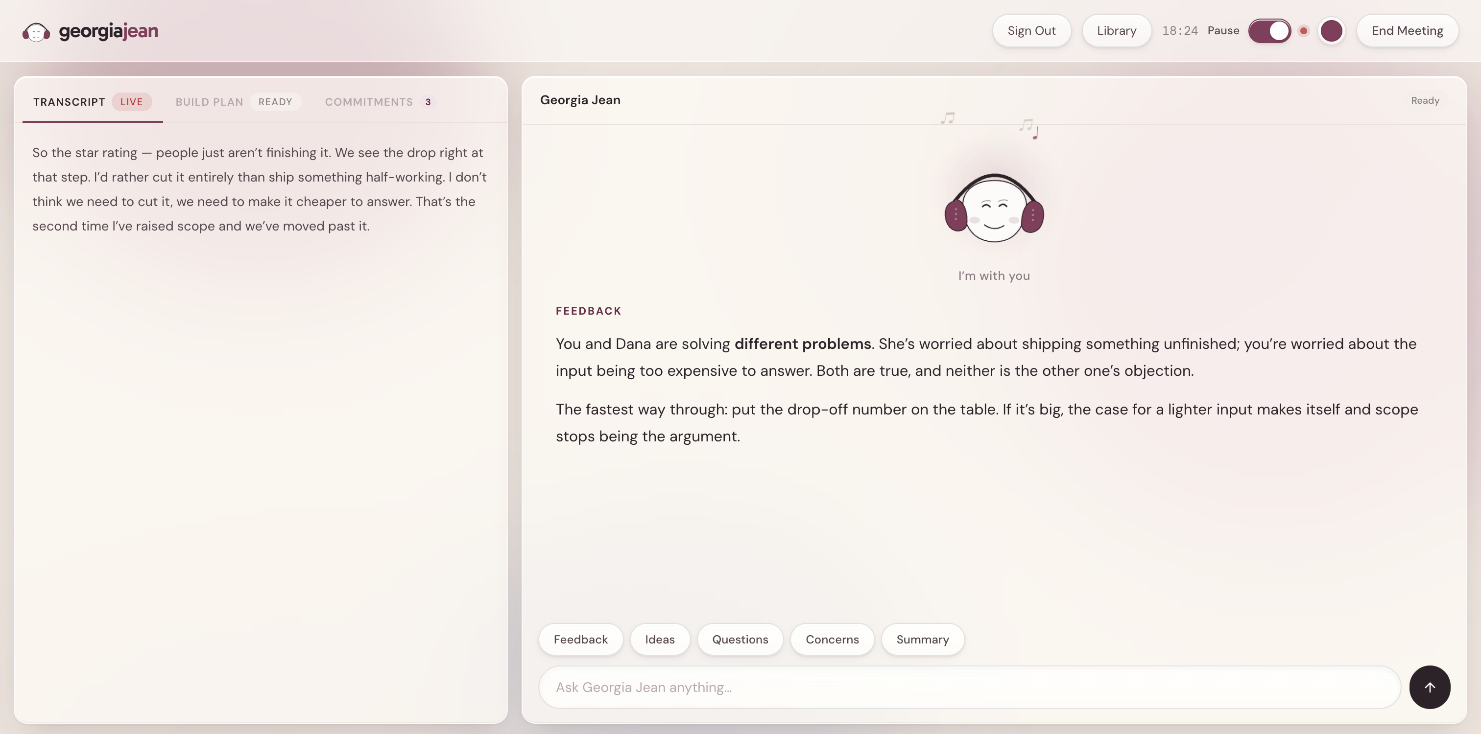
She listens to the call, answers when you ask, catches what people commit to, notices when the room tightens, and quietly writes a build plan the whole time. I founded, designed and built her.
Role
Founder, designer and builder
Scope
Product strategy, UX, UI, front-end
Status
Live and in daily use
Stack
Deepgram, Claude API, Supabase, Vercel
Brainstorm it, build it, and review it before the call ends.
Right now those are three separate events. You talk an idea through, everyone roughly agrees, and the building happens somewhere else on another day. Claude Code can turn a clear instruction into a working prototype in minutes, so building isn't the slow part anymore. Getting the conversation into a shape a build tool can use is, and that happens after everyone has hung up, from memory.
But the conversation needs help too, and that's harder to see. When you're in a call you're participating. You can't also be the person keeping track of what everyone promised, noticing the question nobody thought to ask, or clocking that someone's point has been talked over twice now. Everyone in the room has the same problem, which is why nobody catches it.
So Georgia Jean does both jobs at once. She listens the whole way through, gives you a second opinion the moment you want one, and writes the build plan continuously, so you can hand it over and review the actual thing before anyone leaves.
While you talk, she's
Answering on demand
Feedback, ideas, the questions nobody asked, and the risks nobody wanted to name. One click each, mid-conversation.
Catching what people promise
Commitments get pulled out as they're made, with an owner on each, without anyone stopping to write them down.
Watching the temperature
Flags it when somebody's point keeps getting passed over, which is the thing everyone feels and nobody says.
Writing the build plan
Rewritten every sixty seconds from what's been said, so it's ready to run before the call is over.
Staying out of the room
No bot in the participant list. Visible note-takers make people perform, and that was a dealbreaker.
Twenty-five seconds of a real meeting.
You can't judge a live product from a screenshot, because the whole thing is behavior over time. So press play. This replays a scripted meeting at real pace: she listens, someone speaks, you ask for feedback, a commitment gets caught, the room tightens, and a build plan lands at the end.
Hit “Start Meeting” and share
your meeting tab, with audio on
Ready when you are
I'm here whenever you need me, just ask
Tension detected
Dana has raised scope twice and nobody has answered her.
Press play to watch a meeting run start to finish.
Four jobs, running at once, while you talk.
Hears the whole room
Captures the shared meeting tab and your mic together, streams both to Deepgram, and keeps a live diarized transcript. No bot joins the call, so nobody else knows she's there.
Answers on demand
Feedback, ideas, the questions nobody asked, the risks nobody named, or a summary of where things stand. Five framings of the same conversation, one click each.
Writes the build plan as you talk
Every 60 seconds she rewrites a build prompt from the conversation: context, scope, open questions. By the time you hang up it's ready to hand to Claude Code.
Catches what people promise
Commitments are pulled out of the conversation as they're made, with who owns each one. She also flags tension, meaning the moments when somebody's point keeps getting passed over.
Build it while you're still talking about it.
This is the part I actually care about. Georgia Jean rewrites a build prompt every sixty seconds from whatever has been said: the context, the scope, the open questions. It isn't a summary of the meeting, it's an instruction set, and it's finished before the meeting is.
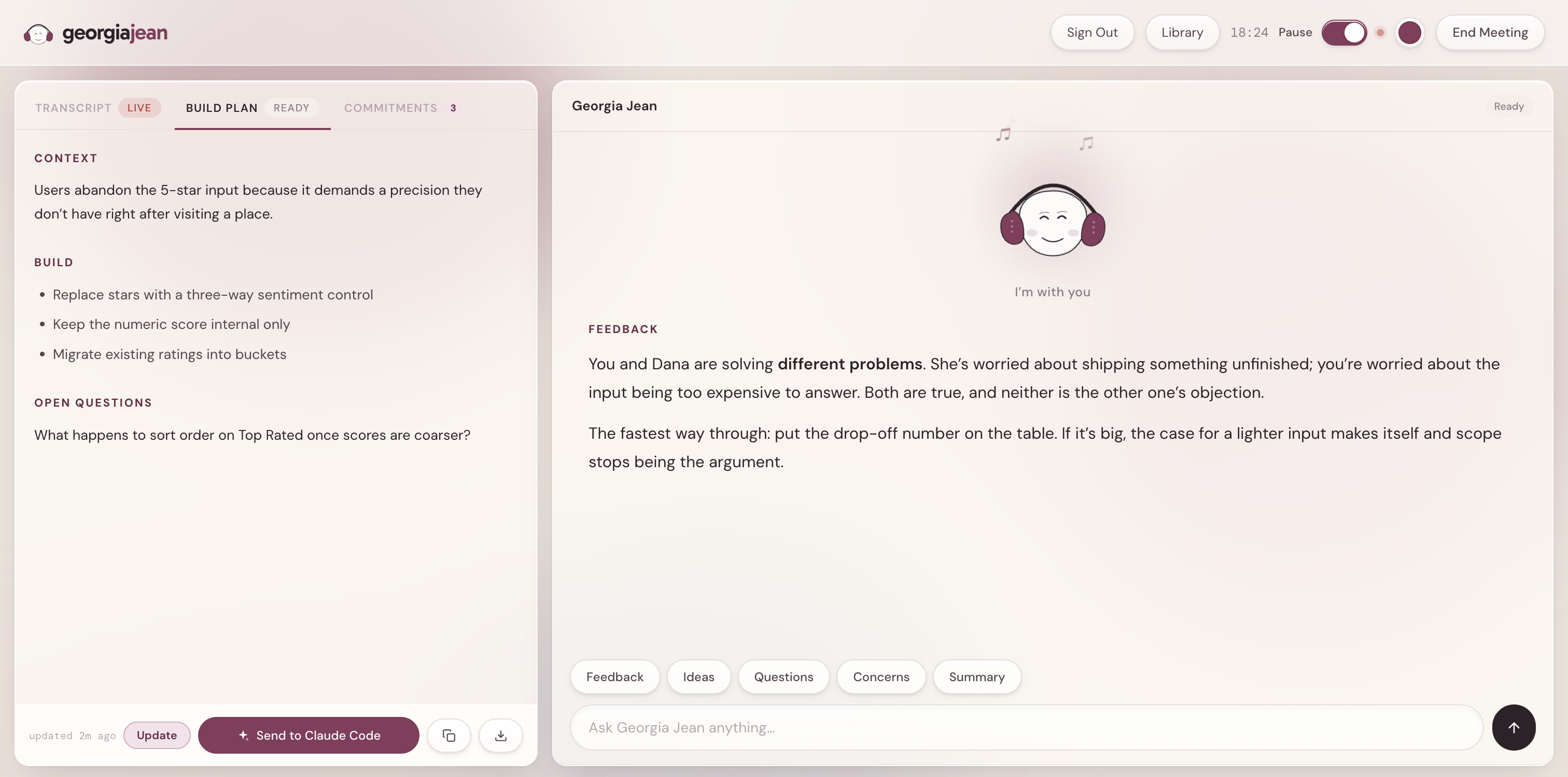
It's written before you need it
Because it regenerates continuously, it's finished the moment the call is. No writing-up step, which is the step that never happens.
One click to Claude Code
The plan goes across with the meeting's context attached, not a bare paragraph but the reasoning behind it.
So the meeting becomes a prototyping session
Build the thing you're arguing about, put it on the screen, and find out in ninety seconds whether you actually agreed or just used the same words. Iteration that used to take a week between calls happens inside one.
Why not just paste the transcript in?
It's the obvious objection and it was the first thing I tried. Claude Code can read a transcript perfectly well. The difference is what it has to reconstruct before it can start, and how much of that reconstruction it has to redo every time the meeting gets longer.
Pasting the raw transcript
Grows with the meeting. Forty minutes of speech is roughly 5,500 words, and every one of them goes across.
Contains the decision AND the reversal, with equal weight. Claude has to work out which one stuck.
Full of hedging, tangents and half-finished sentences that read exactly like requirements.
Has to be assembled after the call, which is the step that never happens.
Sending the build plan
Stays roughly the same size whether the meeting ran 20 minutes or 90. Around 350 words instead of 5,500.
Rewritten against the full transcript every 60 seconds, so a reversal replaces the decision rather than sitting next to it.
Already translated from what people said into what to do: component names, files, logic, APIs.
Arrives in a fixed shape, so the design half and the build half can go to different people.
The constraint that does the work
The prompt forces exactly two sections, every time: Design Changes for component names, layout, copy and UX notes, and Code Changes for files to create or modify, logic, APIs and data structures. Nothing else is allowed through.
That rigidity is the point. A predictable shape means the output can be parsed and split, so the design half and the build half are separable rather than one blob of prose. And forcing the model to fill those two headings is what stops it from writing a summary. There is nowhere to put “the team discussed the rating input” when the only two boxes are what to design and what to build.
No bot joins your call.
Share the tab
You share your Zoom or Meet tab with audio. Everyone else sees a normal call.
Two streams, merged
Tab audio and your mic are combined in the browser and sent to Deepgram over a socket.
Claude reads it live
The rolling transcript feeds prompts for feedback, commitments, tension and the build plan.
It all persists
Transcript, recap, decisions and action items save to Supabase, linkable to past meetings.
Every competitor dials a named bot into the call, and the moment that bot appears in the participant list people start performing. They hedge, they stop thinking out loud, and the raw material Georgia Jean needs disappears. Choosing browser screen-share over a bot cost me a harder build and a clumsier setup step, but it's the only version where the meeting stays a real meeting. That one constraint decided most of the architecture.
The version with more buttons was worse.
The live bar started with eight actions. Alongside the five thinking prompts there was Build Prototype, Draft Email and Draft Calendar Invite. I built all of them, shipped them, and used them for weeks.
What I noticed
Nobody drafts an email in the middle of a conversation. Those three were things I wanted after a call, not during one, and they sat there the whole time making me read past them to reach the ones I actually used.
The cut
The live surface kept only the five that help you think: Feedback, Ideas, Questions, Concerns, Summary. Email and calendar moved to the saved meeting where they belong. Prototype folded into the build plan, which was doing the same job better.
The tell
liveDraftEmail and liveDraftCalendar are still sitting in the codebase, no longer wired to anything. I left them there as a reminder that shipping a feature and keeping it are different decisions.
This is why eight was worse than five even though the extra three worked fine. In a live call almost all of your attention is on the conversation, and the fraction that's left has to be spent choosing. Three of the eight were never going to be picked mid-sentence, so their only real effect was to make the five you did want slower to find.
Where everything lands.
This is the other half of the scoping decision. The three actions that came off the live bar are all here, on the saved meeting, where wanting to draft an email actually makes sense.
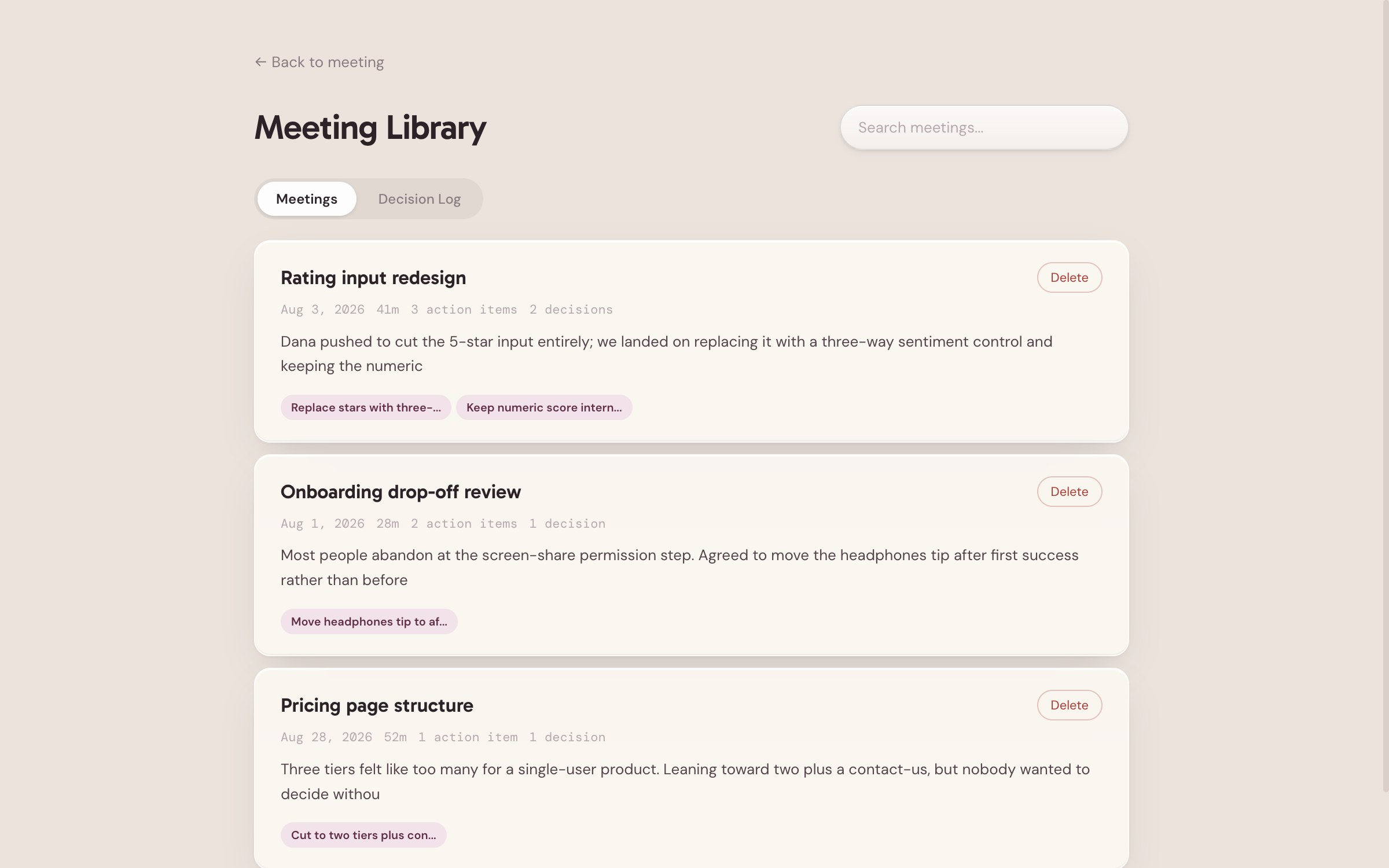
The library. Every meeting, searchable, with the decisions pulled onto the card so you can find the call where something was settled without opening any of them. There's a Decision Log tab that flattens every decision across every meeting into one list, which is the view I use most.
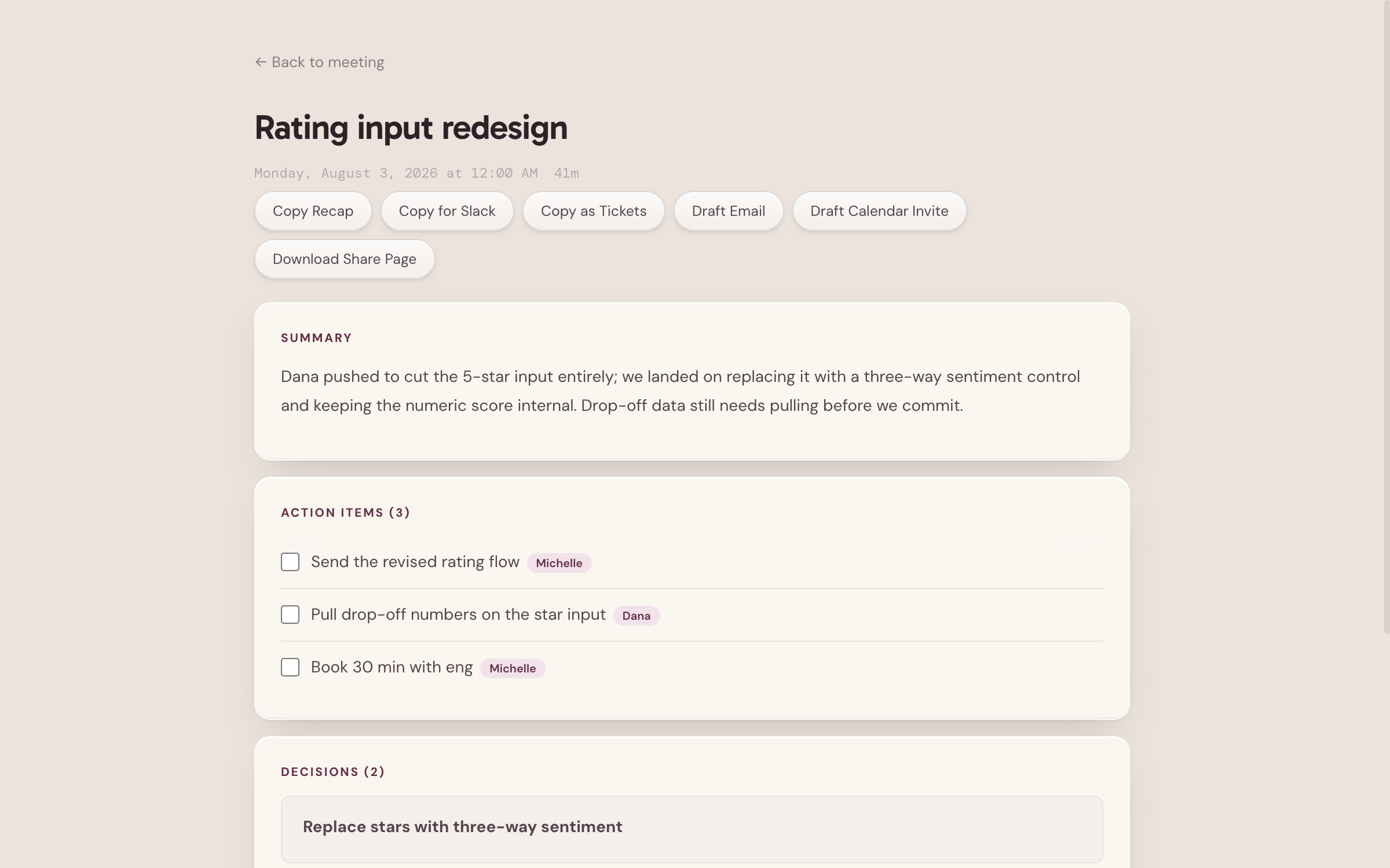
The recap. Summary, then action items as a real checklist with an owner on each one, then the decisions and what prompted them. The export row is deliberately boring: copy it, send it to Slack, turn it into tickets, draft the follow-up email. The work of a meeting usually dies in the gap between deciding and telling people, so all of that is one click.
From flat to breathing.
The first version did everything on this page and I used it every day. It just sat there while it did it. Flat white cards, a hairline border around each one, a single type size doing every job, and an interface that looked identical whether she was asleep, listening or thinking.
The redesign traded outlines for light. Same product, same features, rebuilt on layered glass with an ambient field behind it that breathes, warms and settles depending on what she's doing.
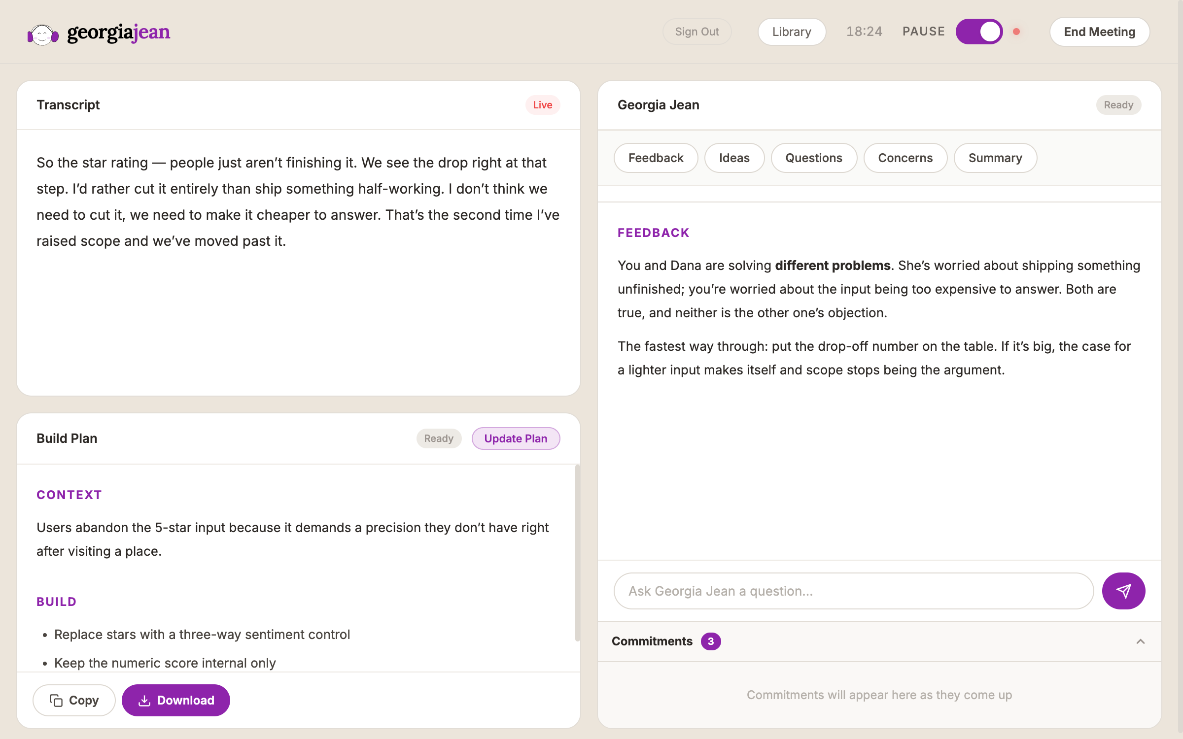
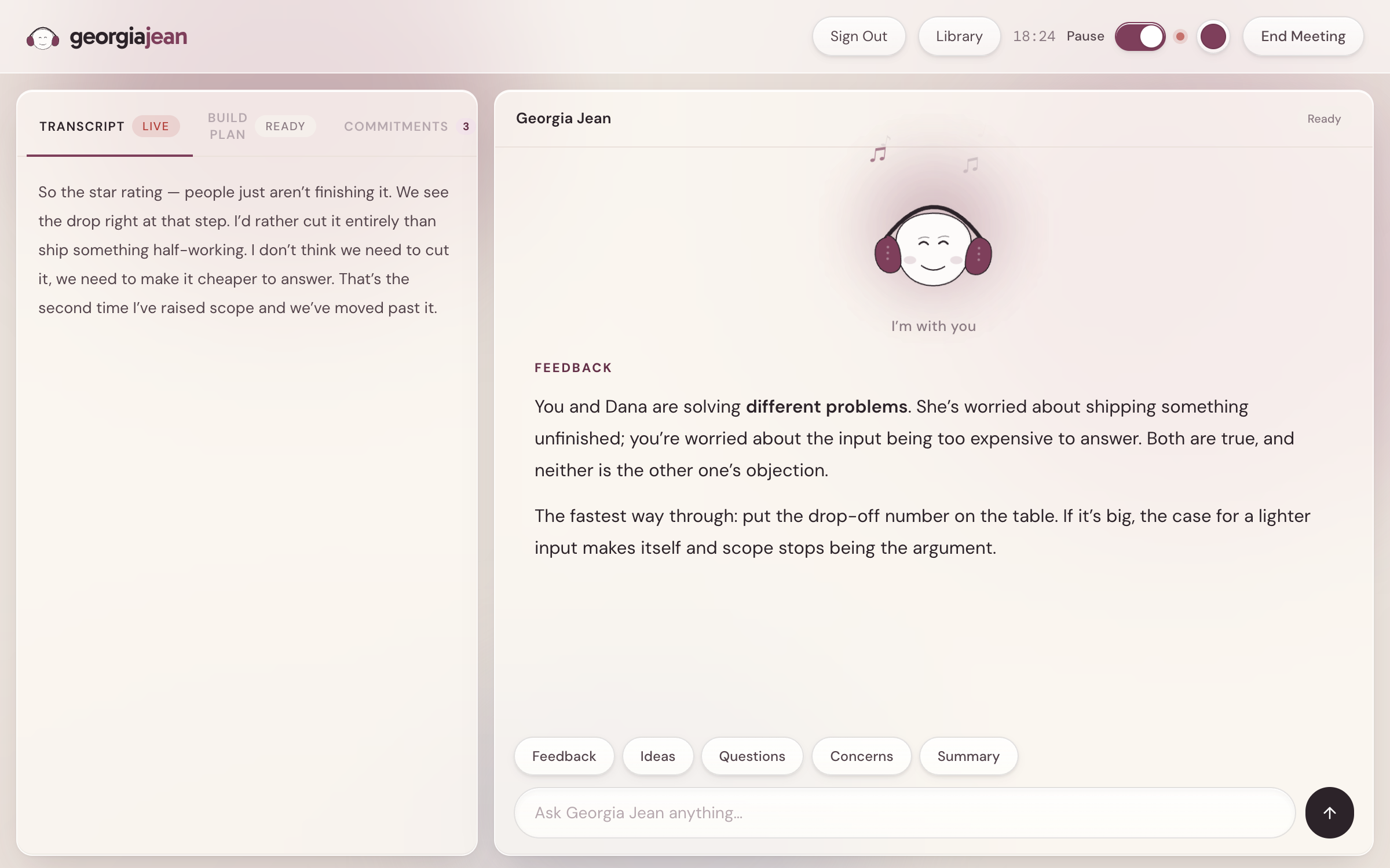
Borders → light
Every panel used to be a 1px outline on white. They're now translucent glass over a color field, so depth comes from layering instead of drawing edges.
One size → a real scale
Everything used to sit between 10 and 14px, so her answer weighed the same as a status badge. The scale now runs 10 to 40 and her answer is the largest text on screen.
Static → breathing
The glow behind the panels expands and contracts on a 5.4 second cycle while she listens, and speeds up as she works. The product is never completely still.
Stock purple → warm raisin
The old accent was Material Design's default, and the same purple half the AI industry uses. The new one is warm enough to sit on the tan base and hard to mistake for anyone else.
Nothing about how Georgia Jean works changed in the redesign. The same five prompts, the same build plan, the same detection. But a tool people trust with a live conversation has to look like it can be trusted, and the flat version was quietly costing me that before anyone had used a single feature.
The room carries her state.
Most AI interfaces put a spinner where the answer will be. But Georgia Jean isn't a chat box. she's present for forty minutes, and she's doing something different in each of them.
So the whole surface responds. Warmth breathes slowly behind the panels while she listens, tightens and rotates while she thinks, settles as an answer arrives. Her halo, how fast she bobs, and the light gathering at her headphones all run off one state machine.
Dormant
No glow at all. She's asleep.
Listening
A slow 5.4s breath.
Hearing
Quickens to 3.2s. Someone's talking.
Thinking
1.8s, and the field starts rotating.
Responding
Settles as text streams in.
Tension
The whole field turns red.
Claude takes a few seconds to answer. I could have hidden that behind a spinner, which is what most products do and what makes the wait feel like lag. Instead the room visibly tightens and starts rotating while she reads. Exactly the same delay, except now you can see her working, and the pause reads as thinking rather than buffering.
The one I'm proudest of is tension. When she detects that someone's point has been passed over twice, the ambient field shifts from raisin to a warm alarm red, before any text appears. You feel the room change a beat before you read why. An interface that conveys the emotional temperature of a meeting pre-verbally is the kind of thing I got into design to make.
The hard parts aren't the screens.
Almost everything difficult about this product lives in the seconds when the system doesn't have an answer yet, or isn't sure, or is doing something the user can't see.
Latency needs a design, not a spinner
Claude takes a few seconds. Instead of hiding that, the room warms and tightens first, so the wait reads as attention rather than lag.
Streaming changes how you set type
Text that arrives a token at a time can't be laid out like text that arrives at once. Her answers get a fixed measure and generous leading so lines don't reflow as they land.
Ambient presence beats notifications
She's there the whole call. Anything that interrupts costs you the conversation, so almost all of her signaling is peripheral: light, motion, color.
People should get to decide how present an AI is
Ambient motion helps some people concentrate and distracts others. So it's a setting: Subtle, Balanced, Full. Shipping that control was a trust decision, not a visual one.
Pick your own theme color.
A tool you keep open for forty minutes at a time shouldn't be stuck with one person's taste, so there are five presets and a full color picker. Whatever you choose, every other value is derived from it: hover states, tints, the ambient glow, the alert tone, even her ear cups. Pick a deep teal and the whole product, mascot included, becomes a teal product.
There's a second control for how strongly the ambient layer moves, from Subtle to Full, because motion in your peripheral vision helps some people concentrate and pulls others out of the conversation.
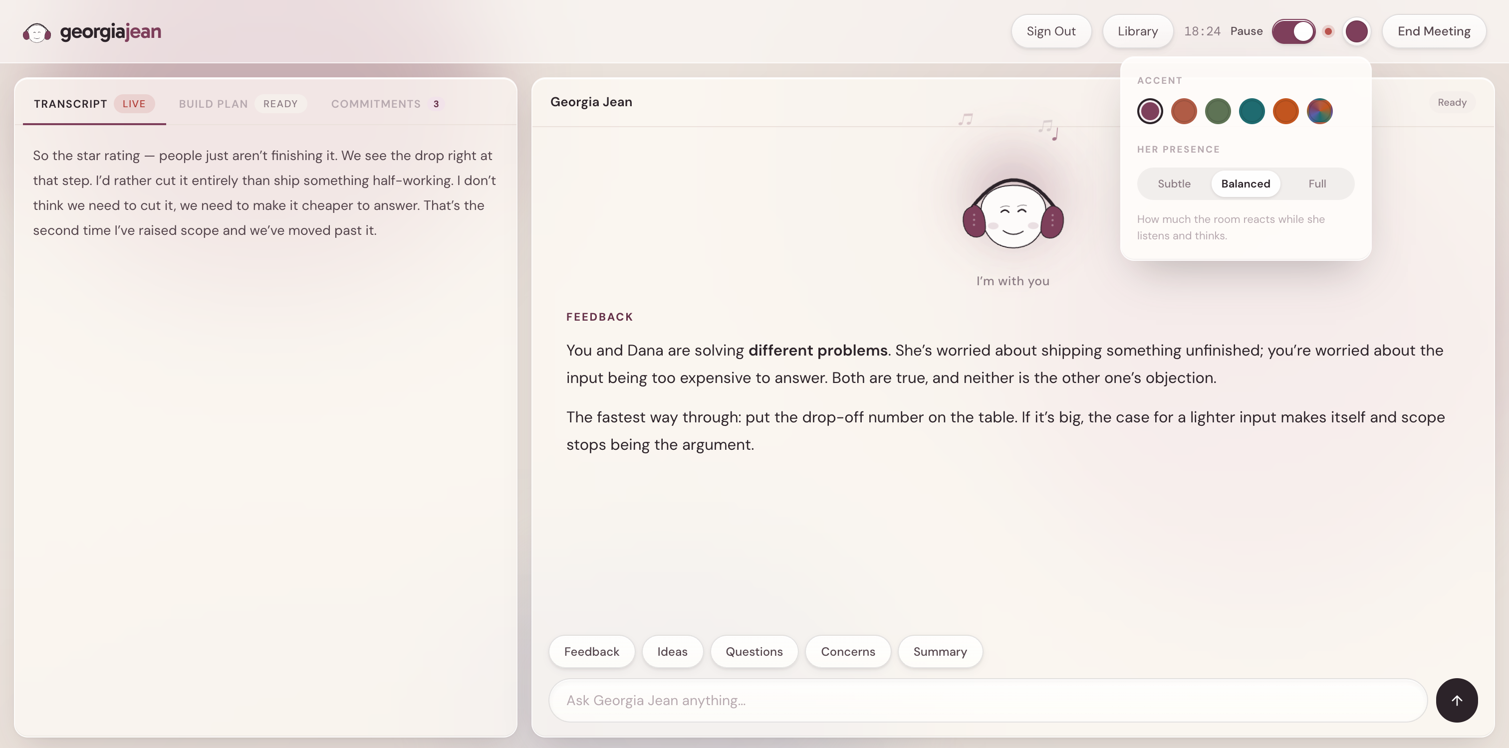
Choosing a color takes one click and changes nothing functional. But the version you picked stops being an app you opened and starts being your setup, and that small act of ownership is worth more to retention than most features I could have built with the same effort.
Tension, caught and named.
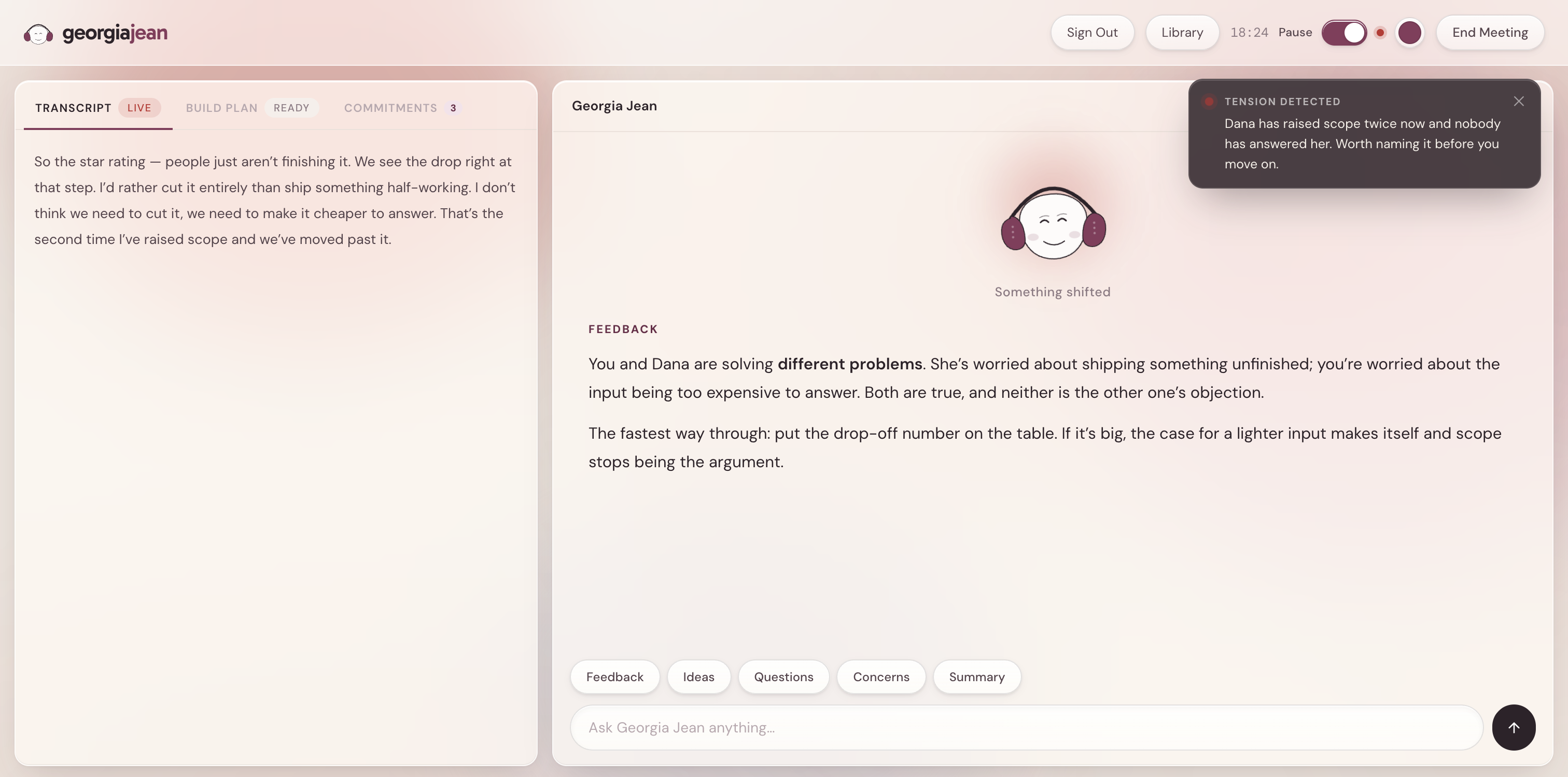
Tension. The field shifts color first; the explanation arrives second. It sits clear of the composer rather than over it, because an alert that blocks the input is worse than no alert.
“I wanted something we could actually look at on the call, instead of waiting days to prototype it, get back on a call, and find out we were picturing different things the whole time.”
Michelle Barron, Founder
Where it goes from here.
A real handoff to Claude Code
Today the build plan copies to your clipboard. It should open in the editor with the meeting's context already attached.
Tension needs calibrating
It fires on a heuristic. I want to test it against recordings of meetings I already know the outcome of.
Let her speak up unprompted
Right now she waits to be asked. The harder design question is when interrupting is worth the cost.